Visualizing Your Time Series Data with the Highcharts Library
By
Margo Schaedel
updated December 14, 2025
Product
Use Cases
Developer
Navigate to:
![]()
There have been a couple of posts in the past on visualizing your time series data using different charting libraries such as this integration with plotly.js or this one on the Rickshaw library. Today we’re going to take a look at the charting library, Highchartsanother great tool for your data visualization needs. Of course, if you don’t want to pull in external graphing libraries, you can always check out Grafana or Chronograf. Grafana easily integrates with InfluxDB, and Chronograf was built out specifically to be used with InfluxDB.
 <figcaption> Our famed InfluxDB I’iwi</figcaption>
Before we start throwing those graphs on the page though, you’ll need to ensure you have an instance of InfluxDB up and running. You can get all the components of the TICK Stack set up locally or spin up the stack in our handy sandbox mode.
![]()
I recently published a beginner’s guide on the Node-influx client library as an option for integrating with InfluxDB without necessarily having to use Telegraf to collect your data. This visualization is built out using the same ocean tide data from that post. You can clone the repo down here if you want to check out the end product.
First Steps
Pulling in the library is our first step. I added the following script tag to the head section of the index.html file.
<script src="https://code.highcharts.com/highcharts.js"></script>To the body of the index.html file, you’ll need a container div with an id of ‘container’ so we can later target that in the script file, like so:
<div id="container"></div>The Highcharts graph will be rendered within this container.
In our server file we’ve already set up an endpoint to query the data from our ocean tides database (see below) so we’ll need to fetch the data in our script file and set it into our Highcharts constructor function.
app.get('/api/v1/tide/:place', (request, response) => {
  const { place } = request.params;
  influx.query(`
    select * from tide
    where location =~ /(?i)(${place})/
  `)
  .then( result => response.status(200).json(result) )
  .catch( error => response.status(500).json({ error }) );
});
In the script file, I wrote a simple fetch function that retrieves the data based on the location name passed in.
const fetchData = (place) => {
  return fetch(`/api/v1/tide/${place}`)
    .then(res => {
      if (res.status !== 200) {
        console.log(res);
      }
      return res;
    })
    .then(res => res.json())
    .catch(error => console.log(error));
}
To fetch all the data for the four different locations, I used Promise.all() and then mutated the results to fit into the required format referenced in the Highcharts documentation.
return Promise.all([
            fetchData('hilo'),
            fetchData('hanalei'),
            fetchData('honolulu'),
            fetchData('kahului')
         ])
        .then(parsedRes => {
          const mutatedArray = parsedRes.map( arr => {
            return Object.assign({}, {
              name: arr[0].location,
              data: arr.map( obj => Object.assign({}, {
                x: (moment(obj.time).unix())*1000,
                y:obj.height
              }))
            });
          });
        })
        .catch(error => console.log(error));
Now that we have our data ready to go, we can construct our graph.
Highcharts.chart('container', {
            colors: ['#508991', '#175456', '#09BC8A', '#78CAD2'],
            chart: {
              backgroundColor: {
                  linearGradient: [0, 600, 0, 0],
                  stops: [
                    [0, 'rgb(255, 255, 255)'],
                    [1, 'rgb(161, 210, 206)']
                  ]
              },
              type: 'spline'
            },
            title: {
              text: 'Hawaii Ocean Tides',
              style: {
                'color': '#175456',
              }
            },
            xAxis: {
              type: 'datetime'
            },
            yAxis: {
              title: {
                text: 'Height (ft)'
              }
            },
            plotOptions: {
              series: {
                turboThreshold: 2000,
              }
            },
            series: mutatedArray
          });
There’s definitely a lot going on here. The Highcharts library comes with the method chart() which accepts two arguments: the target element within which to render the chart and an options object within which you can specify various properties such as style, title, legend, series, type, plotOptions, and so on. Let’s go through each of the options one by one.
- colors: [array] - The colors property accepts an array of hex codes which will represent the default color scheme for the chart. If all colors are used up, any new colors needed will result in the array being looped through again.
- chart: {object} - The chart property accepts an object with various additional properties including type, zoomtype, animation, events, description and a number of style properties. In this instance, I've given the background a linear gradient and designated the type as spline.
- title: {object} - This represents the chart's main title and can be additionally given a style object to jazz things up a bit.
- xAxis: {object} - In this scenario, because I'm using time series data, I know the x-axis will always be time so I can designate the type as 'datetime' and the scale will automatically adjust to the appropriate time unit. However, there are numerous other options here including styling, labels, custom tick placement, and logarithm or linear type.
- yAxis: {object} - Similar to the xAxis property, the y-axis takes an object and has access to a number of options to customize the design and style of the chart's y-axis. I've only specified y-axis title in this case, and deferred to Highcharts automatic tick placement.
- plotOptions: {object} - The plotOptions property is a wrapper object for config objects for each series type. The config objects for each series can also be overridden for an individual series item as given in the series array. Here I've used the plotOptions.series property to override the default turboThreshold of 1000 and change it to 2000. This allows for charting a greater number of data points (over the default of 1000). According to the docs, conf options for the series are accessed at three different levels. If you want to target all series in a chart, you would use the plotOptions.series object. For series of a specific type, you would access the plotOptions of that type. For instance, to target the plotOptions for a chart type of 'line' you would access the plotOptions.line object. Lastly, options for a specific series are given in the series property (see next bullet point).
- series: [array] or {object} - This is where you'll pass in your data. You can additionally define the type for the data to be passed in, give it a name, and define additional plotOptions for it.
Check out the result!
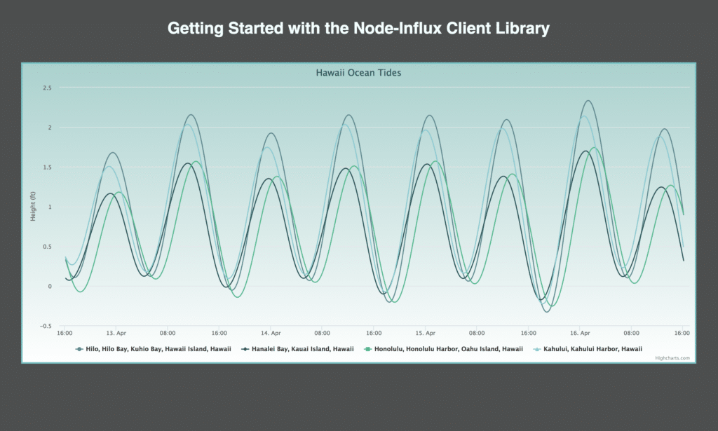 <figcaption> How wavy! (Get it? - You know, because of the ocean… and tides.)</figcaption>
This information really just covers the tip of the iceberg. The possibilities seem endless in terms of what you can create using the Highcharts graphing library. Why not take a look at their documentation or demos and let us know all about your new creations with InfluxDB and Highcharts? Questions and comments? You can always reach out to us on Twitter: @mschae16 or @influxDB. Happy charting!
