Data Visualization Made Easy with ReactJS, Nivo and InfluxDB
By
Charles Mahler
updated December 14, 2025
Product
Use Cases
Developer
Navigate to:
If a picture is worth a thousand words, then a well-done data visualization is worth a million. The quality of a dashboard can make or break an application. In this tutorial, you will learn how to make high-quality data visualizations easily by using the Nivo charting library with ReactJS. You will also learn how to query data stored in InfluxDB to make your charts dynamic and versatile. (If you’re instead looking for a tutorial on visualizing time series data with Chart.js and InfluxDB, click the link.)
What is Nivo?
Nivo is a popular data visualization library built from the ground up for use with ReactJS. While it is great from a performance perspective, the biggest selling point for Nivo, in my opinion, is the developer experience. Nivo includes a bunch of useful utilities and features that will save you time when creating charts in your application and is easy to learn due to the great documentation with plenty of examples. Here are some of the most useful features of Nivo:
- 27 different chart types
- Isomorphic and server side rendering
- SVG, Canvas, and HTML chart support
- Demo data generator utility functions
- Core package with optional chart imports to reduce bundle size
- Storybook with interactive examples
- Pre-set color patterns and template available
Nivo also has a strong community with over 9500 stars on Github and 150 contributors to the project. This means you will be able to find help if you need it and that more features and functionality will continue to be added to the project over time.
What is InfluxDB?
InfluxDB is a database optimized for working with time series data. Time series data is a sequence of data points that are indexed in time order. This type of data has unique properties that conventional relational and noSQL databases tend to struggle with. Some common examples of time series data are:
- IoT sensors
- Monitoring metrics
- Financial data
- Application events
- Analytics
Beyond being able to store and query time series data at massive scale, InfluxDB acts as an entire platform of tools for working with time series data. The platform makes it easy to automate tasks, set alerts based on data, and provides pre-built functions for common queries with the Flux query language.
Getting started with Nivo: components and props
The Nivo library provides 27 different chart types that work for just about any use case or type of data. In this tutorial we will focus on a handful of charts that are particularly good for visualizing time series data.
Because Nivo is designed for making charts in ReactJS applications, all the configuration and styling for your charts is done by passing props to the specific chart component. Each chart type has some own props due to differences in what the charts require, but here are some of the major props to know:
- Data - The data object is required, if you don't pass anything to the chart component it obviously won't be able to display anything. The structure of the data will depend on the chart type.
- Width/Height - These are required props for your chart. If you are using a responsive chart component, the height and width will be taken from the parent element.
- Keys - Key props can be used to determine how each series in the chart is organized.
Beyond the props covered above, there are dozens of other props to control styling, layout, scale, axes, colors, and more. You can also add interactive features like tooltips and event handlers to your charts.
Here is an example line chart configuration:
import { ResponsiveLine } from "@nivo/line";
import { lineData } from "./data";

const MyResponsiveLine = ({ data /* see data tab */ }) => (
  <ResponsiveLine
    colors={{ scheme: "dark2" }}
    data={lineData}
    margin={{ top: 50, right: 110, bottom: 50, left: 60 }}
    xScale={{ type: "point" }}
    yScale={{
      type: "linear",
      min: "auto",
      max: "auto",
      stacked: true,
      reverse: false
    }}
    axisTop={null}
    axisRight={null}
    axisBottom={{
      orient: "bottom",
      tickSize: 5,
      tickPadding: 5,
      tickRotation: 0,
      legend: "transportation",
      legendOffset: 36,
      legendPosition: "middle"
    }}
    axisLeft={{
      orient: "left",
      tickSize: 5,
      tickPadding: 5,
      tickRotation: 0,
      legend: "count",
      legendOffset: -40,
      legendPosition: "middle"
    }}
    pointSize={10}
    pointColor={{ theme: "background" }}
    pointBorderWidth={2}
    pointBorderColor="black"
    pointLabelYOffset={-12}
    useMesh={true}
    legends={[
      {
        anchor: "bottom-right",
        direction: "column",
        justify: false,
        translateX: 100,
        translateY: 0,
        itemsSpacing: 0,
        itemDirection: "left-to-right",
        itemWidth: 80,
        itemHeight: 20,
        itemOpacity: 0.75,
        symbolSize: 12,
        symbolShape: "circle",
        symbolBorderColor: "rgba(0, 0, 0, .5)",
        effects: [
          {
            on: "hover",
            style: {
              itemBackground: "rgba(0, 0, 0, .03)",
              itemOpacity: 1
            }
          }
        ]
      }
    ]}
  />
);

export default function App() {
  return (
    <div className="App">
      <MyResponsiveLine />
    </div>
  );
}
The data is being imported from a file called data.js which exports this array containing an object:
export const lineData = [
  {
    id: "japan",
    data: [
      {
        x: "plane",
        y: 102
      },
      {
        x: "helicopter",
        y: 83
      },
      {
        x: "boat",
        y: 177
      },
      {
        x: "train",
        y: 130
      },
      {
        x: "subway",
        y: 275
      },
      {
        x: "bus",
        y: 243
      },
      {
        x: "car",
        y: 80
      },
      {
        x: "moto",
        y: 60
      },
      {
        x: "bicycle",
        y: 241
      },
      {
        x: "horse",
        y: 211
      },
      {
        x: "skateboard",
        y: 189
      },
      {
        x: "others",
        y: 111
      }
    ]
  }
];
The result is the following chart:
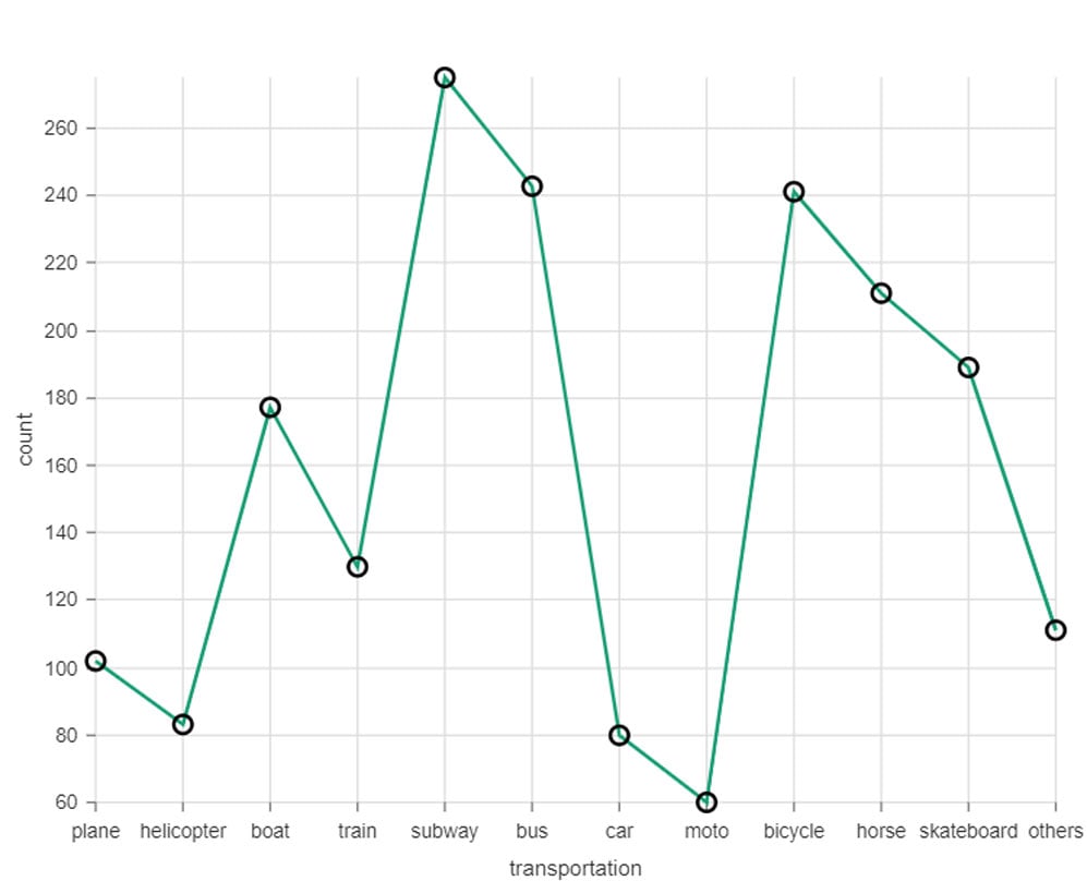
You can play around with the chart props above and see what happens to get a better feel for Nivo.
Setup InfluxDB
Next you need to set up a working instance of InfluxDB so you can write and query data. InfluxDB is open source and can be hosted locally on your computer or deployed to a server. The setup is a bit different depending on which operating system you are using so for this tutorial. I’d recommend you create a free InfluxDB Cloud account which takes about 2 minutes. If you prefer to use the open source version, you can download it here and follow the instructions in the documentation.
Once you have your InfluxDB instance running, now you need to do the following steps to be set up for using the InfluxDB client library:
- Create an organization you will do this while creating your account.
- Create a bucket for storing data the name of the bucket will be used in our code to query the data.
- Create an API token for your bucket with read/write access this token will be used to authenticate the client library.
Install project requirements
Now that InfluxDB is ready to go, you need to set up the frontend of the application. The only requirement for this tutorial is a NodeJS development environment. Create React App will be used as the starting point for this project but you can use a custom ReactJS setup if you prefer. If you don’t want to install anything locally on your computer you can use Replit or CodeSandbox to get a NodeJS environment setup in your browser, both offer ReactJS templates so you can get up and running in seconds.
If you are using VS Code as your editor you have the option of using the Flux VS Code extension which gives you Flux syntax highlighting, autocompletion, and direct integration with InfluxDB inside your editor. This will make testing and running queries much easier.
Next you need to install the InfluxDB JavaScript client library and the Nivo core package with the following command:
npm install --save @influxdata/influxdb-client @nivo/core
You will also want to grab your API token from InfluxDB and either store it as an environment variable or put it as a constant. Be aware that this is a security concern and should not be used in production because your API token will be embedded in your public frontend source code in the browser.
In a production environment you would want to handle these API calls server-side so your token is secure. Another option is to give your API token read-only access on the client and set a short lifespan so it expires quickly.
Write data to InfluxDB
So now that InfluxDB is up and running you need to store some data before you can start querying that data and visualizing it with Nivo. InfluxDB provides several different options to write data depending on your use case.
Telegraf
Telegraf is an open source server agent created by InfluxData that is used to collect, process, and output data to storage without needing any code. Instead all you need to do is create a configuration file and slightly modify it to fit your specific situation.
Telegraf makes it easy to integrate almost any data source with its 250 input plugins that cover almost all the most popular frameworks, tools, and service providers. Once the data has been collected Telegraf provides a number of processor plugins that can be used to transform or enrich the data. Once processed, the data can be output to over 40 different data stores, with InfluxDB being the most popular option.
Client Libraries and REST API
InfluxDB provides access to all functionality directly through a REST API to give developers maximum flexibility in how they store and query data.
Client libraries are also available for 13 of the most popular programming languages. These client libraries act as a wrapper around the API and give developers a bunch of features out of the box to improve development speed like request batching and error handling.
In this tutorial, we will be using the JavaScript client library to query InfluxDB and then visualize that data using the Nivo charting library.
File upload
The InfluxDB UI allows you to upload CSV files or files that are already organized in line protocol. You also have the option to directly type in some data using the UI if you just want to look at a few data points quickly.
Using sample data
For this tutorial, our data will be one of the sample datasets that is available directly inside InfluxDB. There are a number of time series datasets available but for this tutorial we will use the Air Sensor data that gives us the temperature, humidity, and carbon monoxide levels for multiple rooms in a building.
To make sure the data stays up-to-date we are going to use InfluxDB’s task feature to create a task that will update the data every 15 minutes. To do this click on the Tasks icon on the sidebar and then click Create Task.
Give your task a name and then put in 15m in the Every column so that the task runs every 15 minutes. Paste the following Flux code into the editor:
import "influxdata/influxdb/sample"

sample.data(set: "airSensor")
  |> to(bucket: "your-bucket-name"  )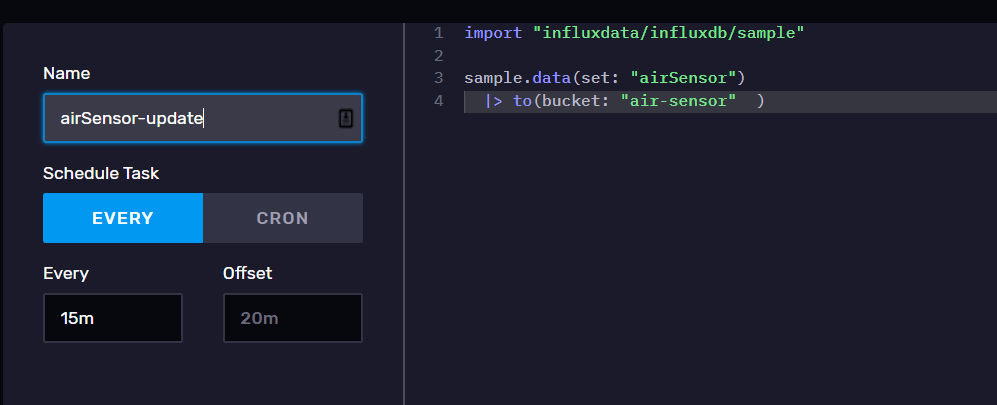
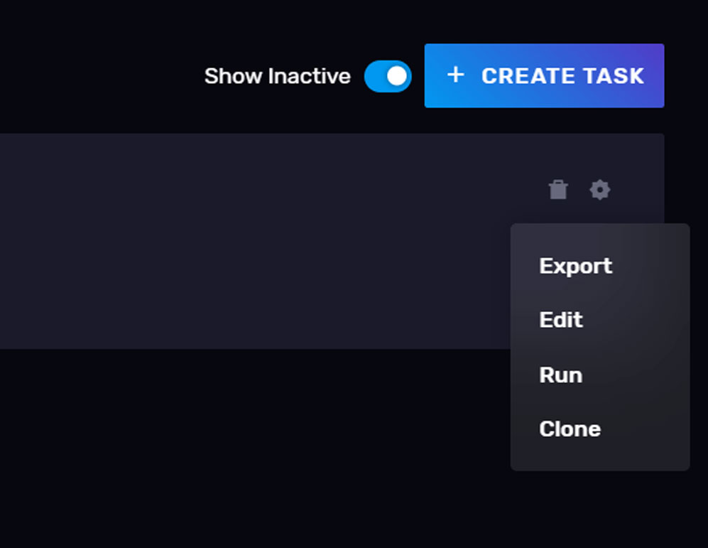
Click save and go back to the tasks dashboard. Click on the wheel icon for the task you just made and click “run” so that it will run right away.
Now go back to the Data Explorer and check out your bucket, you should see data visible now when you submit a query. If you don’t see any data try refreshing your browser and make sure you clicked on the right bucket. If you still don’t see data, try running through the steps again and looking at the documentation to make sure you didn’t miss anything.
Query data from influxDB
Now that you have data being stored, it’s time to learn how you can query that data. The easiest way to get started is using the Data Explorer. You can visually modify queries in the UI and see how the charts change based on those changes.
Under the hood, the Data Explorer uses Flux, the query language used for getting data from InfluxDB. Flux was designed from the ground up for working with time series data and includes many built-in functions for common time series use cases. The syntax is very similar to JavaScript and isn’t hard to pick up. By clicking on the script editor tab in the Data Explorer, you can see the actual Flux query that the Data Explorer UI used to get the data. This type of iteration is probably the fastest way to pick up Flux. For a full introduction and overview of what Flux can do, check out the documentation.
In general, a Flux query will have 4 key pieces:
- Source: The specific bucket you are pulling data from.
- Filter: Rarely do you want all the data in your bucket, so you will use the filter function to select data from a certain time frame and maybe only a few field values.
- Shape: At this stage you might want to modify how the data is formatted for further processing. This can include pivoting columns into rows, dropping columns, or grouping keys together.
- Process: The final stage is processing the data. Some examples of this are aggregating the rows, selecting a specific data point like a minimum or maximum, using the map function to rewrite each row value, or analyzing the data and sending an alert to an external API endpoint.
An example of that structure:
from(bucket: "example-bucket")            // ?? Source
  |> range(start: -1d)                    // ?? Filter on time
  |> filter(fn: (r) => r._field == "foo") // ?? Filter on column values
  |> group(columns: ["sensorID"])         // ?? Shape
  |> mean()                               // ?? Process
Visualize data with Nivo
Now it’s time to put everything together and query InfluxDB using the client library and then display that data using Nivo. The first thing you need to do is create the chart component that we will then import into the App.js file.
Here’s the code for our chart component. I’ll walk through what is going on below:
import React, { useState, useEffect } from "react";
import { InfluxDB } from "@influxdata/influxdb-client";
import { ResponsiveLine } from "@nivo/line";

const token =  "YOUR-TOKEN";
const org = "org-name";
const bucket = "bucket-name";
const url = "INFLUX-DB-URL";

let query = `from(bucket: "air-sensor")
  |> range(start: -1h)
  |> filter(fn: (r) => r["_measurement"] == "airSensors")
  |> filter(fn: (r) => r["_field"] == "co")
  |> aggregateWindow(every: 5m, fn: mean, createEmpty: false)
  |> yield(name: "mean")`;

export const InfluxChart = () => {
  const [data, setData] = useState([]);

  useEffect(() => {
    let res = [];
    const influxQuery = async () => {
      //create InfluxDB client
      const queryApi = await new InfluxDB({ url, token }).getQueryApi(org);
      //make query
      await queryApi.queryRows(query, {
        next(row, tableMeta) {

          const o = tableMeta.toObject(row);
         //push rows from query into an array object
          res.push(o);
        },
        complete() {

          let finalData = []

          //variable is used to track if the current ID already has a key
          var exists = false

          //nested for loops aren't ideal, this could be optimized but gets the job done
          for(let i = 0; i < res.length; i++) {
            for(let j =0; j < finalData.length; j++) {
              //check if the sensor ID is already in the array, if true we want to add the current data point to the array
              if(res[i]['sensor_id'] === finalData[j]['id']) {
                exists = true

                let point = {}
                point["x"] = res[i]["_time"];
                point["y"] = res[i]["_value"];
                finalData[j]["data"].push(point)
              }

            }
             //if the ID does not exist, create the key and append first data point to array
              if(!exists) {
                let d = {}
              d["id"] = res[i]["sensor_id"];
              d['data'] = []
              let point = {}
              point["x"] = res[i]["_time"];
              point["y"] = res[i]["_value"];
              d['data'].push(point)
              finalData.push(d)
              }
              //need to set this back to false
              exists = false

          }

          setData(finalData);

        },
        error(error) {
          console.log("query failed- ", error);
        }
      });

    };

    influxQuery();
  }, []);

  return (
  <ResponsiveLine
  data={data}
   />
  )
};
Here’s what is going on in this file:
- At the top are the imports we need from ReactJS to fetch the data from InfluxDB using the useEffect hook and then storing it in state. We also import the InfluxDB client and the Responsive line chart component from Nivo. Next are the constants needed for connecting to InfluxDB. You should probably store these as environment variables.
- Below that is the Flux query we will be using. The query grabs the latest hour worth of data, grabs the airSensor measurement, filters the data to grab only the Carbon Monoxide data, then takes the 5-minute average of that data
- The chart component is fairly complicated, so I added inline comments if you want to know what is happening at each step. In short, the useEffect hook runs when the component renders on the page and queries InfluxDB. The data is transformed to fit the Nivo chart data format in the
completefunction. The setData hook is used to store the transformed data into our React state which is passed to the Nivo line chart component. Put someconsole.logstatements into the code at various places to see how the data is moving through the component if you are confused.
The App.js file is simple in comparison. We just import the chart component we made. The key thing here is to make sure the parent element has a height and width set. The Nivo responsive components inherit from the parent element. If there is no height set, it won’t render.
import "./styles.css";
import { InfluxChart } from "./Influx";

export default function App() {
  return (
    <div className="App">
      <InfluxChart />
    </div>
  );
}
And here’s the end result:
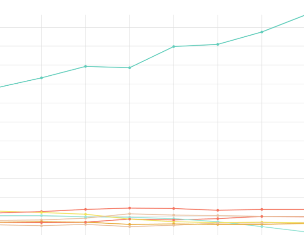
Feel free to play around with the chart axis, colors, and other styling options.
Some other chart types that Nivo provides that would work well for time series data are the heatmap, calendar, and map charts.
Adding features to your project
So now you’ve got a pretty basic chart that is pulling data from InfluxDB, what’s next? There are tons of cool ways you can extend this demo or things you can do with other datasets by taking advantage of some features provided by InfluxDB.
For example, you can make your Nivo charts real-time by setting a hook to update state every few minutes by querying InfluxDB again. Nivo charts are animated and will render the new data when the data prop is updated. You could also use the SQL companion data for the air sensor dataset to enrich the data you are pulling in. Flux provides the ability to query external data sources and combine it with your data stored in InfluxDB. In this case you could query a relational database to get more information about each piece of data. This data would be returned with your Flux query and could be added to your Nivo charts.
For the air sensor dataset specifically you can create an alert that triggers an action based on the data. For example, if carbon monoxide levels hit a certain threshold you can use a webhook alert and send an API request to something like Twilio that would alert people via SMS. If you have a temperature sensor you could dynamically adjust a smart thermostat at home to save yourself money.
The key takeaway is that once your data is inside InfluxDB, you can now take action on that data. You can automate tasks, monitor things, and visualize your data.
Additional resources
Hopefully after going through this tutorial you’ve got a solid understanding of both Nivo and InfluxDB. This project was built with the idea of being extensible so you can build something cool to show off. At the same time this is just a starting point, so here are some additional resources you can check out to learn more:
- InfluxDB Cloud documentation
- Nivo Docs
- InfluxDB Webinars and events
- InfluxDB IoT Center - A more advanced application built using InfluxDB client libraries
It’s also a good idea to “clean up” after this tutorial. Make sure that you either delete or deactivate your API keys if you won’t be checking your account regularly. It’s also a good idea to kill the air sensor data task so that you aren’t downloading and storing data you don’t need.
