Data Visualizations with InfluxDB: Integrating plotly.js
By
Zoe Steinkamp
updated December 14, 2025
Product
Use Cases
Developer
Navigate to:
One of the great features of the InfluxData cloud platform is that it comes out of the box with all the tools you need to quickly read and write your data to the database. Here, we’ll walk through creating data visualizations with InfluxDB and plotly.js, a JavaScript graphing library built on top of d3.js and stack.gl. (If you’re instead looking for a tutorial on visualizing time series data with Chart.js and InfluxDB, click the link.)
Getting started
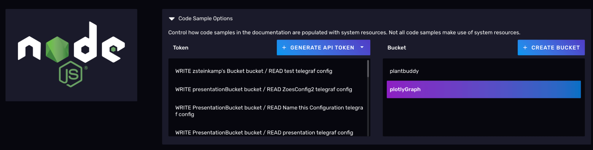
Before we start visualizing, we need to set up an instance of InfluxDB on our local machines. When you create your account on Influx you will want to create a bucket you can store your time series data inside and pull from. When you have your bucket you can go to the /client-libraries/javascript-node page and you can grab a token that is valid to read and write your bucket. You will also find examples on how to install, setup, and query on this page.
Querying data from InfluxDB
When you start your project you will want to run these commands, this will initialize the node project, install the influx client and install express.
npm init -y influx-node-app
npm i @influxdata/influxdb-client
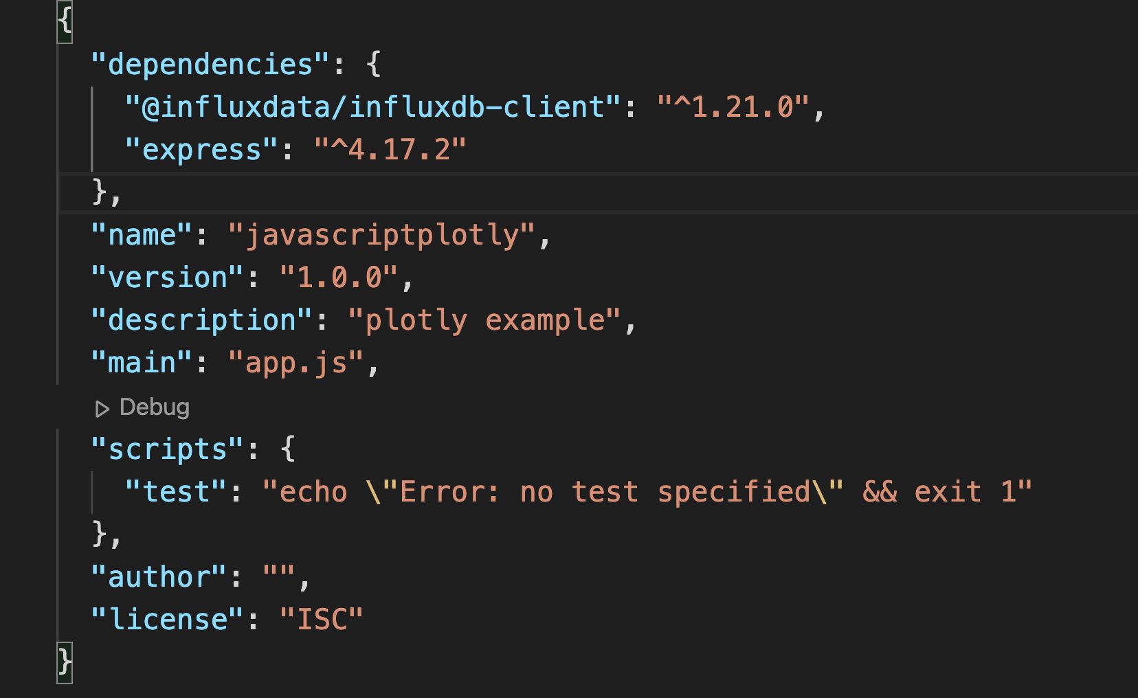
npm install express --saveOnce you’re all set up, and InfluxDB is running, you can set up a file to query the database and grab some data. I’m going to do this with Node/Express using the influx-js client library. For this example, I’ll be querying for data that Telegraf is already collecting for my computer. If you have the Telegraf installed and running, you should be able to do the same. I would expect your package.json file to look like this, keeping in mind i have my main file as app.js:
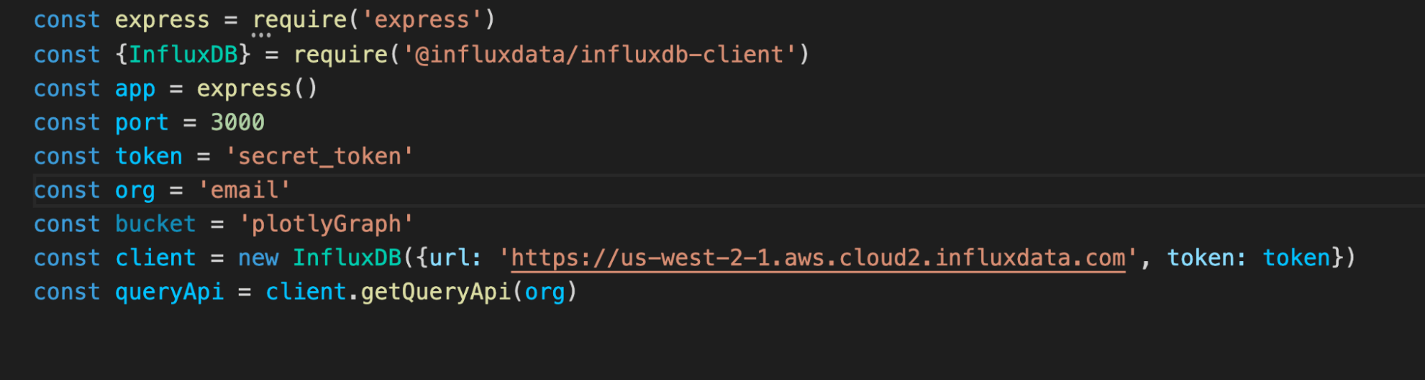
In my app.js file, I have the following. As you can see you will need to add your org email and your secret token, it will need to be added to a token file that you don’t push up to GitHub publicly. Also pay attention to what your influx url is, mine is set to us-west:
Finally in the rest of my app.js file:
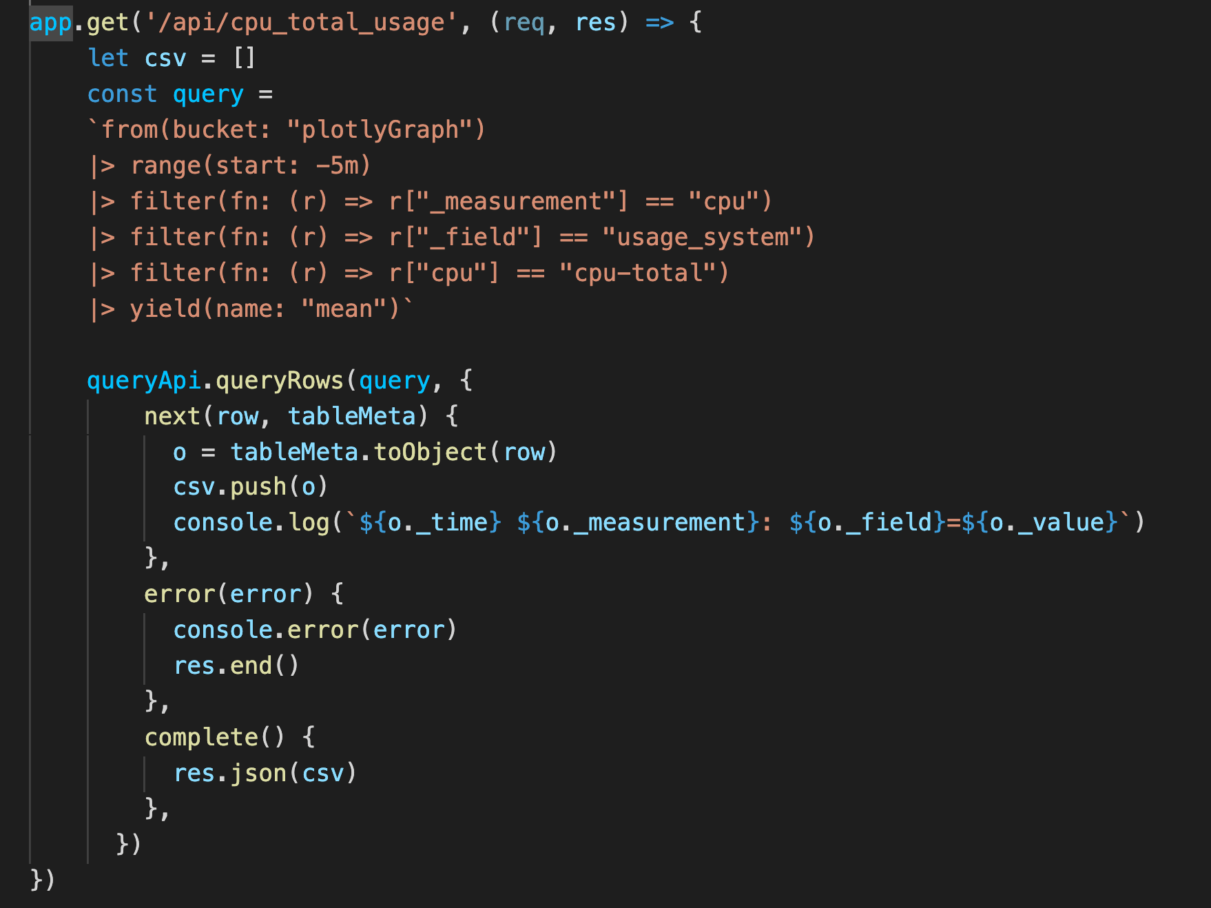
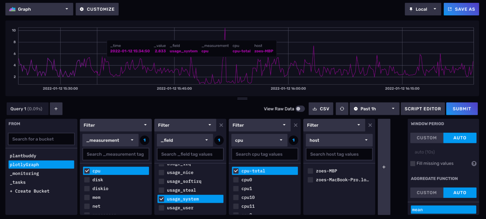
This is my app.get function to grab my cpu total usage. I am using a flux query with a few filter functions to get the exact data I’m looking to display. I am filtering down with my flux query because it is easier to filter the data coming in then do filter in our application. My flux query was built using the query builder in the InfluxDB Cloud. This made it easy to build my simple query and then by switching to script editor I could copy the flux script.
From there, the data is called into our script.js file.
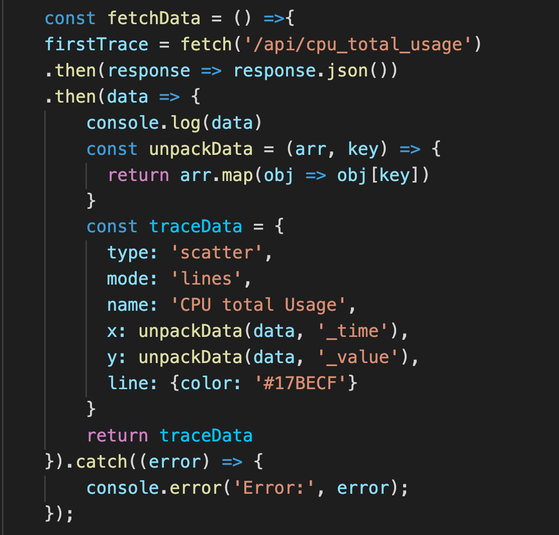
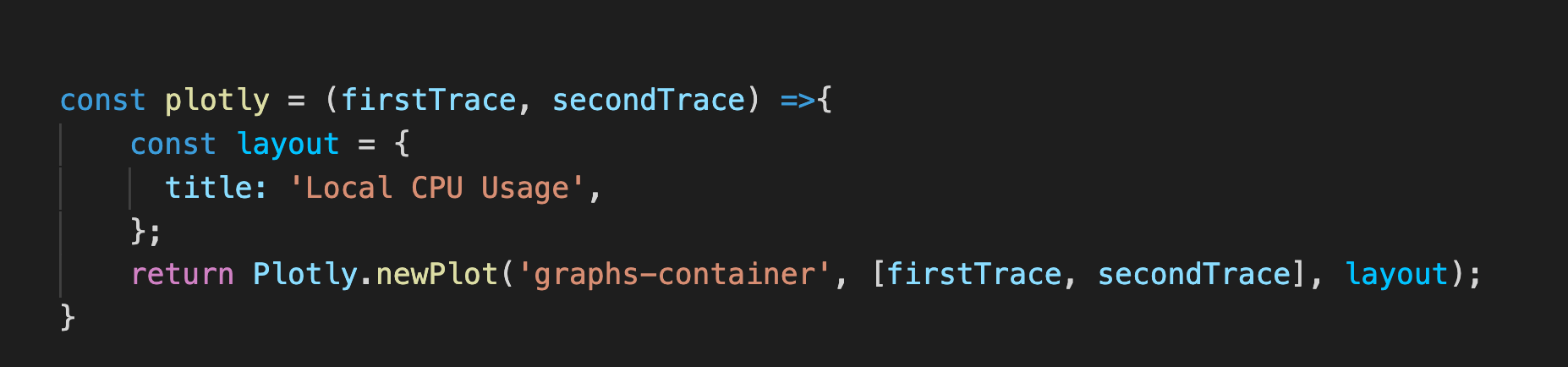
Here I have two fetch functions that call for two specific data sources with two separate Flux queries. We unpack the data and specifically we are looking for the time and value to be our x and y lines when graphed. We return trace data which is our graph with an array of x and y variables. Finally once we have received all the data from influx and prepared our graph object we call for Plotly to be graphed.
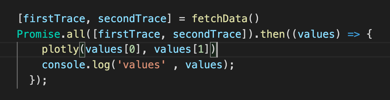
It’s important if you add more fetch data calls that you add them to our promise so it waits to make the Plotly graphs until all the data has been returned. And finally we make our Plotly line graph with two lines.
Setting up HTML and CSS
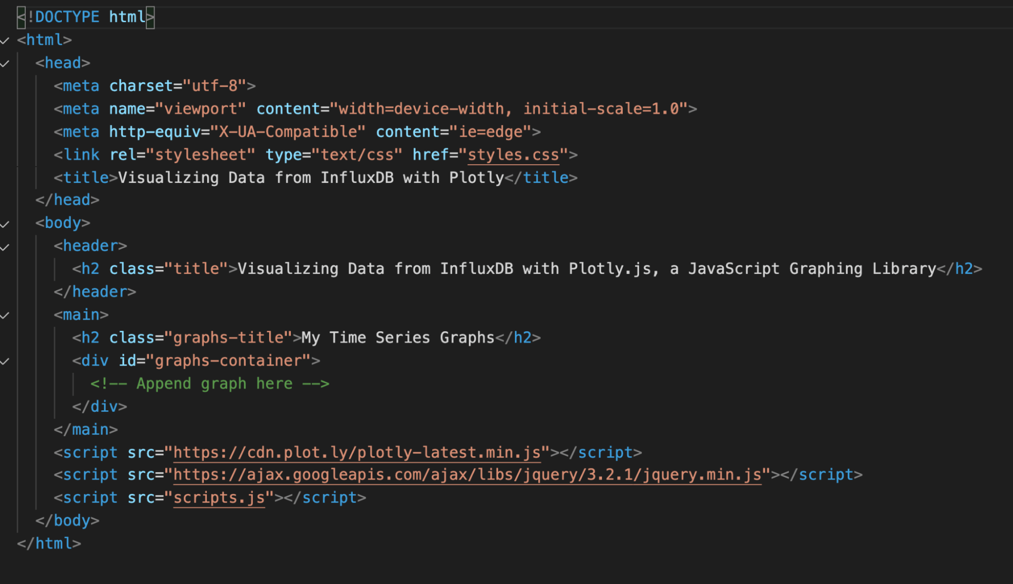
In the public folder directory you will find the index.html, styles.css, and scripts.js file. We will be using these files to display the plotly graphs. In our index.html you will see where we append the graph from script.js:
Aside from incorporating jquery and your script file, you’ll need to incorporate the Plotly CDN. Alternatively, you can install the plotly.js library as an npm module. For more information on that, please visit the “Getting Started” guide on the plotly.js website.
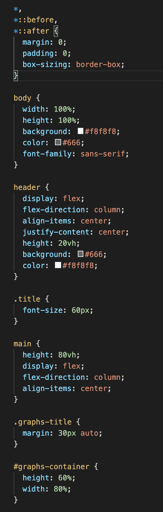
Let’s add the following CSS to our styles.css file for a bit of flair:
If you restart your server at this point and navigate to localhost:3000, you should see something similar to this:
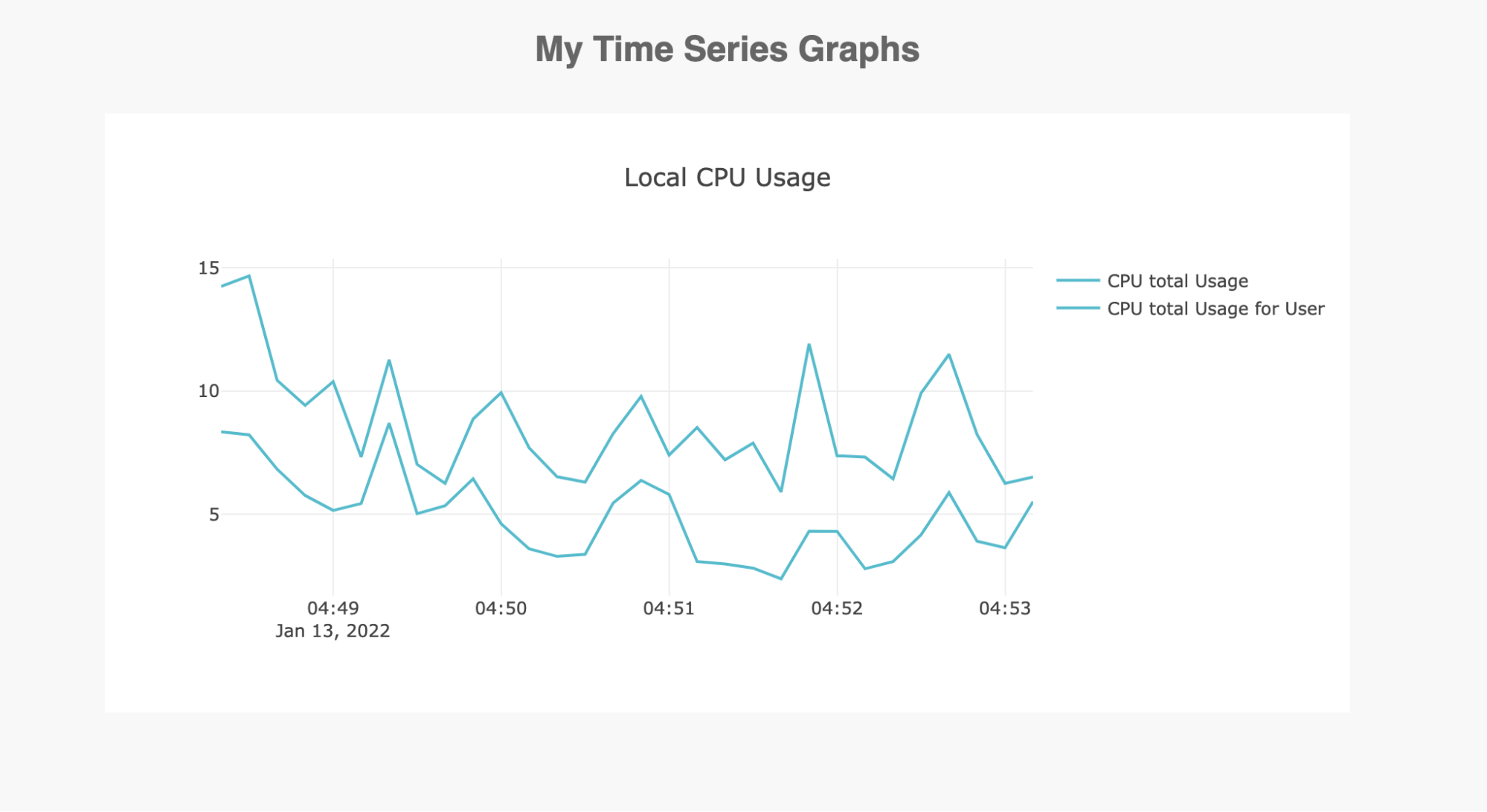
And voila! You’ve got yourself a custom time series visualization, using InfluxDB and plotly.js! You can check out the source code on GitHub or feel free to ping me an email at [email protected].
