Announcing Chronograf 0.3
By
Will Faurot
updated December 14, 2025
Product
Navigate to:
Will from the Chronograf team here! We’ve been hard at work and are excited to introduce our next major feature: dashboards. Also part of this release are major UI/UX improvements, and improvements to the data exploration and query building experience.
What is Chronograf?
If you’re new to Chronograf, it’s a data visualization tool built specifically for InfluxDB. As a team, our goal is to build a product that is feature-rich, but also accessible. A tool for both developers AND non-developers. Using Chronograf should be seamless and intuitive, all the way from initially connecting to your InfluxDB instance to building meaningful visualizations. How quickly we can go from “zero to graphs” is one of our most important metrics.
New in 0.3 - Where We Are Now
Here’s quick rundown of the features we’ll cover:
- Ad-hoc visualizations in Chronograf
- Dashboards!
- Data exploration improvements
Graphs and Dashboards
Early Chronograf development focused on polishing the ad-hoc data exploration and visualization experience via our query builder. As of 0.3 there are two major ‘things’ in Chronograf: graphs and dashboards. Dashboards mainly function as a collection of graphs, but graphs also exist as their own separate entity. Whether you already have a query in mind and want to paste it directly into the query builder, or you want to explore your measurements and tags, Chronograf is still a great choice for these kind of ad-hoc tasks. Simply create a new graph and start building your query:
Graphs being persisted separately from dashboards also gives you the ability to easily add a single graph to multiple dashboards.
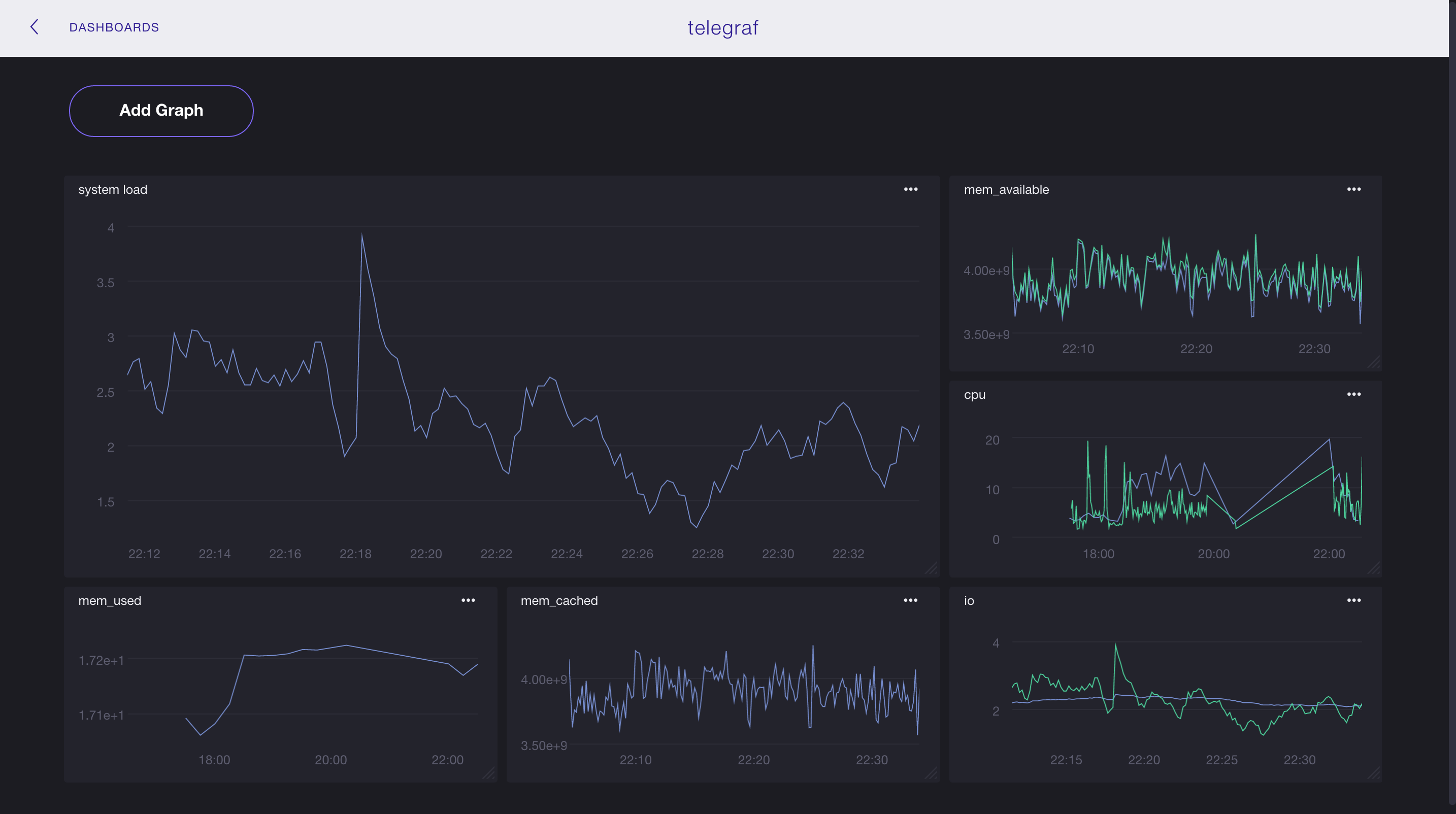
Dashboards, Dashboards Everywhere
We’re eager to get the first version of Chronograf dashboards out there so we can continue to build on user feedback and make improvements. Here’s a quick tour:
Note: In these examples, I'm building a dashboard for system metrics using data gathered by Telegraf, a plugin-driven server agent for reporting metrics into InfluxDB.
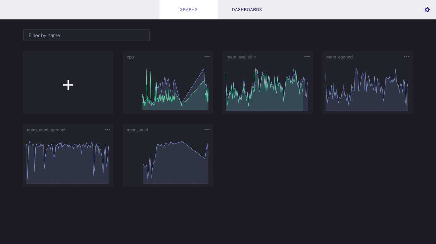
Here we’re creating a new dashboard and adding graphs. You have the option to select from pre-existing graphs or create a new one:
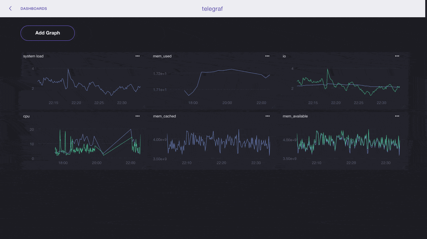
Dashboard layout is fully customizable:
Improvements in Data Exploration
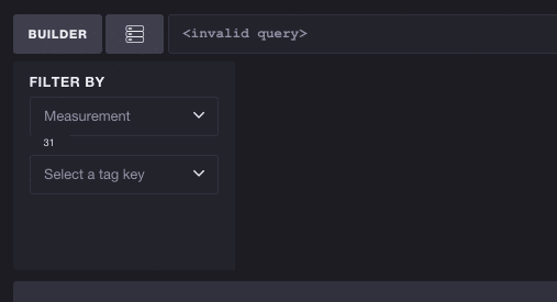
The larger your datasets become, the more important it becomes to have effective tools to navigate and explore your measurements and tags. Chronograf’s query builder is smart: selecting a measurement will mean only tags linked to that measurement will be available to choose, and vice versa.
In this example I start with 30+ Telegraf measurements, only some of which are recording cpu usage. Selecting the tag key cpu filters the list of measurements to only include CPU-based metrics:
What's next?
That’s it for 0.3! Here are a few additional features already in the pipeline for future releases:
- Templating
- Cloud integration - download pre-built dashboards and upload your own dashboards
- Different types of graphs (e.g. line graphs, histograms, etc.)
- New kinds of visualizations (e.g. counters)
Want to try it out? Chronograf is free to use, and without user or per server limits. You can download Chronograf here. We’re still in active development and are eager to hear what you think! Contact the team at [email protected].
