Autocorrelation in Time Series Data
By
Anais Dotis-Georgiou
updated December 14, 2025
Product
Use Cases
Developer
Navigate to:
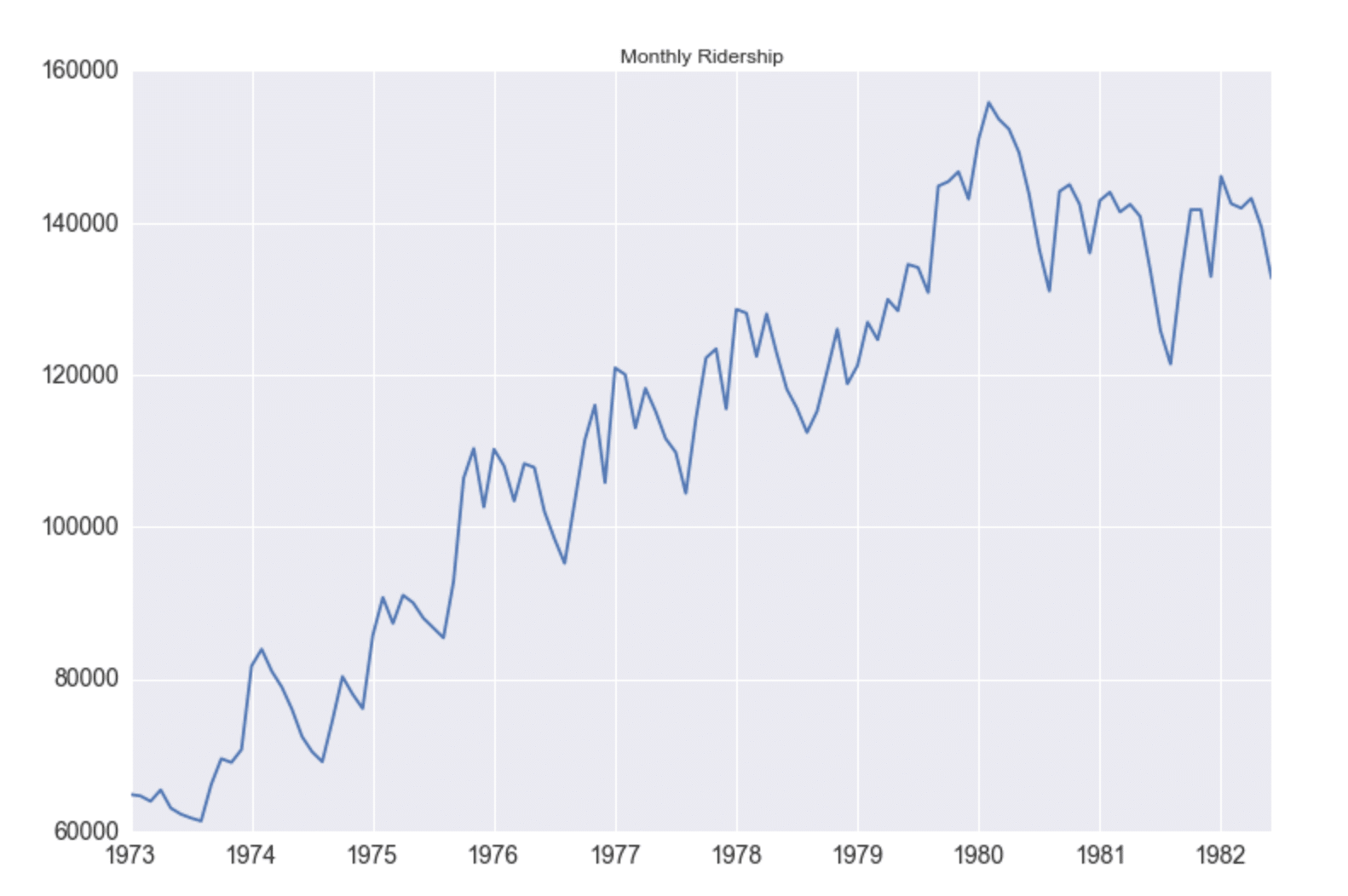
A time series, as the name suggests, is a series of data points that are listed in chronological order. More often than not, time series are used to track the changes of certain things over short and long periods – with the price of stocks or even other commodities being a prime example. Regardless, you’re taking a closer look at how something changes at regular intervals over time – which is important when attempting to use the past to forecast the future.
Why time series analysis is important
If you can see exactly how the price of a security has changed over time, for example, you can make a more educated guess about what might happen to the price over the same interval in the future. This can lead to better and more informed decision making, which is what makes time series analysis so important to so many sectors.
Why time series data is unique
A time series is a series of data points indexed in time. The fact that time series data is ordered makes it unique in the data space because it often displays serial dependence. Serial dependence occurs when the value of a datapoint at one time is statistically dependent on another datapoint in another time. However, this attribute of time series data violates one of the fundamental assumptions of many statistical analyses that data is statistically independent.
What is autocorrelation in time series?
The term autocorrelation refers to the degree of similarity between A) a given time series, and B) a lagged version of itself, over C) successive time intervals. In other words, autocorrelation is intended to measure the relationship between a variable’s present value and any past values that you may have access to.
Therefore, a time series autocorrelation attempts to measure the current values of a variable against the historical data of that variable. It ultimately plots one series over the other, and determines the degree of similarity between the two.
For the sake of comparison, autocorrelation is essentially the exact same process that you would go through when calculating the correlation between two different sets of time series values on your own. The major difference here is that autocorrelation uses the same time series two times: once in its original values, and then again once a few different time periods have occurred.
Autocorrelation is also known as serial correlation, time series correlation and lagged correlation. Regardless of how it’s being used, autocorrelation is an ideal method for uncovering trends and patterns in time series data that would have otherwise gone undiscovered.
Autocorrelation examples
It’s important to note that autocorrelation in time series data is that not all fields use this technique in exactly the same way. It’s nothing if not malleable – meaning that the simple principle of comparing data with a delayed copy of itself is equally valuable in a wide array of contexts. Likewise, not all of the applications of autocorrelation in various fields are equivalent – meaning that they’re using a simple process to arrive at a totally different end result.
Example 1: Regression analysis
One prominent example of how autocorrelation is commonly used takes the form of regression analysis using time series data. Here, professionals will typically use a standard auto regressive model, a moving average model or a combination that is referred to as an auto regressive integrated moving average model, or ARIMA for short.
Example 2: Scientific applications of autocorrelation
Autocorrelation is also used quite frequently in terms of fluorescence correlation spectroscopy, which is a critical part of understanding molecular-level diffusion and chemical reactions in certain scientific environments.
Example 3: Global positioning systems
Autocorrelation is also one of the primary mathematical techniques at the heart of the GPS chip that is embedded in smartphones or other mobile devices. Here, autocorrelation is used to correct for propagation delay meaning the time shift that happens when a carrier signal is transmitted and before it is ultimately received by the GPS device in question. This is how the GPS always knows exactly where you are and tells you when and where to turn just before you arrive at that precise location.
Example 4: Signal processing
Autocorrelation is also a very important technique in signal processing, which is a part of electrical engineering that focuses on understanding more about (and even modifying or synthesizing) signals like sound, images and sometimes scientific measurements. In this context, autocorrelation can help people better understand repeating events like musical beats which itself is important for determining the proper tempo of a song. Many also use it to estimate a very specific pitch in a musical tone, too.
Example 5: Astrophysics
Astrophysics is that branch of astronomy that takes our known principles of both physics and chemistry and applies them in a way that helps us better understand the nature of objects in outer space, rather than simply remaining satisfied with knowing their relative position or how they’re moving. This is another important way in which autocorrelation is used, as it helps professionals study the spatial distribution between celestial bodies in the universe like galaxies. It can also be helpful when making multi-wavelength observations of low mass x-ray binaries, too.
Why autocorrelation matters
Often, one of the first steps in any data analysis is performing regression analysis. However, one of the assumptions of regression analysis is that the data has no autocorrelation. This can be frustrating because if you try to do a regression analysis on data with autocorrelation, then your analysis will be misleading.
Additionally, some time series forecasting methods (specifically regression modeling) rely on the assumption that there isn’t any autocorrelation in the residuals (the difference between the fitted model and the data). People often use the residuals to assess whether their model is a good fit while ignoring that assumption that the residuals have no autocorrelation (or that the errors are independent and identically distributed or i.i.d). This mistake can mislead people into believing that their model is a good fit when in fact it isn’t. I highly recommend reading this article about How (not) to use Machine Learning for time series forecasting: Avoiding the pitfalls in which the author demonstrates how the increasingly popular LSTM (Long Short Term Memory) Network can appear to be an excellent univariate time series predictor, when in reality it’s just overfitting the data. He goes further to explain how this misconception is the result of accuracy metrics failing due to the presence of autocorrelation.
Finally, perhaps the most compelling aspect of autocorrelation analysis is how it can help us uncover hidden patterns in our data and help us select the correct forecasting methods. Specifically, we can use it to help identify seasonality and trend in our time series data. Additionally, analyzing the autocorrelation function (ACF) and partial autocorrelation function (PACF) in conjunction is necessary for selecting the appropriate ARIMA model for your time series prediction.
Testing for autocorrelation
Any autocorrelation that may be present in time series data is determined using a correlogram, also known as an ACF plot. This is used to help you determine whether your series of numbers is exhibiting autocorrelation at all, at which point you can then begin to better understand the pattern that the values in the series may be predicting.
The most common autocorrelation test is called the Durbin-Watson test, which was named after James Durbin and Geoffrey Watson and was derived back in the early 1950s.
Autocorrelation statistics and test
Also commonly referred to as the Durbin-Watson statistic, this test is used to detect the presence of autocorrelation at a lag of one in any prediction errors uncovered from a regression analysis. The precise calculation used to conduct this test can be found here.
Once you have successfully plugged your numbers into the Durbin-Watson test, it reports a statistic on a value of 0 to 4. If the value returned is 2, there is no autocorrelation in your time series to speak of. If the value is between 0 and 2, you’re seeing what is known as positive autocorrelation - something that is very common in time series data. If the value is anywhere between 2 and 4, that means there is a negative correlation something that is less common in time series data, but that does occur under certain circumstances.
How to determine if your time series data has autocorrelation
For this exercise, I’m using InfluxDB and the InfluxDB Python CL. I am using available data from the National Oceanic and Atmospheric Administration’s (NOAA) Center for Operational Oceanographic Products and Services. Specifically, I will be looking at the water levels and water temperatures of a river in Santa Monica.
Dataset:
curl https://s3.amazonaws.com/noaa.water-database/NOAA_data.txt -o NOAA_data.txt
influx -import -path=NOAA_data.txt -precision=s -database=NOAA_water_database
This analysis and code is included in a jupyter notebook in this repo.
First, I import all of my dependencies.
import pandas as pd
import numpy as np
import matplotlib
import matplotlib.pyplot as plt
from influxdb import InfluxDBClient
from statsmodels.graphics.tsaplots import plot_pacf
from statsmodels.graphics.tsaplots import plot_acf
from scipy.stats import linregress
Next I connect to the client, query my water temperature data, and plot it.
client = InfluxDBClient(host='localhost', port=8086)
h2O = client.query('SELECT mean("degrees") AS "h2O_temp" FROM "NOAA_water_database"."autogen"."h2o_temperature"  GROUP BY time(12h) LIMIT 60')
h2O_points = [p for p in h2O.get_points()]
h2O_df = pd.DataFrame(h2O_points)
h2O_df['time_step'] = range(0,len(h2O_df['time']))
h2O_df.plot(kind='line',x='time_step',y='h2O_temp')
plt.show()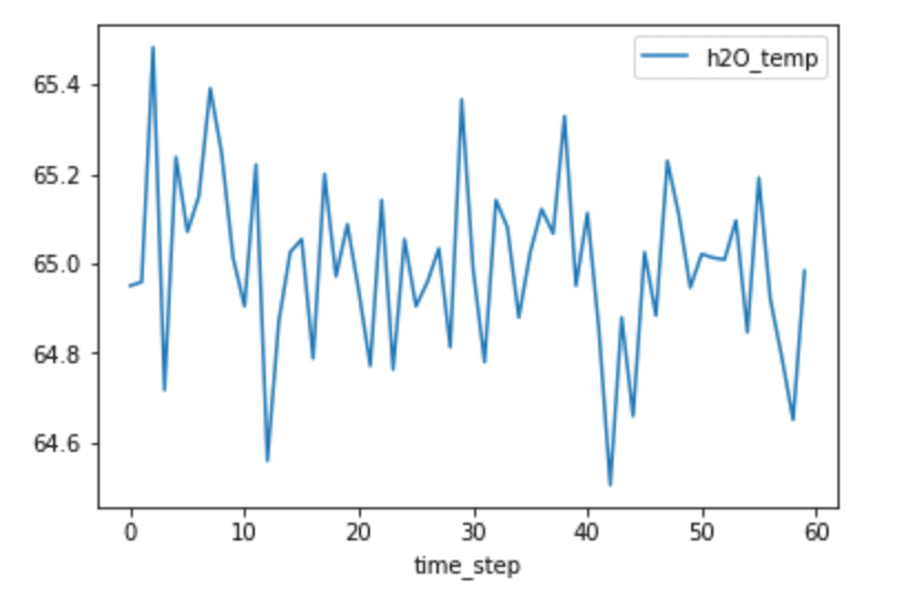
From looking at the plot above, it’s not obviously apparent whether or not our data will have any autocorrelation. For example, I can’t detect the presence of seasonality, which would yield high autocorrelation.
I can calculate the autocorrelation with Pandas.Sereis.autocorr() function which returns the value of the Pearson correlation coefficient. The Pearson correlation coefficient is a measure of the linear correlation between two variables. The Pearson correlation coefficient has a value between -1 and 1, where 0 is no linear correlation, >0 is a positive correlation, and <0 is a negative correlation. Positive correlation is when two variables change in tandem while a negative correlation coefficient means that the variables change inversely. I compare the data with a lag=1 (or data(t) vs. data(t-1)) and a lag=2 (or data(t) vs. data(t-2).
shift_1 = h2O_df['h2O_temp'].autocorr(lag=1)
print(shift_1)
-0.07205847740103073
0.17849760131784975
These values are very close to 0, which indicates that there is little to no correlation. However, calculating individual autocorrelation values might not tell the whole story. There might not be any correlation at lag=1, but maybe there is a correlation at lag=15. It’s a good idea to make an autocorrelation plot to compare the values of the autocorrelation function (AFC) against different lag sizes. It’s also important to note that the AFC becomes more unreliable as you increase your lag value. This is because you will compare fewer and fewer observations as you increase the lag value. A general guideline is that the total number of observations (T) should be at least 50, and the greatest lag value (k) should be less than or equal to T/k. Since I have a total of 60 observations, I will only consider the first 20 values of the AFC.
plot_acf(h2O_df['h2O_temp'], lags=20)
plt.show()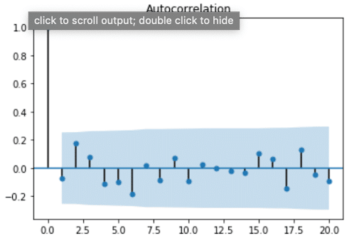
From this plot, we see that values for the ACF are within 95% confidence interval (represented by the solid gray line) for lags > 0, which verifies that our data doesn’t have any autocorrelation. At first, I found this result surprising, because usually the air temperature on one day is highly correlated with the temperature the day before. I assumed the same would be true about water temperature. This result reminded me that streams and rivers don’t have the same system behavior as air. I’m no hydrologist, but I know spring fed streams or snowmelt can often be the same temperature year-round. Perhaps they exhibit a stationary temperature profile day to day where the mean, variance, and autocorrelation are all constant (where autocorrelation is = 0).
Uncovering seasonality with autocorrelation in time series data
The ACF can also be used to uncover and verify seasonality in time series data. Let’s take a look at the water levels from the same dataset.
client = InfluxDBClient(host='localhost', port=8086)
h2O_level = client.query('SELECT "water_level" FROM "NOAA_water_database"."autogen"."h2o_feet" WHERE "location"=\'santa_monica\' AND time >= \'2015-08-22 22:12:00\' AND time <= \'2015-08-28 03:00:00\'')
h2O_level_points = [p for p in h2O_level.get_points()]
h2O_level_df = pd.DataFrame(h2O_level_points)
h2O_level_df['time_step'] = range(0,len(h2O_level_df['time']))
h2O_level_df.plot(kind='line',x='time_step',y='water_level')
plt.show()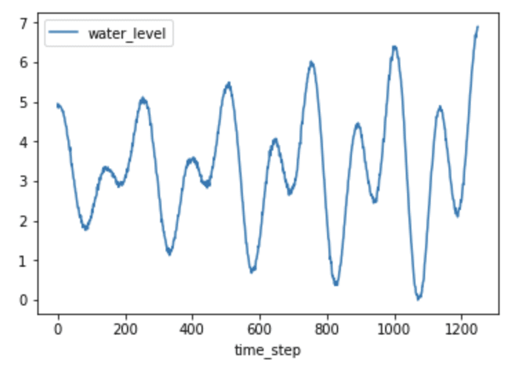
Just by plotting the data, it’s fairly obvious that seasonality probably exists, evident by the predictable pattern in the data. Let’s verify this assumption by plotting the ACF.
plot_acf(h2O_level_df['water_level'], lags=400)
plt.show()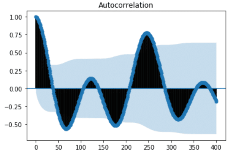
From the ACF plot above, we can see that our seasonal period consists of roughly 246 timesteps (where the ACF has the second largest positive peak). While it was easily apparent from plotting time series in Figure 3 that the water level data has seasonality, that isn’t always the case. In Seasonal ARIMA with Python, author Sean Abu shows how he must add a seasonal component to his ARIMA method in order to account for seasonality in his dataset. I appreciated his dataset selection because I can’t detect any autocorrelation in the following figure. It’s a great example of how using ACF can help uncover hidden trends in the data.
Examining trend with autocorrelation in time series data
In order to take a look at the trend of time series data, we first need to remove the seasonality. Lagged differencing is a simple transformation method that can be used to remove the seasonal component of the series. A lagged difference is defined by:
difference(t) = observation(t) - observation(t-interval)2,
where interval is the period. To calculate the lagged difference in the water level data, I used the following function:
def difference(dataset, interval):
    diff = list()
    for i in range(interval, len(dataset)):
        value = dataset[i] - dataset[i - interval]
        diff.append(value)
    return pd.DataFrame(diff, columns = ["water_level_diff"])
h2O_level_diff = difference(h2O_level_df['water_level'], 246)
h2O_level_diff['time_step'] = range(0,len(h2O_level_diff['water_level_diff']))
h2O_level_diff.plot(kind='line',x='time_step',y='water_level_diff')
plt.show()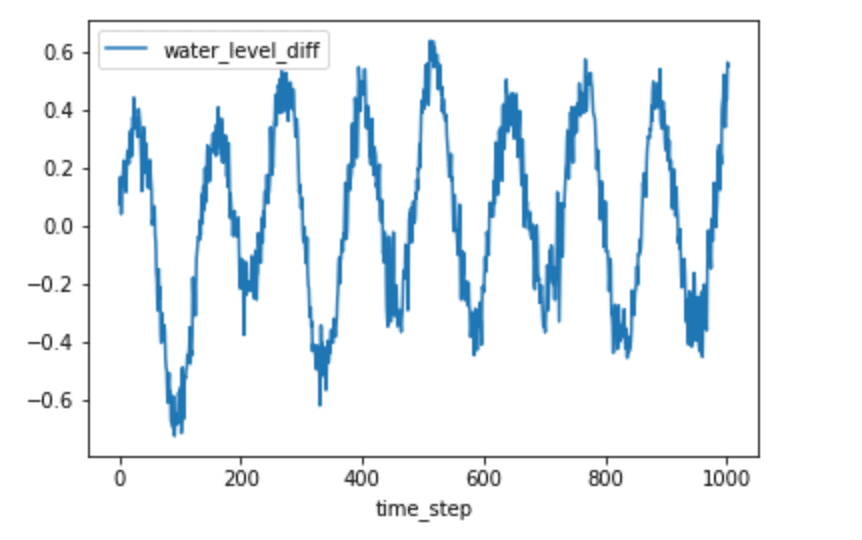
We can now plot the ACF again.
plot_acf(h2O_level_diff['water_level_diff'], lags=300)
plt.show()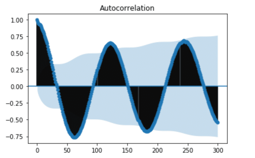
It might seem that we still have seasonality in our lagged difference. However, if we pay attention to the y-axis in Figure 5, we can see that the range is very small and all the values are close to 0. This informs us that we successfully removed the seasonality, but there is a polynomial trend. I used seasonal_decompose to verify this.
from statsmodels.tsa.seasonal import seasonal_decompose
from matplotlib import pyplot
result = seasonal_decompose(h2O['water_level'], model='additive', freq=250)
result.plot()
pyplot.show()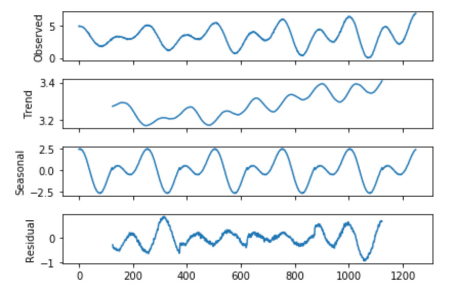
Conclusion
Autocorrelation is important because it can help us uncover patterns in our data, successfully select the best prediction model, correctly evaluate the effectiveness of our model. I hope this introduction to autocorrelation is useful to you. If you have any questions, please post them on the community site or tweet us @InfluxDB. As always, here is a brain break:

References
- Time Series Analysis and Forecasting by Example, Søren Bisgaard and Murat Kulachi
- How to Remove Trends and Seasonality with a Difference Transform in Python
Resources
- Season ARIMA with Python: Time Series Forecasting
- Time Series in Python Part 2: Dealing with seasonal data
- How to Decompose Time Series Data into Trend and Seasonality
- How (not) to use Machine Learning for time series forecasting: Avoiding the pitfalls
- A Gentle Introduction to Autocorrelation and Partial Autocorrelation
- Time Series Concepts
- Stationarity
- Time Series Forecast Case Study with Python: Monthly Armed Robberies in Boston
- How to Create an ARIMA model for Time Series Forecasting in Python
- Interpret the partial autocorrelation function (PACF)
- Assumptions of Linear Regression
