COVID-19 Tracking Using Telegraf and InfluxDB Dashboards
By
Community /
Product, Use Cases, Developer
Aug 10, 2021
Navigate to:
This article was written by InfluxData Summer 2021 interns Bar Weiner, Sara Ghodsi, Brandii Warden, Alex Krantz and Beth Legesse.
For this year’s annual intern hackathon event, we decided to model and monitor real time series COVID-19 data from across the country. As new variants are being discovered and spreading at alarming rates across all 50 states, COVID-19 is still a significant risk to the public, specifically for unvaccinated individuals or those planning to travel within the United States.
Description of our project
We created a platform that makes critical information surrounding COVID-19 data more accessible, including vaccination rates and the number of positive cases for a given location.
Our initial idea was to create a React application from scratch and use Giraffe to visualize the data on our custom application. However, after a half-day of planning all the features we wanted, laying out our plans, and getting feedback from mentors, we decided it was more realistic and straightforward to use the InfluxDB Cloud free service to query and visualize our data while testing out the new UI offerings.
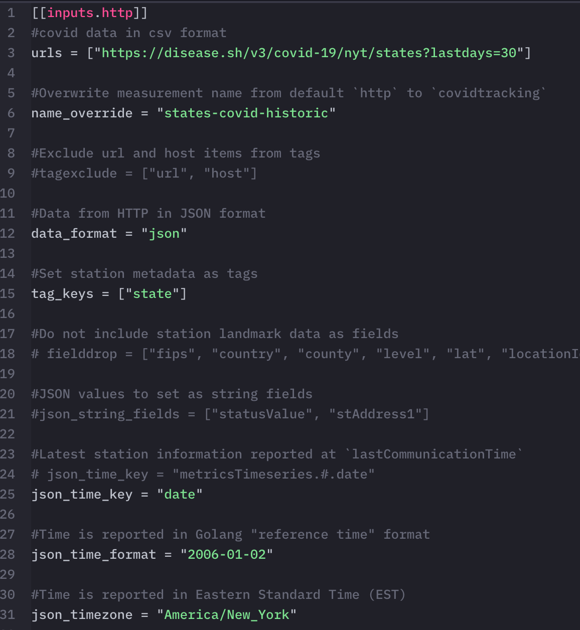
To start our process, we found many different public COVID-19 APIs. Since each one had a unique set of data points, we chose the ones that fit our goals. We then tried to download the JSON or CSV files from the API endpoints with the data we needed and feed them into InfluxDB for analysis and visualization. After struggling with formatting files to fit the Influx specifications, we realized that it would be more efficient and effective to use Telegraf to ingest the data systematically and in a repeatable fashion.
Here is the list of API endpoints we used:
- https://disease.sh/v3/covid-19/jhucsse/counties
- https://disease.sh/v3/covid-19/nyt/states?lastdays=30
- https://disease.sh/v3/covid-19/states
- https://raw.githubusercontent.com/owid/covid-19-data/master/public/data/vaccinations/us_state_vaccinations.csv
What went well
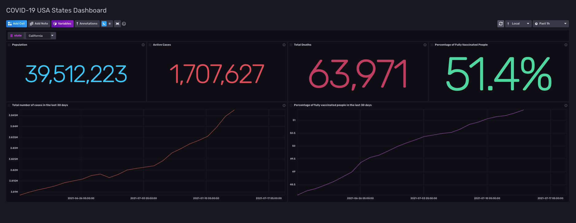
We created three dashboards for our graphs and maps. One had statistics on COVID-19 cases and deaths alongside the percentage of fully vaccinated people. We also included two graphs for total cases and vaccination rates in the last 30 days. There is an option for changing the state as well, which we populated using Variables. If you choose another state from the dropdown, the statistics will change to show appropriate data for the state you selected.
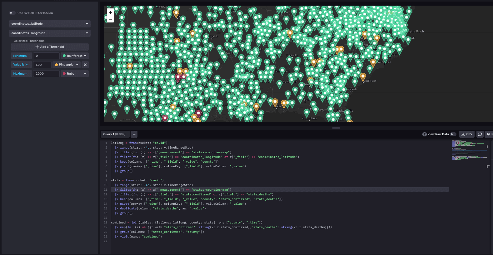
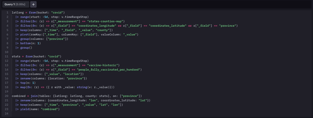
Our second dashboard showed the number of deaths in each county in the United States on a map. We also included the number of confirmed cases in each county. Each point in the map has a threshold that checks if the deaths are high or low and according to that, we set the county’s color to green, yellow, or red. This map is practical for identifying epicenters for the disease across the United States. Counties colored red have more than 2000 reported deaths in them, meaning that COVID-19 was exceedingly prevalent in the area.
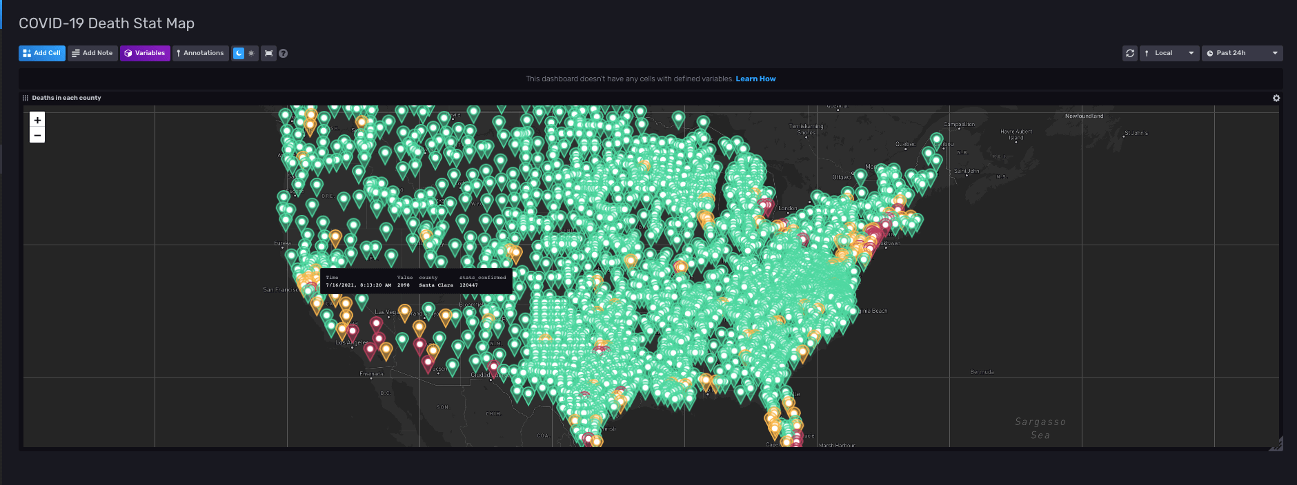
This map had the most complex query out of all of the queries we wrote. In order for the map to show the points, we had to have latitude and longitudes of each county paired with the value of the number of deaths and confirmed cases. We had to use the join function to join multiple data sets to achieve this and line up the data with its corresponding coordinates.
The last dashboard has the vaccination rates of each state showing up on another map. This map also has a threshold setup assigning different colors to each state according to their vaccination rate. If a state had more than 50% of its population fully vaccinated, it shows up green. If the vaccination rate is between 40% and 50%, the state is yellow, and less than 40%, we assign red. This threshold is most useful when a person decides to travel to another state: they can look up that state on the map and see if it is safe to travel or not.
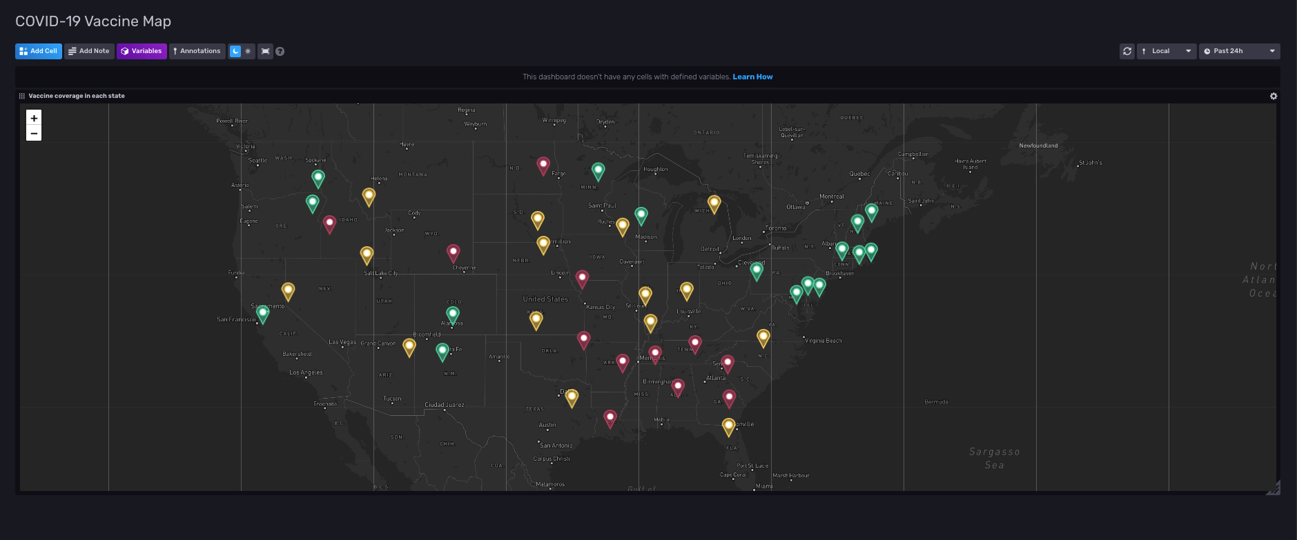
The query for our vaccination map was very similar to the other map. The difference was the data that we accessed in each query.
For pulling the data into our covid bucket, we set up four different Telegraf configurations. Each one serves a unique purpose because we found distinct API endpoints that returned the types of data we wanted to ingest data from. Each dashboard required different configurations and data points, so we needed to find rich data from various API’s to conduct the monitoring and analysis we desired.
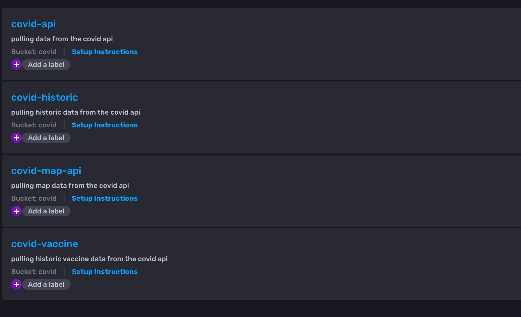
For instance, the covid-historic telegraf pulls data from an API that returns COVID-19 statistics for the last 30 days. We then stored the data in the states-covid-historic measurement and used it in querying for the first graph on the COVID-19 USA States Dashboard.
What went wrong
We had many challenges during our hackathon sprint, but what we did do well was communicate amongst ourselves, realize what we don’t yet know, and ask for help effectively to complete our goals.
When automating Telegraf, we faced cardinality and query write limit issues inherent when using a free Cloud2 account to pull in massive data sets like COVID-19 stats for every county in the US. At one point, we had to research how to lower our cardinality and even delete our bucket along the way: even when we lowered our cardinality usage, our bucket needed a few hours to reset that we could not spare in our tight development process.
We also had trouble getting the data to display, especially in the map format. To do this, we had to take a step back and look at our data, deciding that it would be a better idea to restructure it before we try to write a query on it and feed it into the visualization. With help from mentors, we got closer to this goal, and eventually, we were able to implement it by writing Flux scripts to configure our dashboards and massage our data. For our whole team, it was a really cool experience writing Flux and working across the different product offerings to get a more holistic view of the company and what it does.
Final thoughts
In the future, we would like to keep importing data for the rest of our internship to have a repository of data that we can analyze. Additionally, a few improvements would make the project more complete, such as adding alerting using threshold checks and increasing the bucket retention policy so that we could view historical data since we can only see data going back 30 days. Adding alerting could prove quite helpful as it would allow you to get notified about the current vaccination status of your county or state.
If we repeated this project, we would pre-process our data to make it considerably easier to work with by removing extraneous data and preemptively associating location data with each county or state. Combining the data before importing it would have prevented us from working around irrelevant data in InfluxDB, improving our query times, and hitting the cardinality limit multiple times. It would also simplify our Telegraf configuration drastically as we would not need to work around someone else’s data structure.
Link to our template
We have created a template from our project. You can see it in the community templates repository: https://github.com/influxdata/community-templates/tree/master/covid19-usa-states
