Instrumenting Your Node/Express Application: Viewing Your Data
By
Margo Schaedel
updated December 14, 2025
Product
Use Cases
Developer
Navigate to:
This post is the follow-up to Instrumenting Your Node/Express Application. Here we will begin to explore some of the data that is being stored in InfluxDB and build out a dashboard in Chronograf. If you haven’t had a chance yet to begin instrumenting your Node.js applications, I recommend taking a look at my previous post to provide some context.
When I last left off, we had some data being collected and stored in InfluxDB, as we could see from querying the database:
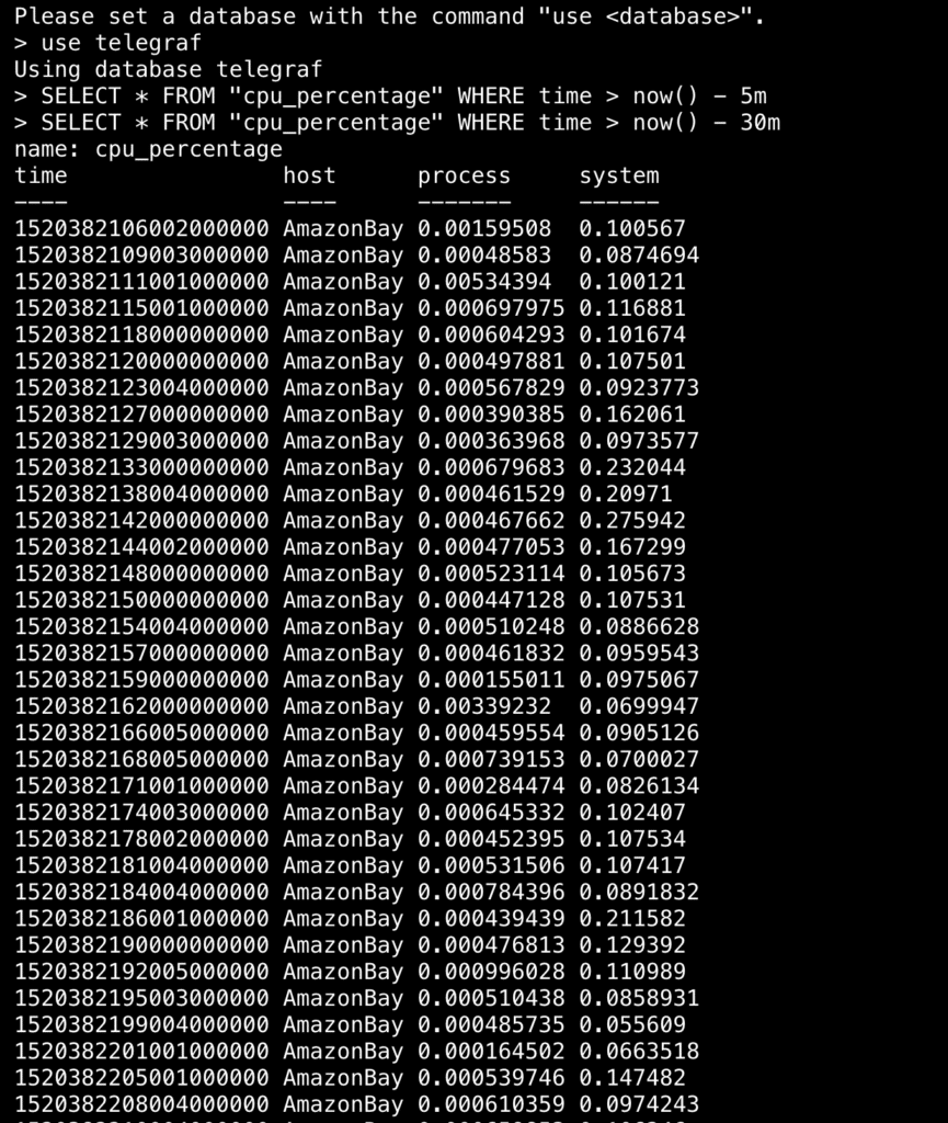 <figcaption> Just some data…</figcaption>
Of course, it’s not entirely helpful just to see rows upon rows of numbers. It would be more sensible to view the data in a graph or table so we can more easily see trends in the data, and better yet to build out a full dashboard, so we can view all relevant data simultaneously. Using Chronograf to visualize our data offers just that. If you haven’t installed Chronograf yet, here’s a nifty guide that will get you up and running with all the different components of the TICK StackTelegraf, InfluxDB, Kapacitor, and Chronograf.
For this section, I’ll be using the instrumented version of the Node.js application, AmazonBay, which you can clone down from GitHub here. It’s using this Node Metrics library to send data via Telegraf into InfluxDB. Once you’ve cloned it down and set everything up, ensure your server is running with node server.js so that Telegraf can start collecting metrics.
Let’s start Chronograf and navigate to our dashboards section, where we can start building out a proper dashboard to gain some insight into the data we’re collecting. You’ll need to create a dashboard first and name it mine is “Instrumented-AmazonBay” for the sake of convenience.
 <figcaption> Let’s create a new dashboard</figcaption>
As we start visualizing, let’s take a moment to consider what metrics we’re collecting and why.
CPU Usage
It’s generally a good idea to keep track of an application’s CPU usage over time. Although Node.js apps typically consume a minimal amount of CPU, having this data on-hand affords visibility into the health of your application, by highlighting instances that deviate from the norm. Having the capability to ascertain what, if any, operations are causing high CPU usage is certainly a step towards understanding the performance of your application.
In the case of AmazonBay, we are monitoring the CPU percentage (a value between 0-1) of our process (the percentage of CPU used by the application) and our system (the percentage of CPU used by the system as a whole). We can chart both as seen below:
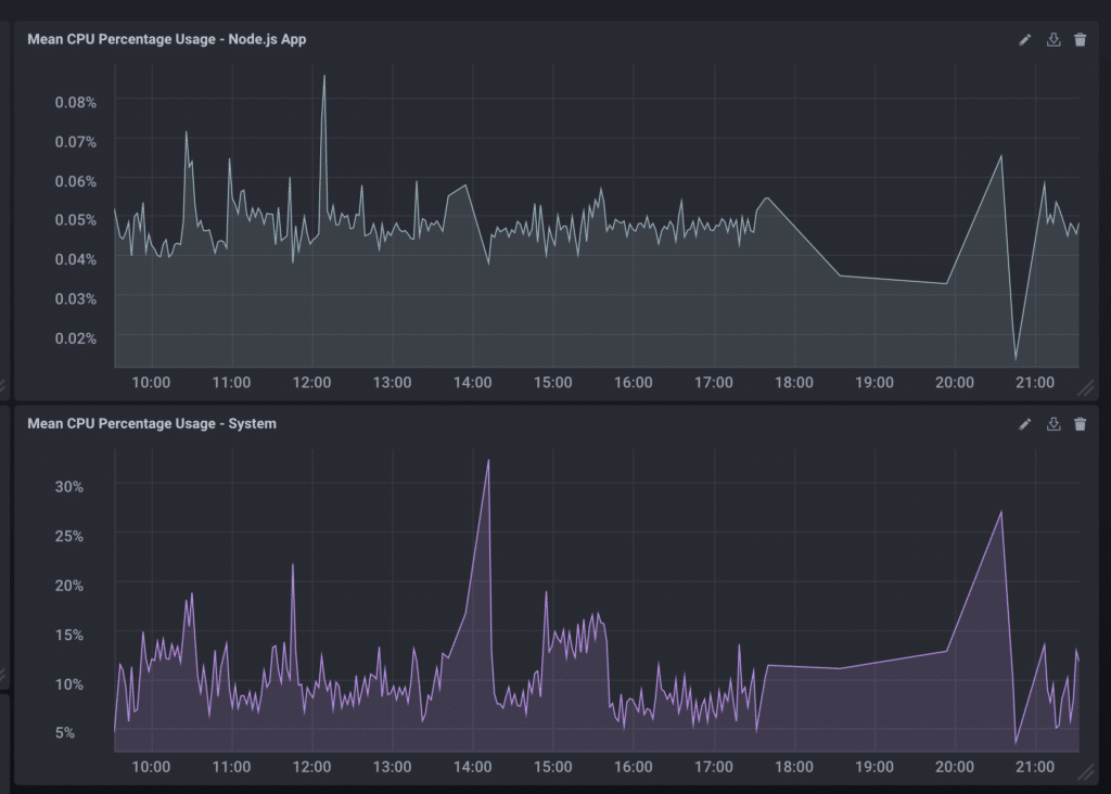 <figcaption> CPU Usage of both Process and System</figcaption>
I built the query through the Chronograf UI, but edited it to change percentage to a value between 0-100 as so:
SELECT (mean("process")*100) AS "mean_process" FROM "telegraf"."autogen"."cpu_percentage" WHERE time > :dashboardTime: GROUP BY :interval: FILL(null)Event Loop Latency
Because of Node.js’s nonblocking, single-threaded nature, it is extraordinarily fast in handling a multitude of events quickly and asynchronously. The event loop is responsible for this, and it would therefore behoove one to recognize and pinpoint any latencies present within the event loop that could be causing regression in application performance. Longer-lasting latency exacerbates each cycle of the event loop and could eventually slow down the app to a state of purgatory. If the server witnesses an increase in load, for example, this can lead to an increase in tasks per event loop, which will effect longer response times for the end user. Collecting data on these latencies can assist in the decision of whether to scale up the number of processes running the application and return performance levels to equilibrium.
For our measurement of event loop latency, we have access to the min, max, and average latency times in milliseconds. There are several visualization options available in Chronograf, including line and stacked graphs, step-plots, bar graphs, and gauges, all available when you switch from the Queries section to the Visualizations section.
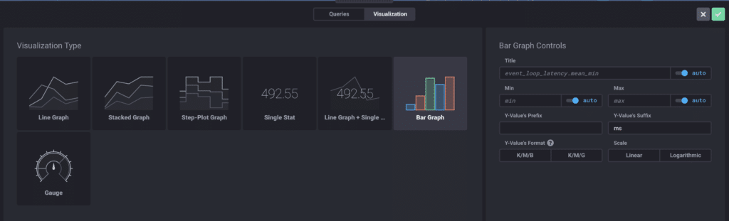 <figcaption> Various Visualization Types are available in Chronograf</figcaption>
Below you can see event loop latency depicted in various visualizations:
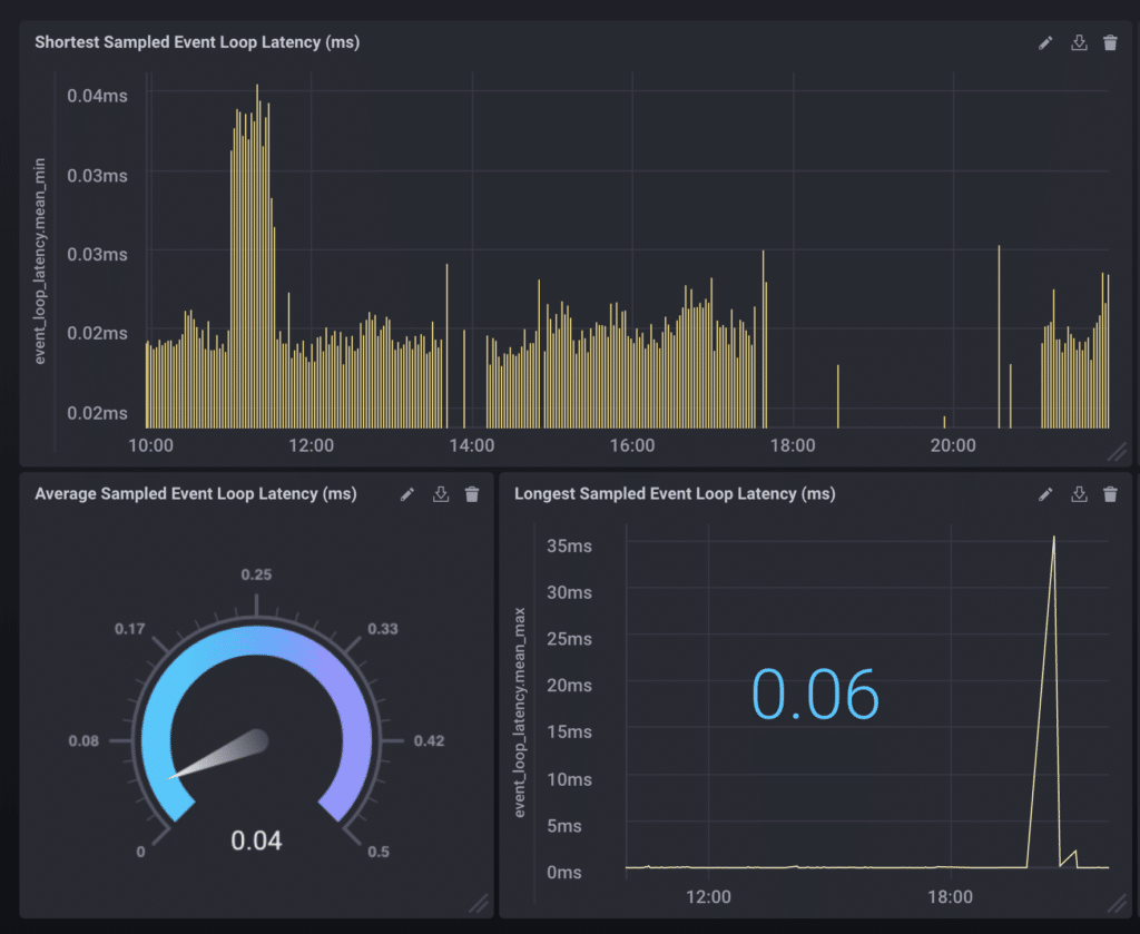 <figcaption> Minimum, Average, and Maximum Sampled Event Loop Latency (in milliseconds)</figcaption>
Garbage Collection, Heap Usage, and Memory Leaks
Memory leaks are an oft-cited complaint by Node.js developers, as it is usually tricky to determine the point of causation. They occur when objects are referenced for too long, when variables are stored past their point of use. Recognizing their existence early on is integral to monitoring the health of your application, and can be achieved by tracking the app’s heap usage (a segment of memory allocated for storing objects, strings and closures) and/or its garbage collection (the process of freeing up unused memory) rates. For instance, a steady growth in heap usage will eventually max out at the 1.5GB default restriction required by Node.js and cause a service crash and restart on the process. Similarly, you can look for patterns within garbage collection rates, for as extraneous objects accumulate within memory, the time spent in the garbage collection process likewise increases. Of course, once you’ve found yourself with a memory leak, it’s a rather tedious process trying to pinpoint the root cause, usually involving comparing differently timed heap snapshots of your application to see what has changed between the two.
We will monitor both the heap usage and the garbage collection rates in this instance. See below:
 <figcaption> GC Cycle Duration and Heap Usage (MB)</figcaption>
For heap usage in particular, I altered the query to display in megabytes rather than the default (bytes):
SELECT ("used"/1000000) FROM "telegraf"."autogen"."gc" WHERE time > :dashboardTime:HTTP Requests
The duration of HTTP requests is an important metric especially because it most often directly involves the end user. As users have become more impatient than ever, slow response times can heavily detriment the success of an application. Monitoring the duration of these requests presents awareness on whether users are able to interact with the application quickly and efficiently. The faster things are, the higher user satisfaction will be, plain and simple.
Here, you’ll see I built out a stacked graph visualizing mean HTTP request/response duration in milliseconds, grouped by different URLs:
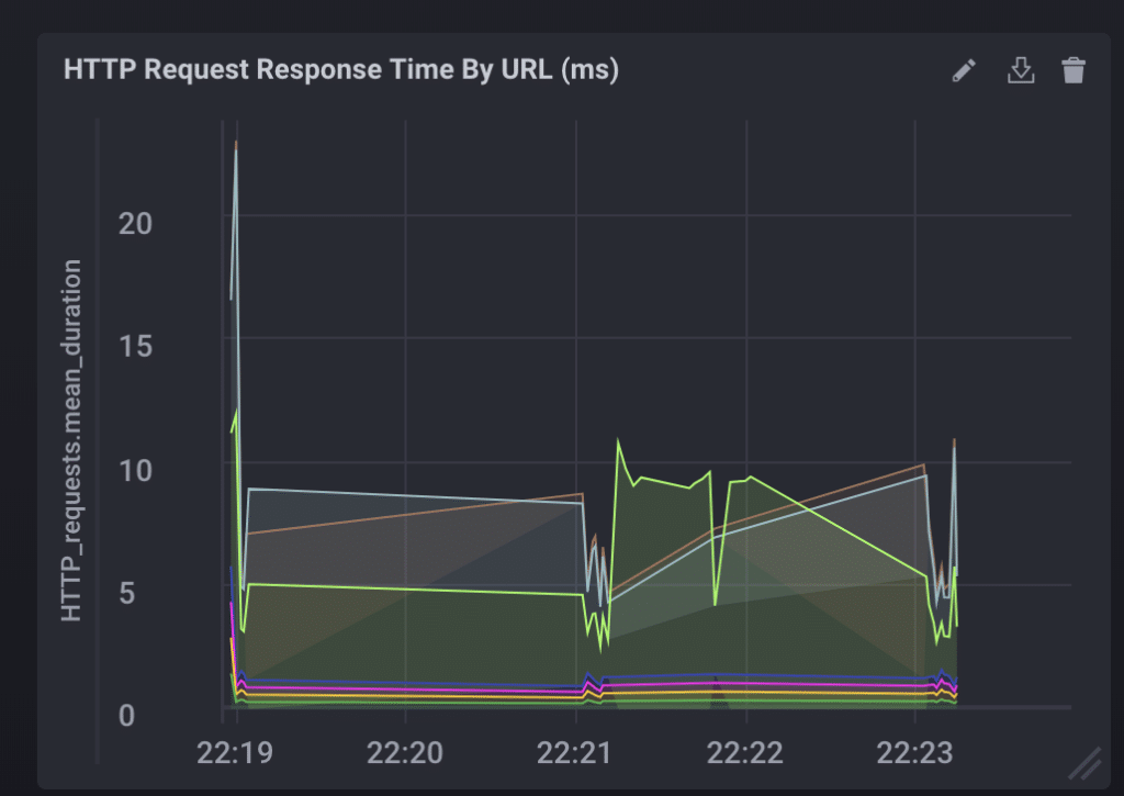 <figcaption> HTTP Request/Response Duration (ms)</figcaption>
Database Queries
In this particular application, the inventory and order history are stored using the PostgreSQL relational database and at various points in the application, one has to query the database. This falls under the category of an external dependency or any system with which your application interacts. There are others beside databasesthird-party APIs, web services, legacy systemsand although we cannot necessarily change the code running within these services directly, these dependencies are nevertheless important to the success of the application and therefore worth tracking, if only to be able to differentiate between problems arising within the application and problems without. However your application communicates with third-party applications, internal or external, the latency in waiting for the response can potentially impact the performance of your application and your customer experience. Measuring and optimizing these response times can help solve for these bottlenecks.
We’ve tracked the duration of our queries to the Postgres database and are depicting them in a line/stat graph as so:
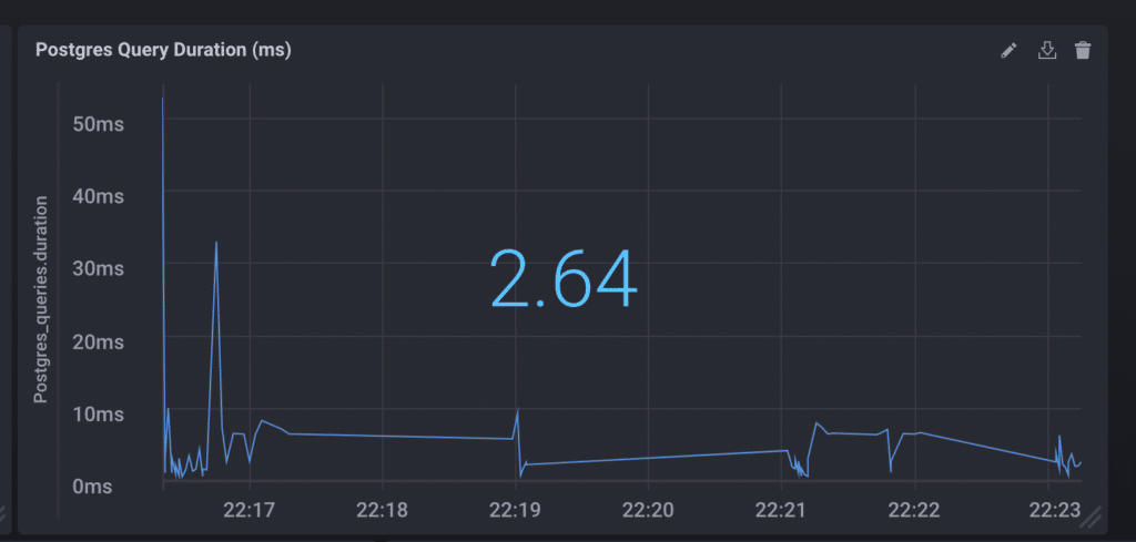 <figcaption> Postgres Query Duration (ms)</figcaption>
Summary
Once you pull everything together, you have a full dashboard at your disposal monitoring the health of your Node.js application:
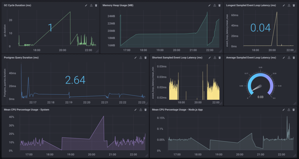 <figcaption> Success!</figcaption>
That just about sums it up for this post. I’d love to hear how you’re instrumenting your Node.js applications, and how you’re visualizing your metrics and events! Thanks for coming along on this journey and feel free to reach out to me via [email protected], or on Twitter with any questions and/or comments. Happy dashboarding!
