Introduction to Giraffe
By
Jill Pelavin
updated December 14, 2025
Product
Use Cases
Developer
Navigate to:
Giraffe is InfluxData’s graphing library, built to use and graph the data coming from InfluxData’s time series database, InfluxDB.
Yes, there are other graphing libraries available; but ours is the only one purpose-built to graph line protocol without having to convert it. Plus, we have lots of great features, like legends and colorization, without much configuration.
So, how to get started?
First, you need to set up and install InfluxData. You can use a cloud installation here; or install a local version.
Next, you need to have some data.
If you already have data in your system, you can skip this step.
Here’s what this article will cover:
- Setting up data with Telegraf
- Sample Project 1: Direct API
- Sample Project 2: Query API
- Related resources
Setting up data with Telegraf
An easy way to bootstrap dashboards is to use community templates. It is a way of importing dashboards that others have already created to view data in InfluxData.
The two templates I recommend are:
-
If you are running InfluxDB locally and have Docker, you can use the Docker Monitoring Template.
-
or the Air Quality Monitoring Template.
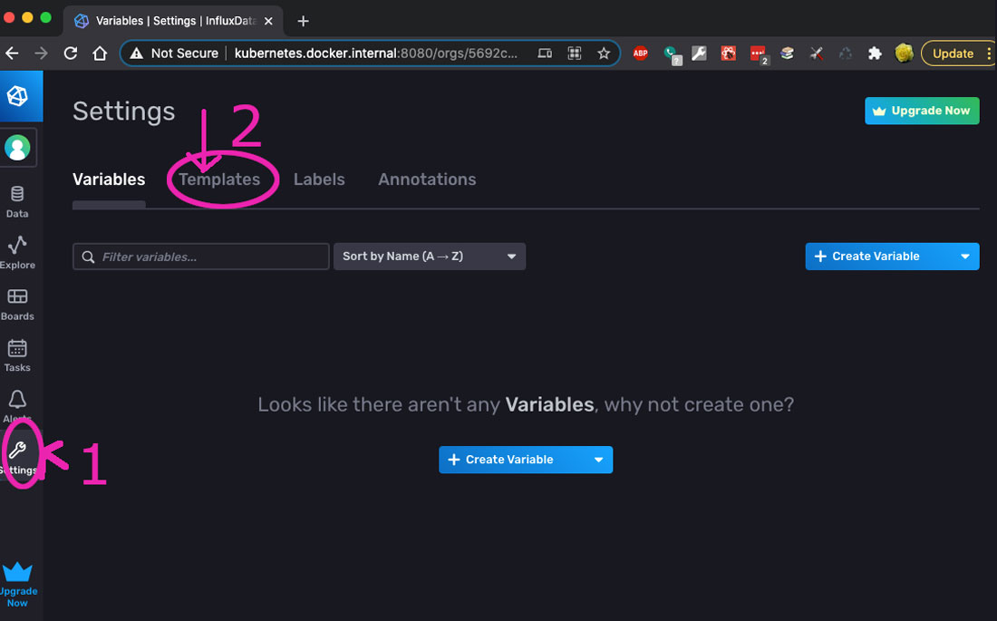
To install a template; go to Settings in the left navigation menu, then click on the Templates tab on the top (right under the Settings heading).
Here is a screenshot with the two items to click on, circled in magenta, with a #1 and a #2.
Then, paste in either of the above urls in the input under the #2 in the form (labeled in the pic with #3).
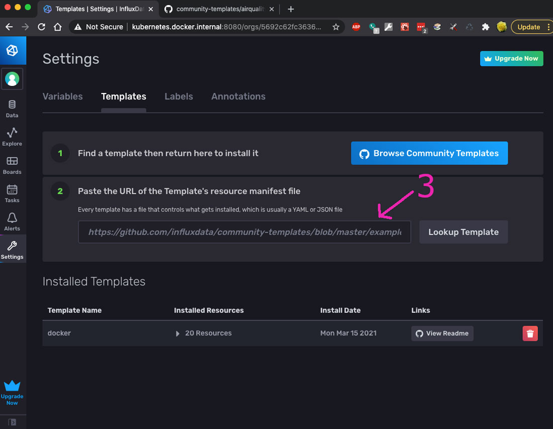
You can choose a different template if you like (you can browse available templates), but then setting it up will be up to you.
Click Lookup Template, and follow the prompts to install.
- After installation, if you have chosen the Air Quality Monitoring Template, follow the instructions here for setup.
If you chose the Docker Monitoring Template, no additional setup is needed. Just skip ahead to step 4.
- Setup Telegraf:
Go to Data -> Telegraf (see #1 and #2 below on where to click).
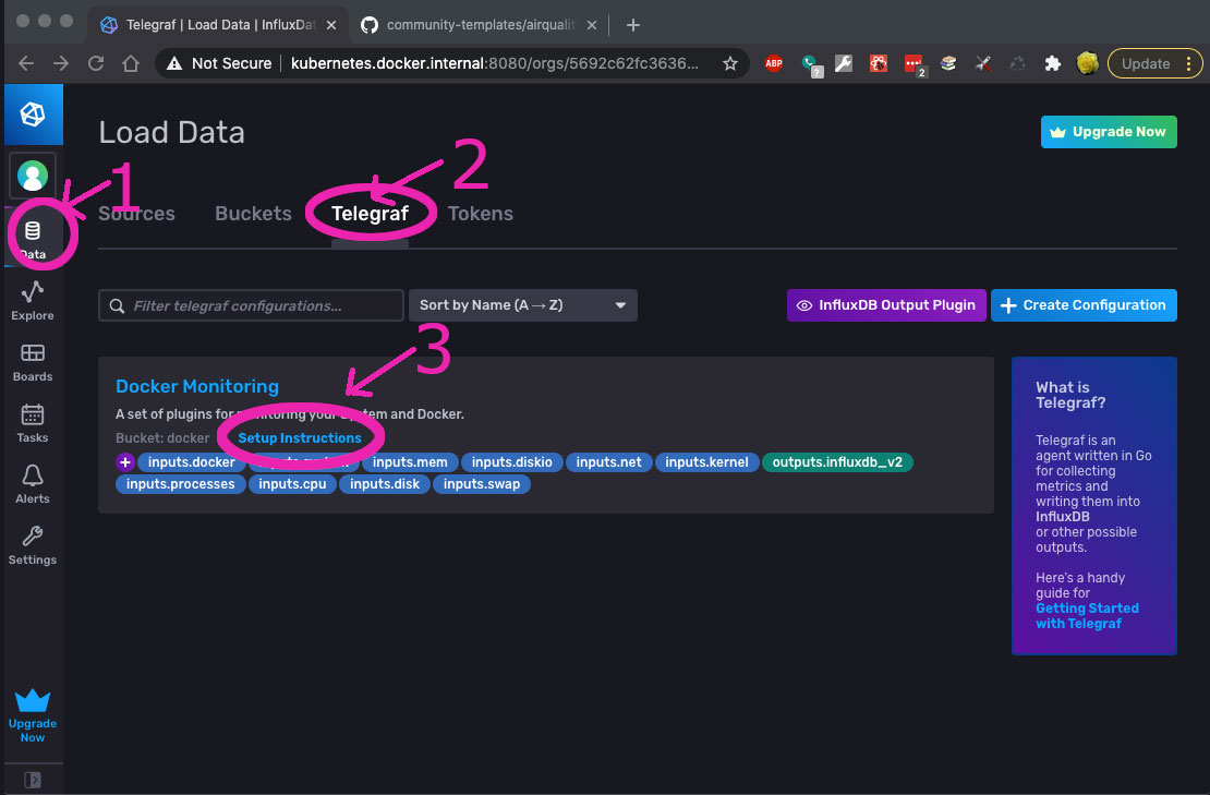
In this screen, you will see the Docker Monitoring Template, which I installed.
- Click Setup Instructions (#3 in the screenshot above).
You will now see this screenshot:
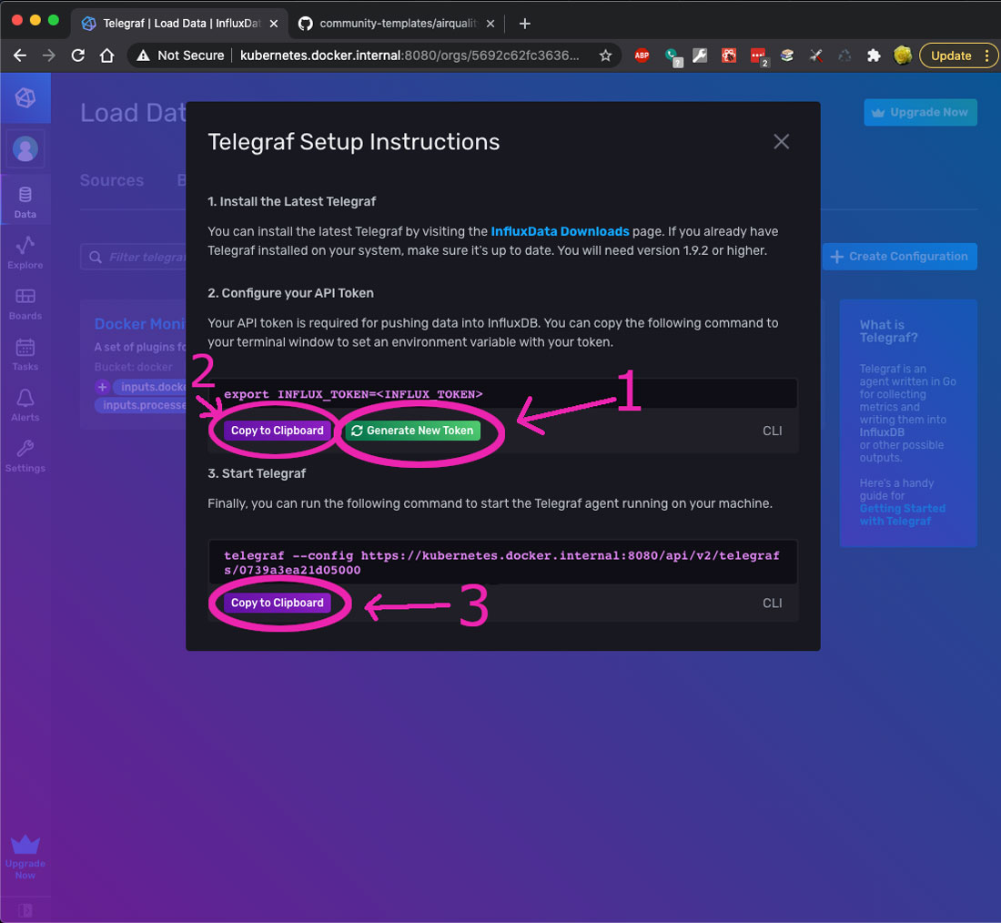
Install Telegraf if you have not done so already.
Click Generate New Token (#1), then Copy to Clipboard (#2) above.
Then start Telegraf using the command in the third option in the popup; by copying and pasting that command (#3) onto your command line.
Note: Depending on how your system is set up, you may need to change the config. The command I use to start my own telegraf is the following:
telegraf --config ~/Code/tools/telegraf/docker_monitoring.conf
where the file referenced above (docker_monitoring.conf) is:
# Global tags can be specified here in key="value" format.
[global_tags]
  # dc = "us-east-1" # will tag all metrics with dc=us-east-1
  # rack = "1a"
  ## Environment variables can be used as tags, and throughout the config file
  # user = "$USER"


# Configuration for telegraf agent
[agent]
  interval = "10s"
  round_interval = true
  metric_batch_size = 1000
  metric_buffer_limit = 10000
  collection_jitter = "0s"
  flush_interval = "10s"
  flush_jitter = "0s"
  precision = ""

  hostname = ""
  omit_hostname = false


###############################################################################
#                            OUTPUT PLUGINS                                   #
###############################################################################

# Configuration for sending metrics to InfluxDB
[[outputs.influxdb_v2]]
  urls = ["https://kubernetes.docker.internal:8080/"]
  token = "$INFLUX_TOKEN"
  organization = "InfluxData" ## Destination bucket to write into.
  bucket = "docker"
  insecure_skip_verify = true


###############################################################################
#                            INPUT PLUGINS                                    #
###############################################################################

[[inputs.cpu]]
  percpu = true
  totalcpu = true
  collect_cpu_time = false
  report_active = false

[[inputs.disk]]
  #ignore_fs = ["tmpfs", "devtmpfs", "devfs", "iso9660", "overlay", "aufs", "squashfs"]

[[inputs.diskio]]

[[inputs.kernel]]

[[inputs.mem]]

[[inputs.net]]

[[inputs.processes]]

[[inputs.swap]]

[[inputs.system]]

[[inputs.docker]]
  endpoint = "unix:///var/run/docker.sock"
  gather_services = false
  container_names = []
  source_tag = false
  container_name_include = []
  container_name_exclude = []
  timeout = "5s"
  perdevice = true
  total = true
  docker_label_include = []
  docker_label_exclude = []
  tag_env = []
Then go to the dashboards, and look for the data. That is the data we will be referencing in the rest of this article.
You can use any query for the first implementation (my Giraffe sample). The second implementation uses a specific query that aligns with the docker template.
If you choose to use the air quality template or a different template, you will need to adjust the query.
Remember that the band plot needs three data points (min, max, mean), so adjust your query accordingly.
Sample project 1: Direct API
The next step is to download one of our sample projects. But which one?
We have a list of sample projects here. I’m going to discuss two of the projects; the one I worked on (the fifth one in the above referenced list) and Gene Hynson’s Giraffe Playground (the second project listed above).
Both use a proxy server, but one is a pass-through (it directly uses the InfluxDB API’s), and the other queries InfluxDB directly (more complicated, but then it’s much easier to tweak the query and vary what you get in real time).
My project: Giraffe Line Sample
This project is a pass-through; to show in another page a graph that is already showing in your influxdata web application; either by using a dashboard or the ‘explore’ functionality.
When following the directions at the link above, some things to note:
- This has a proxy and client directory. The Proxy directory contains a local server that talks to your InfluxDB instance, whether that is local or on another machine. This is here to bypass CORS restrictions (Cross-Origin Resource Sharing; browser security that makes sure that one site cannot access another site).
- The client directory contains the webpage that retrieves the data and shows the graph. This is the code that you would duplicate to get the graph to show on your own webpage/website.
- For configuration and getting the orgId: at 29:05, this video shows Kristina Robinson getting the orgId from the url, and she also shows where the organization Id is displayed in the UI.
- Be aware if you are using http or https. It is ok to bypass the certificate if you are just developing this internally, but if you are putting these graphs on a site available to the outside world, then you need to actually use the certificate.
As stated in proxy/index.js:
//to get past the self-signed cert issue: ignore the need for a cert
// DO NOT DO THIS IF SHARING PRIVATE DATA WITH SERVICE

//if you want to not use this workaround, then you need to put the actual cert into
//this agent; like so: (instead of the agent in the code below)

//const httpsAgent = new https.Agent({ ca: MY_CA_BUNDLE });

//see https://stackoverflow.com/questions/51363855/how-to-configure-axios-to-use-ssl-certificate
//for details
const httpsAgent = new https.Agent({
  rejectUnauthorized: false
});
After you get this working, you should see a line graph; like the following:
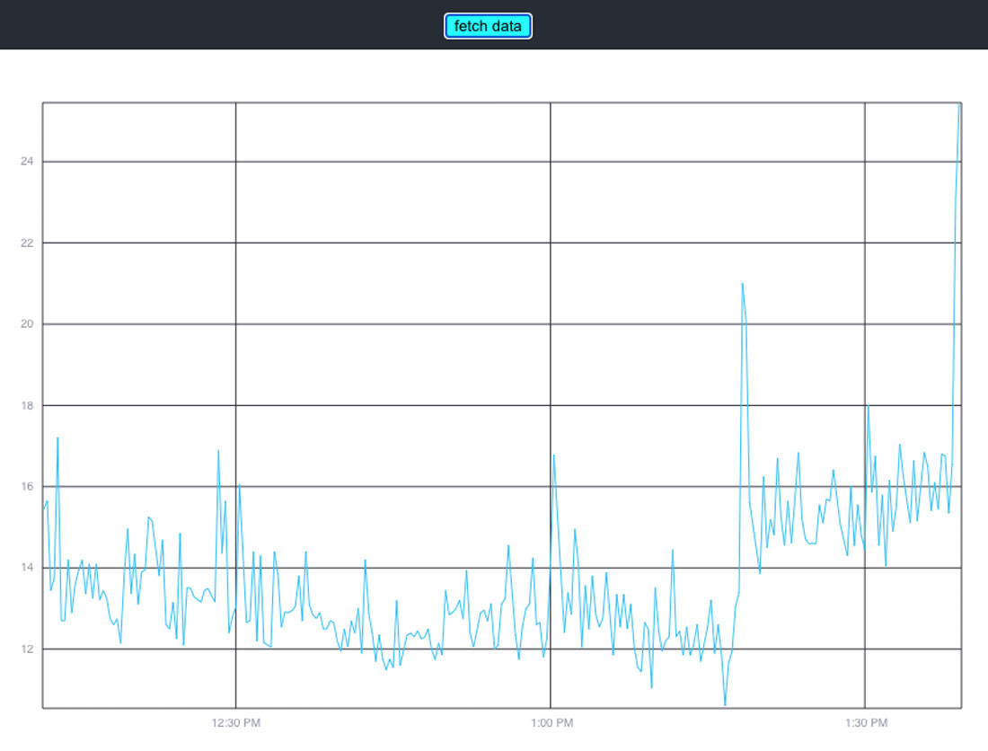
Gotchas with this project:
Create-react-app has its own styles, and there was a style that was applied to the entire page that interfered with Giraffe and put an offset into the graph. It had to be removed for Giraffe to render properly. So beware of any styling that affects the plot.
https can be frustrating, so at first (when developing) turn it off to just get it working, then if needed turn it back on with your certificates.
I didn’t include a timer to auto-update, so the button needs to be pressed to get data. This means that on the first loading of the page, there is no data; so press the button first!
This solution just takes a query that is all set and sends it along to InfluxDB. What about making our own query though?
The next project does that.
Sample project 2: Query API
Gene Hynson, a fellow senior software engineer at InfluxData, created this Giraffe sample project.
If you are connecting to an influxdata cloud2 instance, the client should be able to handle https because it is not using a self-signed certificate. If you are connecting to a local open source instance (OSS), then that is not using https (it is using http), so there should be no security problems connecting.
But if you are running locally and using a self-signed certificate, then you will need to circumvent https. You can use an httpsAgent similar to my project, or you can just turn it off for development, which is what I did.
I added this variable, along with the BUCKET_NAME, ORG_ID and such that it requires:
export NODE_TLS_REJECT_UNAUTHORIZED=0
That way, the server continued to work for my testing. Note that if you want to expose a graph like this on a public site, don’t forget to put in real authorization with the certificate.
I also created a file called ‘environment’ with the export commands, so it was simple to just run that and not have to type them in each time I start the server again in a new shell.
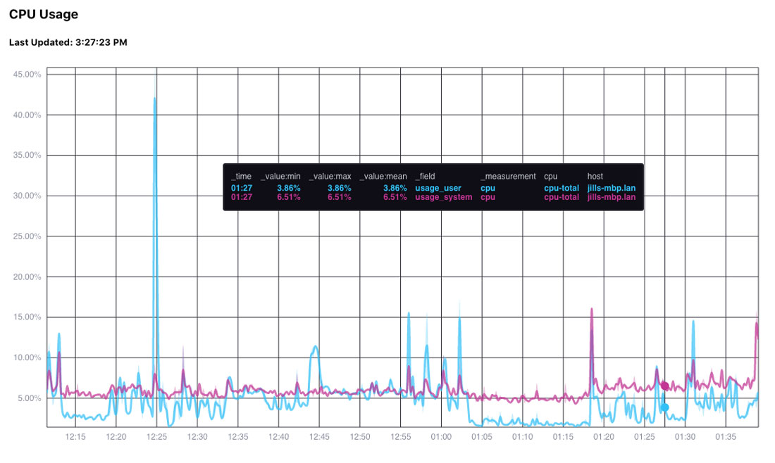
Here’s what the graph with Gene’s project looks like; with the last five minutes of data from Telegraf:
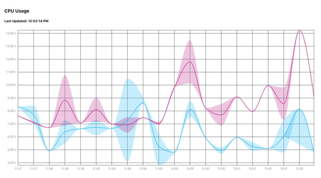 This one auto-updates, and you can set the interval in the client/src/plotters/band.js file:
It is set to five seconds (5000) in the code, but I changed it to 25000 (25 seconds) so I could take screenshots and such.
const REASONABLE_API_REFRESH_RATE = 25000;
Here is the Flux query that defines the graph, with the guide to Flux here. Because it is a band plot, we need the mean, max and min for this to display properly.
Let’s explore the query here:
// the cpu usage query we're using
const cpuQuery = `from(bucket: "${bucket}")
|> range(start: -5m)
|> filter(fn: (r) => r["_measurement"] == "cpu")
|> filter(fn: (r) => r["_field"] == "usage_user" or r["_field"] == "usage_system")
|> filter(fn: (r) => r["cpu"] == "cpu-total")
|> aggregateWindow(every: 15s, fn: mean, createEmpty: false)
|> yield(name: "mean")

from(bucket: "${bucket}")
|> range(start: -5m)
|> filter(fn: (r) => r["_measurement"] == "cpu")
|> filter(fn: (r) => r["_field"] == "usage_user" or r["_field"] == "usage_system")
|> filter(fn: (r) => r["cpu"] == "cpu-total")
|> aggregateWindow(every: 15s, fn: min, createEmpty: false)
|> yield(name: "min")

from(bucket: "${bucket}")
|> range(start: -5m)
|> filter(fn: (r) => r["_measurement"] == "cpu")
|> filter(fn: (r) => r["_field"] == "usage_user" or r["_field"] == "usage_system")
|> filter(fn: (r) => r["cpu"] == "cpu-total")
|> aggregateWindow(every: 15s, fn: max, createEmpty: false)
|> yield(name: "max")`;
The range here (-5m) means get data from the last 5 minutes. You can change that to hours (h), days (d), or whatever range you want.
The API for time ranges is here, and with timestamp shortcut format details is here.
Here is a graph with a much longer time period (2 hours instead of five minutes).
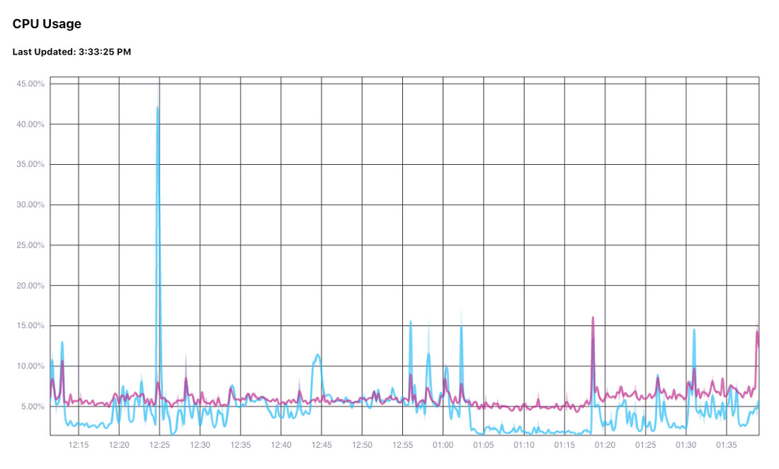 I personally changed the range to -2d to get the last two days of data; because that is the range I wanted.
If you look at the graphs though, it shows the time, and it only spans an hour. That is because the bucket I used was active for about an hour 2 days ago, so it got all the data within the last two days, and then it showed what it had. If you do a query, and there is no data, then nothing will show in your graph, which is very frustrating. So you may want to play around with the data and queries interactively in our Data Explorer to find the time range you want before putting it into your standalone Giraffe application.
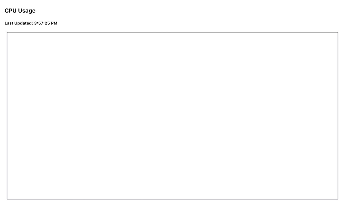
When I switched the times to the last 10 minutes (-10m), I got no data, so it looked like this:
Fill
Also, we need to provide the fill. The fill is how the lines are grouped. In this example, we get the fill by getting all the columns with the datatype of string:
const findStringColumns = (table) =>
  table.columnKeys.filter(k => table.getColumnType(k) === 'string')

 const fill = findStringColumns(this.state.table)
For the above case, the fill variable is:
["result", "_field", "_measurement", "cpu", "host"]
And so each line is grouped by the result, _field, _measurement, cpu, and host; plus, all those items show up in the legend:
If the code is changed to *only* have ['_result', 'cpu'], then it looks like this.
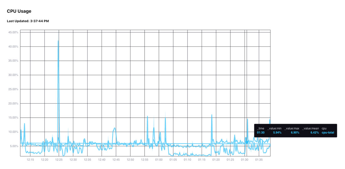
This is because the data that makes the lines different is in the “_field” column, so without that, Giraffe is told that the data all belongs to the same line. And so it all has the same colors. The colors are changed when the fill tells the graph how to group the items.
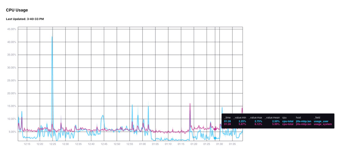
For example, when fill is:
const fill=["result", "cpu", "host", '_field'];
Then the graph is:
With just the fill being equal to:
const fill=["result", '_field'];
The graph is:
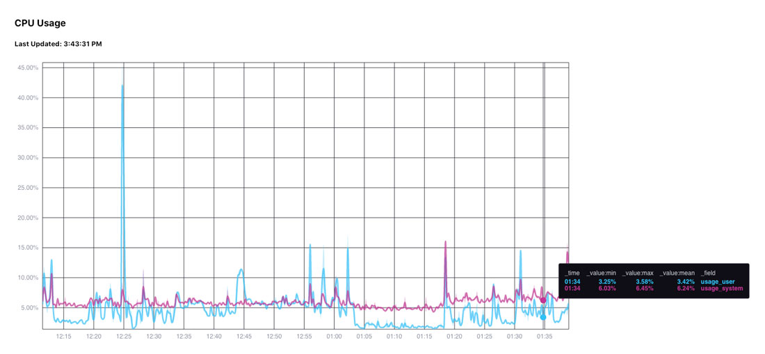
You’ll notice that the legend only adds the _field (besides the numeric values).
If cpu is added in, then the cpu value shows in the legend, but the graph looks exactly the same.
So that’s my introduction to Giraffe!
Related resources
I’m including relevant resources here, all in one place for easy access. Some of these have been introduced earlier in the document, and others are just referenced here.
- You can watch Kristina Robinson go through another example in her talk Meet the Experts: Visualize Your Time-Stamped Data Using the React-Based Giraffe Library.
- Giraffe quick start: where you create a very simple graph out of whole cloth. This is a way to create your own annotated csv table and just display it.
- List of sample projects
- Flux documentation
- Start and stop times
- Timestamp shortcut formatting
