Monitoring Your Data with the Mosaic Graph Type
By
Community
updated December 14, 2025
Product
Use Cases
Developer
Navigate to:
This article was written by InfluxData interns Rashi Bose and Rose Parker.
InfluxDB provides several graph type visualizations to allow users to easily monitor their data. However, most of those graph types are only helpful if your data can be represented numerically. What if you want to track the health of your application, or visualize the status of your pods deployed in Kubernetes, over time? In both these cases, status is tracked over time using one of several discrete values, and can’t be plotted on an x/y chart.
In this post, we’ll walk you through our process of creating the mosaic graph type over the course of our summer internship. This graph is well-suited to tracking status over time.
What's the problem?
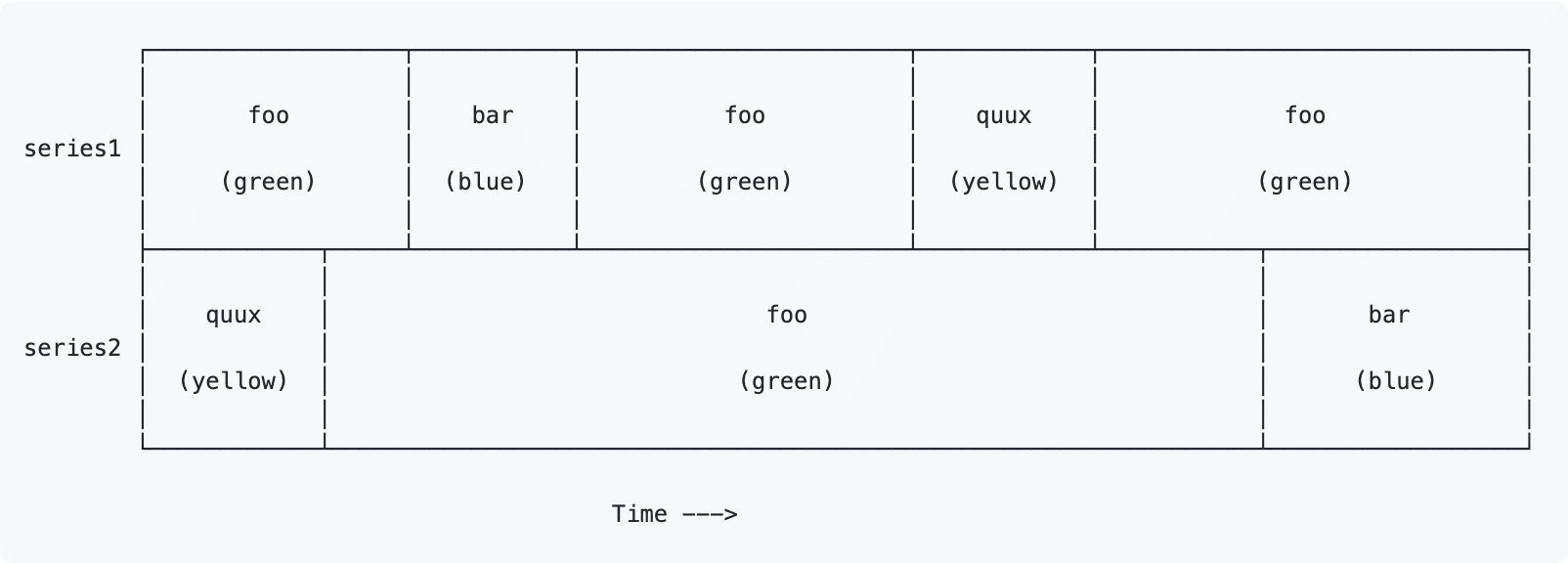
The project started with a request by our teammate, Mark Rushakoff, for a graph type that plots the change in the value of a given category of data over time. The x-axis represents time and the y-axis represents the names of the different series of data. Lastly, the graph would have colored boxes, such that each color represented a certain value and the length of the box represented how long the value lasts. Mark provided us with the rough drawing (shown below) of what he imagined the graph would look like. In the drawing, the two sets of data are series1 and series 2, and the list of possible values is “foo”, “bar”, and “quux”. In the drawing, each value is assigned a color, and in our graph, those boxes would be colored in with that color. After meeting face-to-face with Mark to ensure the project was still valuable and clarify some specifics, we were off.
Why a mosaic graph?
The first question we had to ask ourselves was what this visualization should be called. The original request didn’t refer to the graph type by name, so we did some research. We considered graph types such as Gantt, timeline, and state but eventually settled on a mosaic graph. A mosaic graph visualizes data for two or more qualitative variables in our case, series and value. We chose this graph type because even though our graph is a little more specialized than a mosaic, we wanted to make sure it fits all the requirements of whatever graph we chose. Also, unlike the other possibilities, mosaics are a common enough type of graph that people should recognize the name and have some idea of what it will be used for.
Our first attempt
The first time we tried to add our visualization type to Giraffe, our graph visualization library built using ReactJS, we struggled with understanding all the different variables and files, so we decided the simplest method would be to emulate the most similar existing graph types (histogram and heatmap) as closely as possible. As you might imagine, this wasn’t very successful. We weren’t able to get anything to visualize and didn’t understand the errors we were getting. We soon realized that we wouldn’t get anywhere with this strategy, so we took a step back and tried to figure out how everything worked together before adding our code.
Starting from scratch
The first thing we did was create a simple mosaic graph with the Canvas element to figure out what shape we would need the data to be in to draw our graph. While looking at the data other graphs were displaying in Giraffe, we saw that the data we received would contain multiple columns including time, value, series name, and potentially other data. Each row of data would have a timestamp and the value of the series at that exact time. For our graph, we would have to organize this data in terms of intervals. Since we wanted to display how long a value (ex. “foo”) lasted, we would need to know when “foo” became the value and when the value changed again. Therefore, we would need to create a table that stored the start and end times along with the value and series name for each interval.
After we had a better idea of what we were working towards, we started adding small amounts of code where we were sure we needed and built up mosaic to be similar to other graph types.
In our first iteration, we hard-coded the column names in our transform function to correspond to the sample data set we created. Thus, our transform function only worked with the sample data set we created. Then, once we were sure the graph looked like our target graph, we removed hard-coded values so that the graph would work with any incoming data set.
Creating a dummy data set
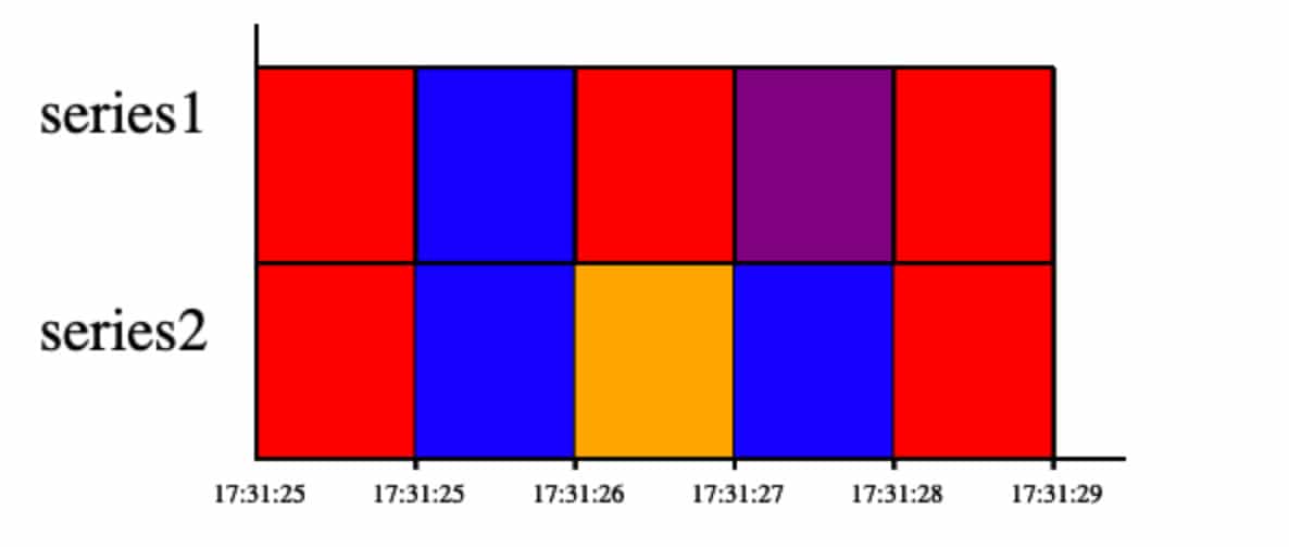
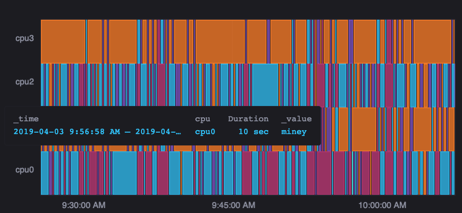
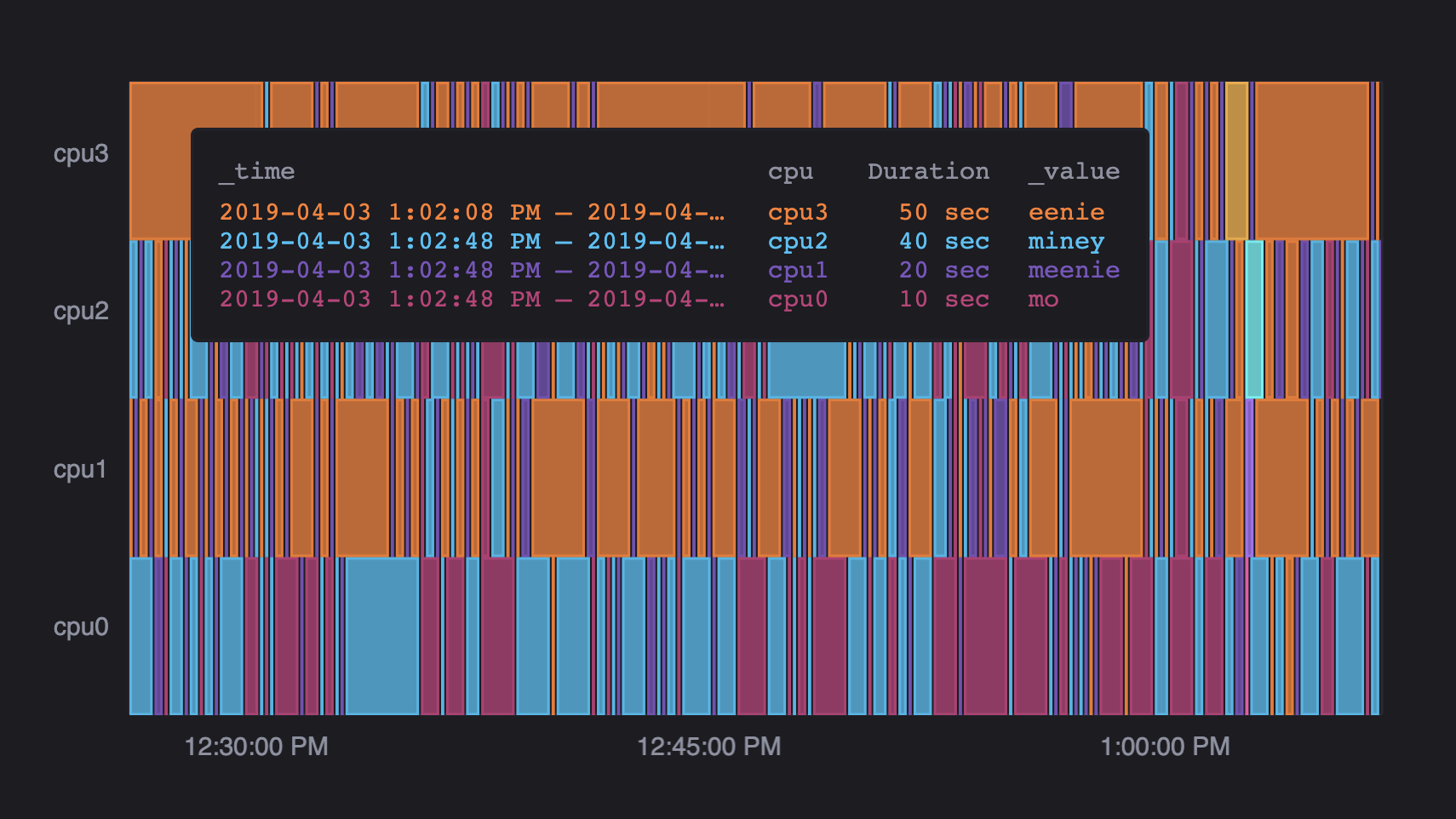
One of the first issues we ran into was that we didn’t have a set of raw data that worked for our graph. As we mentioned earlier, all of the other graph types use numeric values. Therefore, the dummy data set that existed in Giraffe at the time didn’t work for our purposes. To solve this problem, we wrote a script to convert the values of the existing dummy data set to one with string values by putting the numeric values into ranges with string names. This resulted in a data set with each series being a CPU and each value interval mapping to a color that changes over time.
Visualizing the graph
After we got the data in the proper shape, we were finally able to get to work on drawing it. We started by creating the function to draw the graph itself. We managed to get the visualization to appear without too much trouble, but the graph looked different than expected. The boundary points of each series were inconsistent, and some colors were faded.
To better understand what the issue was, we created a second, smaller raw data set. Using this data set, we found that our initial transform function incorrectly calculated the end time for a given series. We originally assigned the end time of one series as the start time of the next. However, this was an incorrect approach because each series ran independently of each other, so the end time of one series occurred before the start time of the next. To fix this issue, we made the end time of the last interval of each series the last timestamp in the graph.
The next thing we did was draw the axes because we figured that would be relatively straightforward. We were wrong. We wanted to set up the x-axis with time and y-axis to display the series’ names. We were able to set up our x-axis without much difficulty, but setting up the y-axis proved to be more complicated as no graph had used strings for their y-axis before. We ended up doing this by storing the series names in a variable called yTicks, which stores a number array for non-mosaic layers. To implement this, we had to create a mosaic-specific case for all y-axis functions, including the function to find the appropriate margin width, since they all rely on yTicks being a number array.
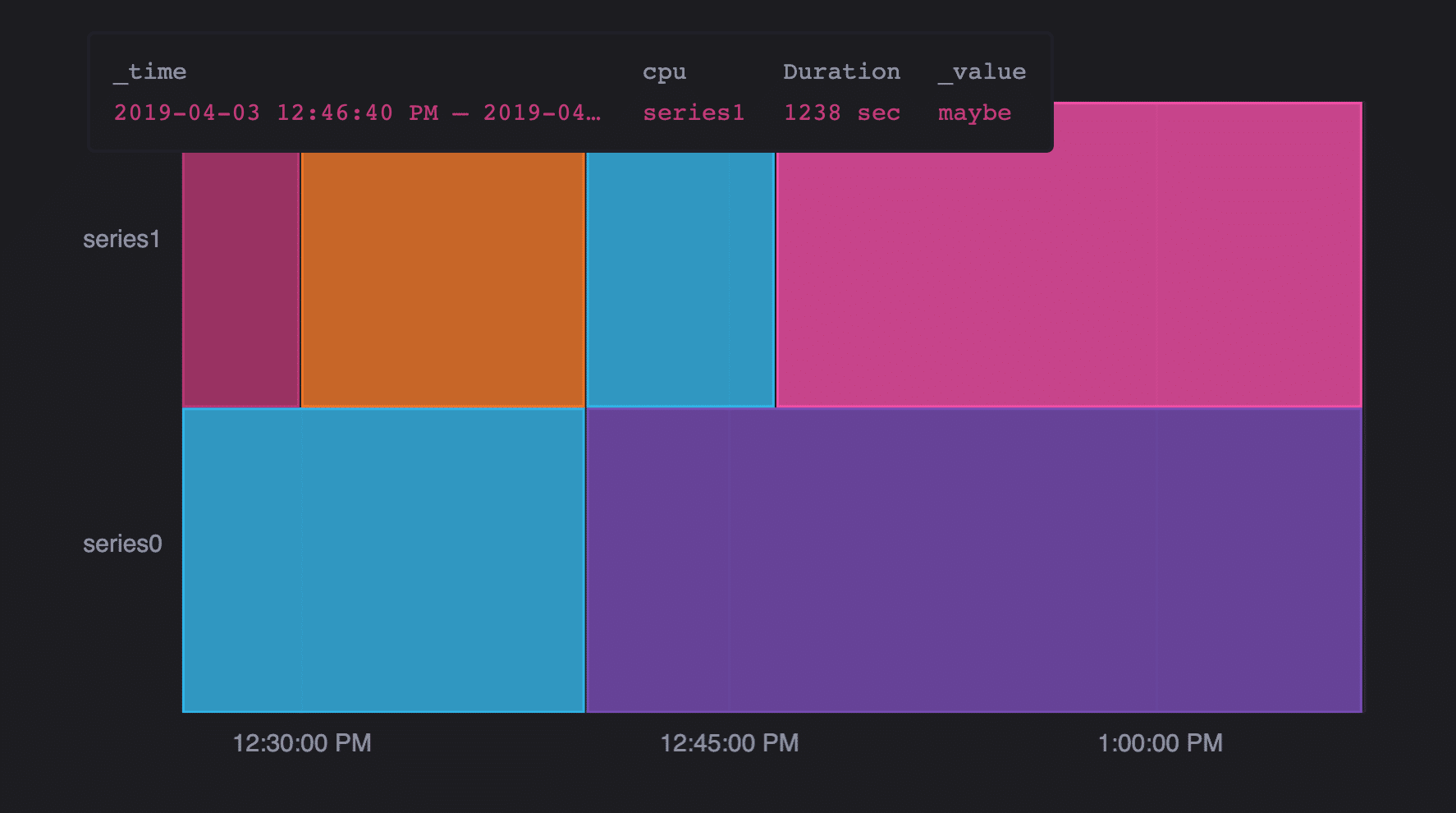
Once we had everything visualizing correctly, we were able to get to work on adding the tooltip. As with all graph types in Giraffe, the tooltip for the mosaic graph acted as a graph legend. Thus, the first thing we needed to do was decide what information to include on our tooltip. For our initial attempt, we assumed that the user would find it most useful to see the information for just the box they’re currently hovering over (time range, series, value). It turned out that it was simpler to display all information for the current timestamp, but we filtered through those so it only displayed the information for the specified timestamp and series.
After that first iteration, which took about two weeks, we met with Mark to get feedback on our graph. We received positive feedback, with the only suggestion being to add the duration of the current box to the tooltip. After that quick fix, we were ready to move onto the next step. All graph types are first implemented in Giraffe and then imported into InfluxDB. Now that we had a working graph type, we were able to say goodbye to Giraffe (for now) and to start adding the mosaic graph to InfluxDB.
Adding the graph type to InfluxDB
Having learned from our mistakes with Giraffe, we spent our first day with InfluxDB exploring how other graph types, specifically the scatter plot, were implemented. We struggled with understanding where we truly needed to reference our mosaic graph since each graph was implemented slightly differently. Therefore, we decided to make note of the functions in which the scatter plot was referenced and the reason, then slowly added the mosaic graph in those places as well. In the process, we added a lot of console.log statements and added and deleted files we mistakenly thought we needed, but we eventually figured it out. After a week of work and building up a mental model of the code base, we only created two new files: a mosaic plot file to visualize the graph and a mosaic options file to visualize the graph’s customization options.
Back to the drawing board
When we finally rendered the Mosaic plot in InfluxDB, we found that our graph did not look the way we expected. We decided to look at a small sample of the data that the query returned and walk through our transform function with that data to verify that the function returned the correct output. While walking through the code, we found that the data we were receiving from the query was in a different order than the data we were testing within Giraffe. In our test data sets in Giraffe, we ordered all the data according to the series name, so all the values for series1 appeared then all the values for series2 appeared. In the data returned from the query, the values for all the different series were interspersed, though they were all still in chronological order. To address this issue, we rewrote the transform function to organize the data a little differently. While we collected the data in terms of intervals, we also sorted the data according to the series’ names. This saved us the trouble of changing the way we process our data.
After solving that issue, we realized we had another. The graph now appeared faded, similarly to when we had assigned the end time of one series as the start time of the next in Giraffe. On a closer examination, we realized that the data set being used had multiple values for the same series assigned to each timestamp, so the graph was redrawn with each of those different value sets. To solve this issue we added a check for repeating timestamps for the same series in our transform function. If this occurs, we stop collecting data and only render the data that had been collected up to that point.
To ensure we understood what the incoming data would look like after our changes, we asked Mark for the dataset he wanted to render using the mosaic graph. We successfully created a mosaic graph using that data and set up a meeting with Mark to show him. Unfortunately, the graph didn’t include some features he expected it to have, like the ability to add more data to the tooltip or the y-axis. After the meeting, we explored the possibility of adding those features but after consulting with Mark and our mentors again, we all concluded that we didn’t have enough time to add them in before our deadline.
Wrapping up
Once we had a working graph in the UI, we began setting up the backend for the mosaic graph. Neither of us had worked on backend code before, so we paired with our mentors to better understand the backend infrastructure. We defined a schema for how the graph should be saved and followed the example of other graphs to set up the rest of the code for saving and exporting a mosaic graph. While we weren’t able to include Mark’s requested changes in the UI, we updated the backend to allow for those changes in the future.
We then did some last-minute clean-up. We reworked several pieces of the frontend code, including the mosaic transform function, to make the UX flow more intuitive, and disabled any features that weren’t functioning properly. After everything was exactly how we wanted it, we put the mosaic graph behind a feature flag so that it could be properly tested without affecting the current users’ experience. The feature won’t be released before the end of our internship, as we finished it in our last week, but we hope to see the mosaic graph type released in the next InfluxDB update!
Next steps
Due to time constraints, there were a few features we didn’t get a chance to add. As we briefly mentioned earlier, for example, Mark was interested in the ability to view more dimensions of the data simultaneously, so we would have liked to add the ability to select multiple fields for the y-axis and create groupings for each series, as well as add more fields to the tooltip and exploring possibilities to add more dimensions to each interval’s color.
We also would have liked to include more functionality to the mosaic customization options, such as the ability to add prefixes and suffixes to the axes. We’d also like to allow the user to select whether the tooltip displays information for just the interval they’re hovering over or the information for all intervals of the current timestamp.
Additionally, the end time of each series is currently set to the last timestamp in the entire data set by default. We’d like to explore the possibility of setting the end of each series to the last timestamp collected for each series to ascertain which behavior would be preferred.
Conclusion
As with all experiences, if we had the chance to redo this project, there are a few things we would have done differently. Most of all, we would try to meet with Mark more regularly. If we had done so, we feel like we would have been able to ensure we understood how we should render the data and what features the graph should include sooner.
Even though we wish we could have shortened the time it took us to reach this point, with each roadblock we hit, we learned a valuable lesson. For one, the fact that we weren’t able to include all of the features we’d like gave us the opportunity to learn how to make the compromises we needed to ship the software on time.
Another issue we ran into was our lack of experience working with complex codebases. Through our work in Giraffe where the code only accounted for numeric values, we had to recognize this implicit expectation and work to create a graph where strings could also be rendered. This experience helped us improve our approach to recognizing the underlying assumptions in complex codebases.
Among all the questions we wrestled with throughout this project, one popped up again and again: how do we quantify the work we’re doing? There would be days when we would spend hours simply trying to understand how the pre-existing code worked, without adding any code of our own. This resulted in us feeling like we hadn’t made any progress. However, we slowly realized that all the time we spent building our mental model was actually a really important step in solving the overall problem. Throughout our internship, it’s become clear to us that reading code is harder than writing code. Therefore, time spent understanding other people’s code is just as valuable as time spent writing your own code.
Without the support of everyone we’ve encountered here at InfluxData, we wouldn’t have learned such valuable lessons this summer. For this reason, we’d like to thank everyone who helped make this project and internship possible. We’d especially like to thank our mentors, Bucky and Deniz, and the rest of the Monitoring Team. We’re so glad we got the chance to get to know and work with them; we are so grateful for all of their advice and guidance. We would have crashed and burned without them.
Here’s where you can play with this visualization in Storybook, and where you can try out Giraffe for yourself. As always, if you have any questions, please post them in our InfluxDB community Slack and forum site.
