Project Night: Lonely Hearts Club
By
Noah Crowley
updated December 14, 2025
Product
Use Cases
Developer
Navigate to:
People are used to interacting with time series data without knowing about it, whether it’s a weather forecast, changes in stock prices, or the locations of your package as it makes its way from a warehouse to your door. If you see a graph on TV or on a website, there’s a good chance that the y-axis is time. Even so, people aren’t necessarily familiar with thinking about these various data sets as having similar features, with common tools and techniques that can be used across applicationsbut there are commonalities: statistical methods, computer science algorithms, software of all kinds, a lexicon of data visualizations, and other assorted tools and processes.
If you're interested in learning more about Time Series data and its uses across various industries, check if there's a Time Series Meetup in a city near you!
In March I had the opportunity to lead a workshop at NYU which took attendees through the measurement, collection, storage, and visualization of time series data using open source hardware and software.
We used a pulse sensor to measure each participant’s heartbeat and send that data to an instance of InfluxDB running in the cloud. Heartbeats are time series data; everyone is familiar with the graph of an EKG from its use in popular culture. As an example of a time series, heartbeats are accessible and provide an immediate personal connection to the data.
Sensing Heartbeats
 We weren’t measuring heartbeats directly in the workshop; in fact, there are very few techniques which observe the heart itself to see how it beats. The aforementioned EKG, for example, measures electrical impulses going to the muscles of the heart. The technique we used is called photoplethysmography, which is the same technology Apple uses in the Apple Watch. They have a great description of how the process works on one of their support pages:
Blood is red because it reflects red light and absorbs green light. Apple Watch uses green LED lights paired with light?sensitive photodiodes to detect the amount of blood flowing through your wrist at any given moment. When your heart beats, the blood flow in your wristand the green light absorptionis greater. Between beats, it's less.
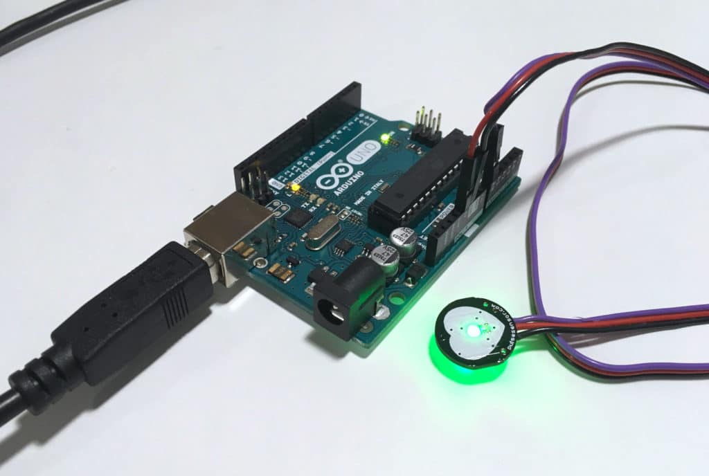
Pulse Sensor and Arduino
Fortunately there’s a nice, open-source photoplethsymography sensor available from pulsesensor.com, complete with example projects and sample code. It has a single green LED and a photodiode, in addition to some analog circuitry. It outputs an analog signal which correlates to the amount of blood that’s detected; more blood flow, higher values. This actually means that the signal is the inverse of the amount of light received, since more light is absorbed when blood flow is higher. You can read more about the pulse sensor on the open hardware page on their website.
Since the pulse sensor hardware is an analog signal, we also need a way to convert the signal into something a standard laptop can understand. Most modern microcontroller platforms come with built-in analog-to-digital converters; devices which take an analog signal and transform it into a digital number. Many microcontrollers also have built-in USB functionality, so we can then get the number from the ADC onto our laptops for the next step of their journey.
The Arduino platform is an easy-to-use set of standards and software that let you get up and running quickly with a microcontroller, and there is already code available for reading the pulse sensor. Arduinos come in a number of form-factors and capabilities, and many Arduino-compatible boards are a great fit for this application. For the rest of this post, we’ll use the now-classic Arduino Uno R3 as an example, but you could use any board you like. Just make sure it has a built-in ADC and that you have a way of getting the data to your laptop, either through built-in USB or another connection.
The Arduino measures the voltage coming from the pulse sensor at very small intervals, waiting 1/10th of a second between each measurement. This interval is defined in the Arduino sketch, but we won’t need to change it, as it gives us a good enough resolution to see individual heartbeats.
Prior to the workshop, the pulse sensors were connected to the Arduinos, which were pre-loaded with the sketch from the Getting Started project, which lights up the Arduino’s built-in LED and outputs serial data based on the readings collected from the sensor.
Software
We also needed something that can read the data from the USB connection and pass it along. For that, we’ll be using a simple python script, relay.py along with the pyserial library.
After reading from the serial port, the script adds some metadata and forwards the measurement to Telegraf, which will then handle the connection with InfluxDB. We could also have used the influxdb-python library, but the additional capabilities of Telegraf make it a valuable tool in the time series toolbox. Telegraf is a collection agent with a plugin-based architecture, and there are nearly 140 plugins available that handle various inputs, outputs, processing and aggregation. We used one of those plugins for the workshop: the versatile socket_listener, which listens over UDP or TCP for incoming data in any of the formats which Telegraf can parse.
Finally, we used an instance of InfluxDB and Chronograf running on a virtual machine in the cloud to store and visualize the data from all attendees.
Attend...
We’ll be running the workshop again, both at Time Series Meetups and at other events around the country. The next workshop is scheduled for next Wednesday at the Time Series Denver meetup.
If you’re interested in having us run the workshop at your organization, you can always reach out to us on Twitter @InfluxDB.
...or Organize!
Hopefully, some of you will be interested in running this workshop yourself! If that’s you, we’d love to hear from you, and offer whatever support we can. Get in touch!
