Streaming Time Series with Jupyter and InfluxDB
By
Anais Dotis-Georgiou
updated December 14, 2025
Product
Use Cases
Developer
Navigate to:
Jupyter Notebooks are wonderful because they provide a way to share code, explanations, and visualizations in the same place. Notebooks add narrative to computation. The cells compartmentalize steps and reduce the fear or hesitation associated with editing code. In this way, notebooks act as an invitation for experimentation.
Today, I want to extend that invitation and apply it to InfluxDB. In this post, we’ll learn how to query our system stats data from InfluxDB v2.0 using Flux. Then we’ll display the results in real time in a Jupyter Notebook.
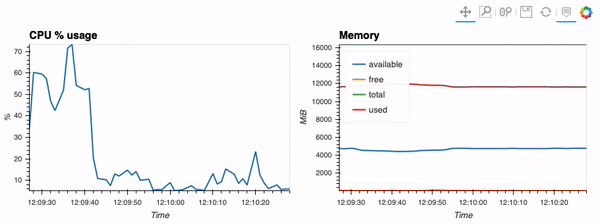 <figcaption> The type of visualization that we’ll be performing via hvPlot, Streamz, RxPY. The notebook that accompanies this tutorial can be found here.</figcaption>
Imports and connection
First, we must import our dependencies:
from datetime import timedelta
from typing import List

import hvplot.streamz
import pandas as pd
import rx
from rx import operators as ops

from streamz.dataframe import Random, DataFrame
from streamz import Stream
from influxdb_client import InfluxDBClient
Next, we must establish a connection. If you’re running InfluxDB Cloud on AWS Oregon, here’s how to do that:
client = InfluxDBClient(url='https://us-west-2-1.aws.cloud2.influxdata.com', token='my-token', org='my-org')For AWS Frankfurt, it’s:
client = InfluxDBClient(url=https://eu-central-1-1.aws.cloud2.influxdata.com', token='my-token', org='my-org')And for Google Cloud Iowa, it’s:
client = InfluxDBClient(url='https://us-central1-1.gcp.cloud2.influxdata.com', token='my-token', org='my-org')Finally, if you’re running InfluxDB open source locally, here’s how to connect:
client = InfluxDBClient(url='http://localhost:9999', token='my-token', org='my-org')Source Data function
This function is the meat of this notebook. It uses the Pandas functionality query_data_frame(), of the client to return data as a dataframe, auto_refresh, specified by the user. The function works by appending the user’s Flux query, the tail Flux query, to the beginning Flux query, as specified by source_data().
def source_data(auto_refresh: int, query: str, sink: Stream):
    rx \
        .interval(period=timedelta(seconds=auto_refresh)) \
        .pipe(ops.map(lambda start: f'from(bucket: "my-bucket") '
                                    f'|> range(start: -{auto_refresh}s, stop: now()) '
                                    f'{query}')) \
        .pipe(ops.map(lambda query: client.query_api().query_data_frame(query, data_frame_index=['_time']))) \
        .pipe(ops.map(lambda data_frame: data_frame.drop(columns=['result', 'table']))) \
        .subscribe(observer=lambda data_frame: sink.emit(data_frame), on_error=lambda error: print(error))
    pass
Generating the Auto Refreshing DataFrame
Create the tail Flux query:
cpu_query = '|> filter(fn: (r) => r._measurement == "cpu") ' \
            '|> filter(fn: (r) => r._field == "usage_user") ' \
            '|> filter(fn: (r) => r.cpu == "cpu-total") ' \
            '|> keep(columns: ["_time", "_value"])'
Generate the Auto Refreshing DataFrame with source_data(). This will refresh every five seconds, but you can change it to suit your needs:
cpu_sink = Stream()
cpu_example = pd.DataFrame({'_value': []}, columns=['_value'])
cpu_df = DataFrame(cpu_sink, example=cpu_example)

source_data(auto_refresh=5, sink=cpu_sink, query=cpu_query)
Creating the visualization using hvPlot and Streamz:
Now it’s time to create some charts. To do this, import the bokeh DatetimeTick formatter, for displaying datetime values nicely across a range of scales, and specify each scale property:
from bokeh.models.formatters import DatetimeTickFormatter

# Time formatter
formatter = DatetimeTickFormatter(
    microseconds = ["%H:%M:%S"],
    milliseconds = ["%H:%M:%S"],
    seconds = ["%H:%M:%S"],
    minsec = ["%H:%M:%S"],
    minutes = ["%H:%M:%S"],
    hourmin = ["%H:%M:%S"],
    hours=["%H:%M:%S"],
    days=["%H:%M:%S"],
    months=["%H:%M:%S"],
    years=["%H:%M:%S"],
)
Next, generate the hvPlot:
cpu_df.hvplot(width=450, backlog=50, title='CPU % usage', xlabel='Time', ylabel='%', xformatter=formatter)Jupyter visualizations, TensorFlow forecasts, and more with the InfluxDB v2.0 Python Client
Forecasting with TensorFlow, forecasting with Prophet, and multiprocessing writes are just some of the fun things that have been happening with the InfluxDB v2.0 Python Client recently. I hope this tutorial and implementation is on par with the rest! As always, if you run into hurdles, please share them on our community site or Slack channel. We’d love to get your feedback and help you with any problems you run into.
