The Algorithm That Ties Together Google Maps and InfluxData's Giraffe
By
Anais Dotis-Georgiou
updated December 14, 2025
Product
Use Cases
Developer
Navigate to:
One of the best parts about being a developer advocate is being able to share the developer’s work with the community. Working at InfluxData also means the code, projects or ideas that I blog about come from exceptional engineers who, like any good coding magicians, have several tricks up their sleeve. Today, I describe in detail one simple but important trick: the algorithm used in Giraffe, a React-based visualization library used to implement the InfluxDB Cloud 2.0 user interface (UI).
One algorithm, two types of visualizations
What do Google Maps and InfluxData’s Giraffe have in common? The implementation of the Ramer-Douglas-Peucker Algorithm (RDP Algorithm). As a point-reduce algorithm, it represents a complex line, with fewer points in a visually proper way.
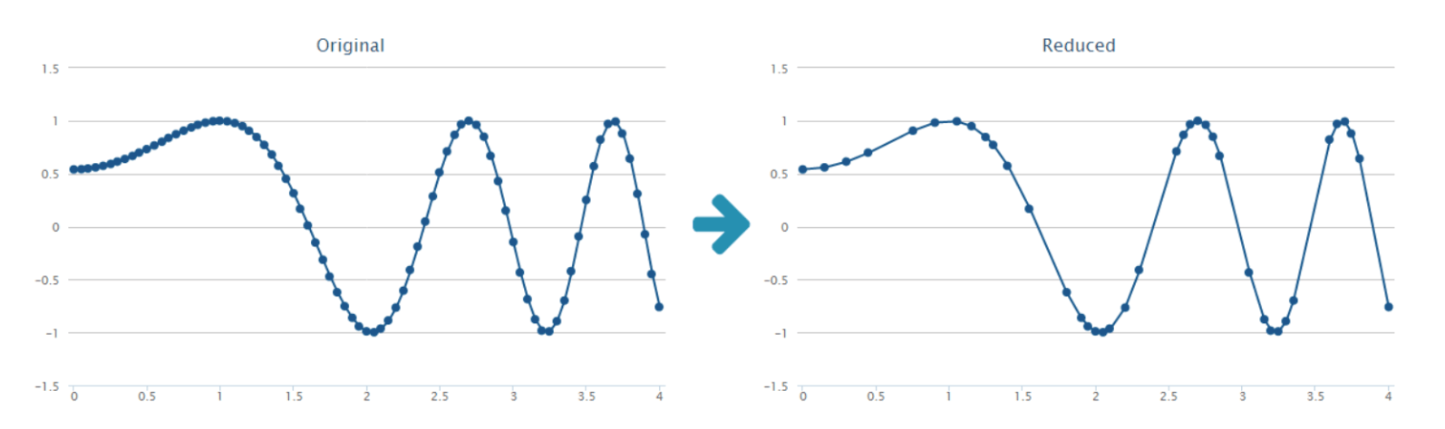 <figcaption> Original dataset (right) and reduced output (left) from Ramer-Douglas-Peucker Algorithm. Image from NAMEKDEV.</figcaption>
Why it's useful
It wasn’t until I learned about this algorithm that I ever even thought about asking the question: “How does Google Maps render the maps so quickly on my browser?” Maps contain millions of points of geospatial data, but the visualization of this data only uses several thousand pixels.
Painting every point on the map is redundant and computationally exhaustive. The RDP algorithm is used to reduce redundant points and enable the fast rendering that I’ve come to expect with Google Maps. While this algorithm is typically used to render geospatial data, it has applications for time series data as well. Customers need to be able to query hundreds of thousands of points from InfluxDB and have Chronograf render the line plot or scatter plot quickly. The line and scatterplot below are two examples of some of the beautiful Giraffe visualizations in InfluxDB Cloud 2.0.
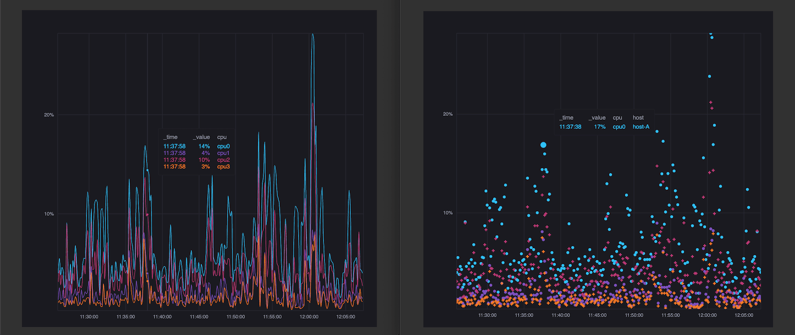 <figcaption> Please check this Storybook for more examples, including histograms and heatmaps. Or just try it out for yourself for free here.</figcaption>
How it works
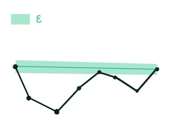
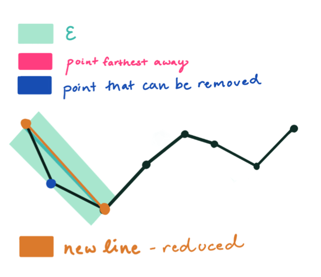
In order to apply the algorithm, the user must define epsilon, a threshold limit that is used to determine which points to keep and discard, as a value greater than 0. Take a look at this interactive visualization to understand how the value of epsilon influences the output. The RDP algorithm is recursive and has three steps.
Step One: The algorithm automatically keeps the first and last point. Next, it draws the shortest line from the bookend points.
Step Two: It determines which point is farthest from the line, and draws a new line from that point.
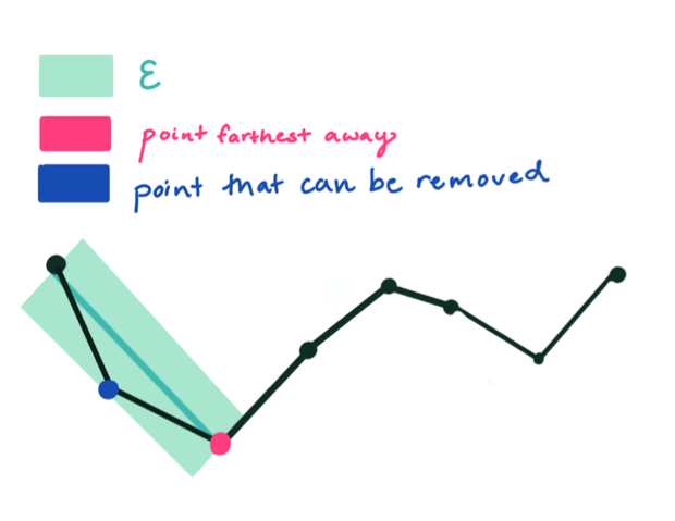
Step Three: Any points within an epsilon distance from this line will be removed. Since a point lies within epsilon, it is removed and the approximation is drawn.
That’s all there is to it. The process repeats recursively until the new approximation for the polyline has been formed.
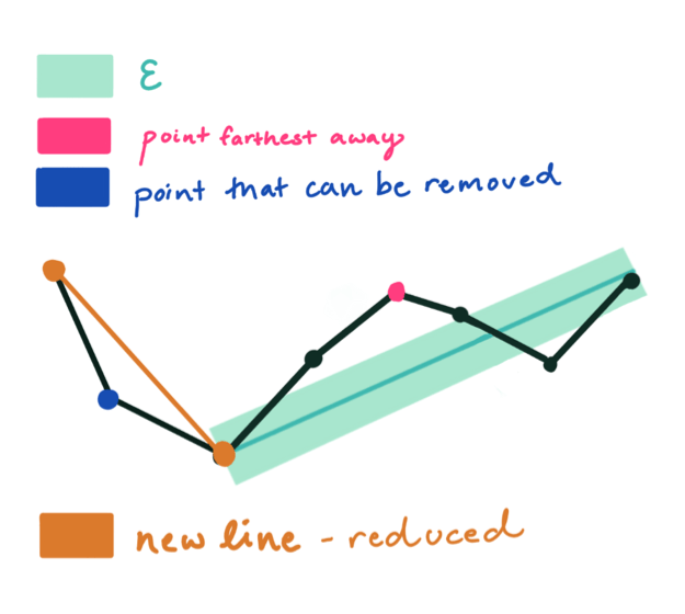
Step One repeated.
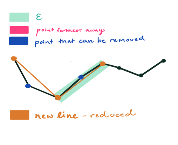
Step Two repeated.
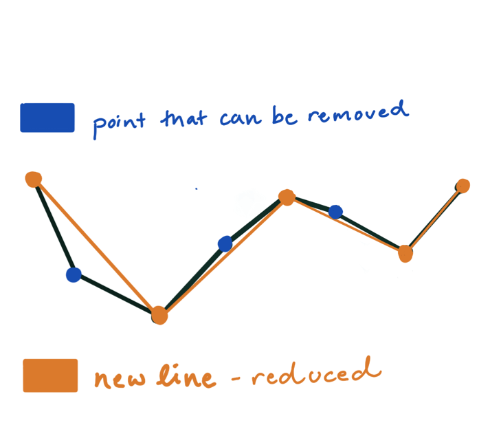
The final approximation, a cycle later, represented by the burnt orange line.
Conclusion
Being able to collect and store high-throughput time series data is part of mission-critical workloads across several industries. However, this data loses much of its value without fast-rendering and meaningful visualization solutions. After all, what’s the point of being able to collect hundreds of thousands of points at nano-second precision if the data takes minutes to render, causing you to miss important events?
The fast rendering of time series data in InfluxDB Cloud 2.0 through Giraffe enables quick analytics, real-time monitoring and immediate action. If you have any questions, please post them on our community site or Slack channel.
