Table of Contents
This article was written by InfluxDB Community member Ignacio Van Droogenbroeck. 
Ignacio is a DevOps Engineer based in Uruguay. He started a blog about ten years ago, and writes about IT Infrastructure, Cloud, Docker, Linux and Observability.
I wanted to better understand how COVID-19 has been developing in South America. As I’ve recently started playing with InfluxDB, the open source time series database, I created a dashboard of cases and deaths using InfluxData’s platform.
I usually use InfluxDB, Chronograf, Grafana, Zabbix and other similar solutions to monitor services and systems. However, until this point, I hadn’t used them to process and visualize other kinds of data. As healthcare data is time-stamped data, a time series database made sense.
For this case, I built a dashboard about COVID-19 cases and deaths in Argentina, Bolivia, Brazil, Chile, Paraguay and Uruguay. These metrics include 24 hours change in new cases. For reference, I also included a worldwide cases and death panel. The API I use is pulling real-time data from Johns Hopkins University COVID-19 tracker. This is the dashboard:
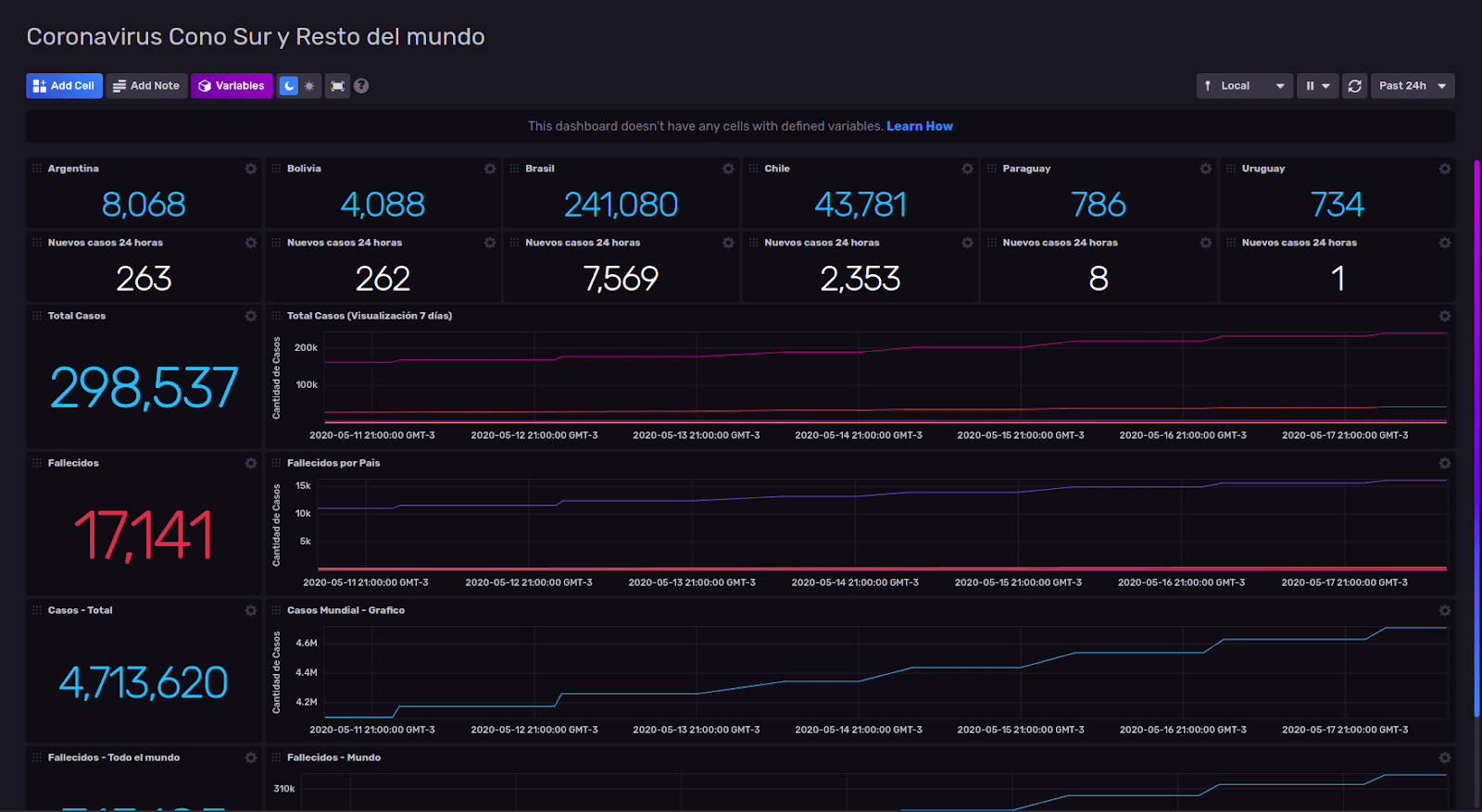 <figcaption> Chronograf dashboard showing COVID-19 cases and deaths in Argentina, Bolivia, Brazil, Chile, Paraguay and Uruguay</figcaption>
How did I build my Chronograf dashboard?
The time series data and the dashboard were stored in InfluxDB. The data is fetched using an API found on GitHub.
I built a .sh file to run a curl command specifying location against the API URL and then converted the output to JSON. For example, for Uruguay, here is the full “command”:
curl -s https://coronavirus-tracker-api.herokuapp.com/v2/locations/224 | json_ppAs previously mentioned, this command saves an executable file. I used Telegraf with input for executables to bring the result of that command to InfluxDB.
[[inputs.exec]]
  ## Commands array
  commands = [
      "sh /Users/nacho/docker/influxdb2.0-covid/uruguay.sh" ]

  ## Timeout for each command to complete.
  timeout = "30s"

  ## measurement name suffix (for separating different commands) name_suffix = "_uruguay"

  ## Data format to consume.
  ## Each data format has its own unique set of configuration options, read
  ## more about them here:
 ## https://github.com/influxdata/telegraf/blob/master/docs/DATA_FORMATS_INPUT.md data_format = "json"
Tip: It is important to specify the name_suffix, because, by default, Telegraf will save data with the suffix “_exeCollector”. When you need to process data for several “sources”, it is important to have them identifiable. ????????
I configured every single “input.exec” for each country, ran Telegraf and waited until the data started to load into InfluxDB.
I use Chronograf’s Data Explorer a lot for data analysis and visualization and to test queries. In this case, I will keep using Uruguay as an example. I now know the latest count of confirmed cases. Flux is InfluxData’s scripting language which is built into InfluxDB v1.8. For this project, I’m using the InfluxDB 2.0.0 Beta 10, and all queries were written in Flux.
Here is the Flux query:
from(bucket: "covid")
      |> range(start: v.timeRangeStart, stop: v.timeRangeStop)
      |> filter(fn: (r) => r["_measurement"] == "exec_uruguay")
      |> filter(fn: (r) => r["_field"] == "location_latest_confirmed")
I specified the graph type as “single stats” and boom! ???? The number of total cases confirmed appears on the screen. ????????
To list the number of reported cases in the last 24 hours, I created this query:
from(bucket: "covid")
      |> range(start: v.timeRangeStart, stop: v.timeRangeStop)
      |> filter(fn: (r) => r["_measurement"] == "exec_uruguay")
      |> filter(fn: (r) => r["_field"] == "location_latest_confirmed")
      |> increase()
      |> yield(name: "increase")
As before, I used the graph “Single Stat”. As I also wanted to know the total of the cases (and deaths) of the six countries, I built this query:
from(bucket: "covid")
      |> range(start: -1m)
      |> filter(fn: (r) => r["_measurement"] == "exec_argentina" or r["_measurement"] == "exec_uruguay" or r["_measurement"] == "exec_bolivia" or r["_measurement"] == "exec_paraguay" or r["_measurement"] == "exec_chile" or r["_measurement"] == "exec_brasil")
      |> filter(fn: (r) => r["_field"] == "location_latest_confirmed")
      |> mean()
      |> group()
      |> sum()
Note: While I used the mean() aggregate transformation, it should be noted that I could’ve used last(). Last() is a selector transformation which returns the last value in the table. Mean() returns the average of rows in the table. As the queried tables only contained one row, mean() worked! ?
If you’re interested in learning more about Flux, here are a few of helpful links:
As you can see, monitoring data beyond system and application metrics isn’t complicated. It does require a little time to understand how Flux works, but the results are worth the time. All of the queries built for these dashboards were created using fluxlang.
Here you can download this dashboard with configuration of Telegraf and executable files to build this same dashboard or customize with the data of your country.
Additional resources:
- If you want to know how to monitor Linux with InfluxDB 2.0 Beta (including the deployment) take a look at this article (in Spanish).
- If you're not ready to try InfluxDB v2, you can try with InfluxDB v1.8, Chronograf and Kapacitor (TICK Stack).
- I can be found on the InfluxDB Community Slack workspace @Ignacio Van Droogenbroeck
- Let me know on social media if you're using this dashboard and how. If you have any issues, I'm happy to help.
If you’re interested in learning more about Flux, register for our virtual hands-on Flux Training which is being held on June 8-9, 2020.
