Trending Aggregate Values by Downsampling with InfluxDB
By
Kristina Robinson
updated December 14, 2025
Product
Use Cases
Developer
Navigate to:
(Update: InfluxDB 3.0 moved away from Flux and a built-in task engine. Users can use external tools, like Python-based Quix, to create tasks in InfluxDB 3.0.)
InfluxDB is great at capturing many kinds of metrics and allowing end users to aggregate those metrics to custom time groupings whether you’re watching IoT devices perform at 10-minute intervals, GitHub repositories issues close over weeks, or web performance metrics over seconds. Dashboards provide that information at a glance, at precisely the intervals you’ve determined. But what about the next level? What happens when you’ve fine-tuned your dashboards, and you’ve captured the numbers you want. How do you watch them change over time? This is where downsampling and trending become critical, and can take your goals to the next level. InfluxDB makes it easy to identify what to trend, track it, and graph it.
To demonstrate how to trend values over time, this blog post will cover using the SpeedTest Community Template, to download internet connectivity speeds into InfluxDB every minute. The community template has a dashboard that shows current upload and download speeds. Then we will calculate the minimum, average, and maximum speeds over 5-minute intervals. It requires the installation of the SpeedTest-CLI executable on a local computer.
Using the SpeedTest Community Template with InfluxDB
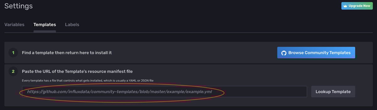
To install the SpeedTest Community Template inside InfluxDB, click Settings, Templates, and enter the following url in line 2 for the resource manifest file:
https://github.com/influxdata/community-templates/blob/master/speedtest/speedtest.yml
Configure the following environment variables: INFLUX_HOST (set to your cloud URL), INFLUX_ORG (available by clicking on the person icon), and INFLUX_TOKEN (can be generated under Settings, Tokens, must be at least a WRITE token for speedtest bucket). Environment variables can be set in either a shell resource file, exported directly (export INFLUX_ORG=InfluxData) or set using User Environment Variables (Windows OS).
Start Telegraf on your local machine with the instructions provided from the Setup Instructions popup (click Data, Telegraf, Setup Instructions).

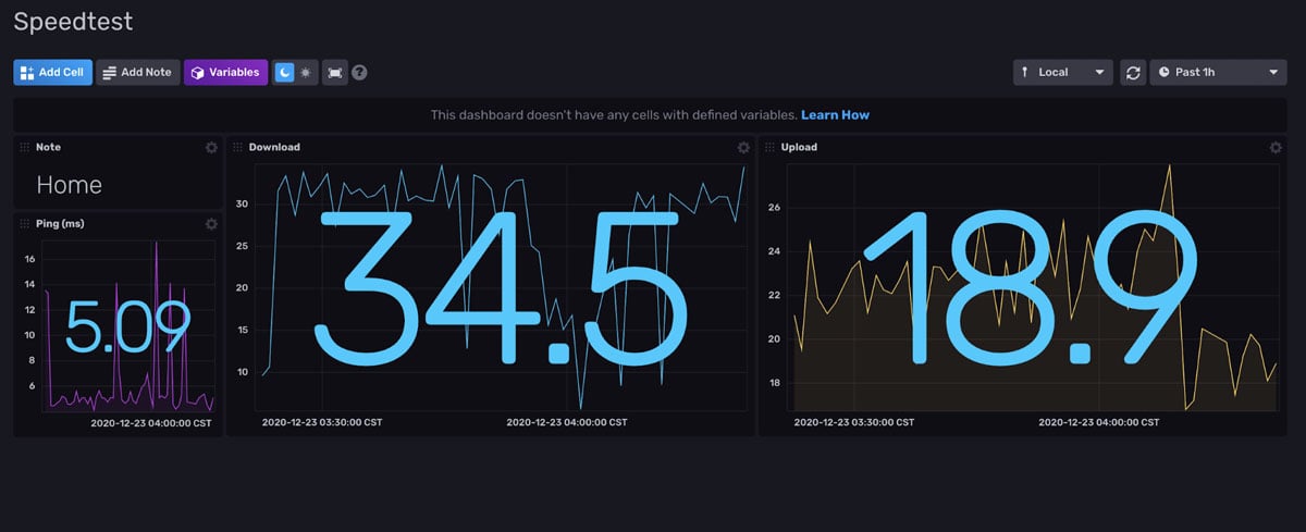
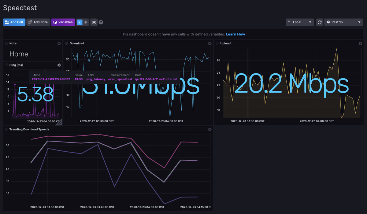
You should have a board that looks similar to this:
Access the Flux queries that generate the Dashboard Cells
We want to select the query behind the value you’re interested in trending. In this example, it’s Download Speed.
Open the dashboard labeled ‘Speedtest’.
Configure the cell labeled ‘Download’’.
The Query Editor opens, so you can select and copy the entire query:
from(bucket: "speedtest")
|> range(start: v.timeRangeStart, stop: v.timeRangeStop)
|> filter(fn: (r) => r["_measurement"] == "exec_speedtest")
|> filter(fn: (r) => r["_field"] == "download_bandwidth")
|> map(fn: (r) => ({r with _value: r._value / 1000000.0}))
|> yield(name: "last")
Visualizing multiple aggregations simultaneously with Flux in InfluxDB
The next step involves using the query that takes the existing metric, but writes it to another bucket. Or, aggregates, and then writes. Why do this? For two reasons:
- A bucket may have a limited retention policy. For example, the source data might be available for only 30 days. We want to trend beyond 30 days, so writing to a different, smaller bucket with a longer retention policy allows us to keep the trending data for longer.
- We can write aggregated data NOT available in the original bucket, but derived from the source data. This allows us to do some interesting work on the aggregated data.
As a side note here, you can visualize the aggregated data directly from a dashboard. However, this blog is intended to address aggregated data that is interesting in its own right for manipulation, and may need to be available longer than the initial source is around.
Let’s track three aggregations: min, max, and mean for the download speed.
Click on Explore (Data Explorer).
Click on the Script Editor button on the right hand side.
Paste in the copied query from above.
Calculate three new values from this query: min, max and mean. You may use any aggregation functions that InfluxDB offers, but let’s keep it simple for example purposes. To begin, assign the copied query to the DATA tag. That saves the returned dataset for later use. Next, use that DATA and use the pipe forward operator to send that data set to each of the three functions, and the yield() function to show the results. Using a different name in the yield() function will allow multiple values to be displayed per submit.
DATA = from(bucket: "speedtest")
|> range(start: v.timeRangeStart, stop: v.timeRangeStop)
|> filter(fn: (r) => r["_measurement"] == "exec_speedtest")
|> filter(fn: (r) => r["_field"] == "download_bandwidth")
|> map(fn: (r) => ({r with _value: r._value / 1000000.0}))

DATA
|> mean()
|> yield(name: "mean")

DATA
|> min()
|> yield(name:"min")

DATA
|> max()
|> yield(name:"max")
Clicking Submit at this point will show three lines of data on a Graph, or three sets of data using a Table. You may also look at the Raw Data and see the generated data. You may also further clean this data by dropping tagged values not needed long-term in the new table. You can add the ‘drop’ function to the top section and remove any fields you don’t wish to keep.
Writing a downsampling task to calculate the min, max, and mean Download Speed with InfluxDB
Now that we have the values we want to trend queried, we’re ready to write them to a new bucket. Let’s create a new bucket called ‘speedtest-downsampled’.
Change the yield() functions above to write statements, using the to() function. Additionally, use the set() function to create matching names (“min”, “mean”, “max”) in the “_field” entry for each value calculated by min(), mean() and max() functions. These hard-coded “_field” entries will be the keys (stored in _field) to lookup the values (stored in _value) when filtering and displaying graphs at the end.
Finally, let’s look at the _time column. Min() and max() both resolve to a single record, which means they each will have their own _time value (which occur at different times). However, mean() is an aggregation of many records, which will not have access to a single row’s _time value. However, to snapshot these 3 values and group them together, we want to compare them at whatever interval we choose. Therefore, let’s assign the same value to the _time field for all three aggregate rows by using the map() function. Assign a _time value to the value of when this query is executed by using the now() function and saving it to all three functions. This allows for queries based on the same _time and _measurement fields. Remember, all rows written to buckets using the to() function are required to have values for the following fields: _measurement, _field, and _time. We get _measurement from the filter function in line 3. We assigned the _field values using the set() function. And we’re now assigning a _time value.
DATA = from(bucket: "speedtest")
|> range(start: v.timeRangeStart, stop: v.timeRangeStop)
|> filter(fn: (r) => r["_measurement"] == "exec_speedtest")
|> filter(fn: (r) => r["_field"] == "download_bandwidth")
|> map(fn: (r) => ({r with _value: r._value / 1000000.0}))
|> drop(columns:["_start", "_stop", "host"])

time = now()
DATA
|> mean()
|> map(fn: (r) => ({r with _time: time}))
|> set(key:"_field", value:"mean")
|> to(bucket:"speedtest_downsampled")

DATA
|> min()
|> map(fn: (r) => ({r with _time: time}))
|> set(key:"_field", value:"min")
|> to(bucket:"speedtest_downsampled")

DATA
|> max()
|> map(fn: (r) => ({r with _time: time}))
|> set(key:"_field", value:"max")
|> to(bucket:"speedtest_downsampled")
Test this query by clicking on the Submit button. Click on Query2, from the Query Builder, select FROM ‘speedtest_downsampled’, Filter ‘exec_speedtest’ and click Submit.
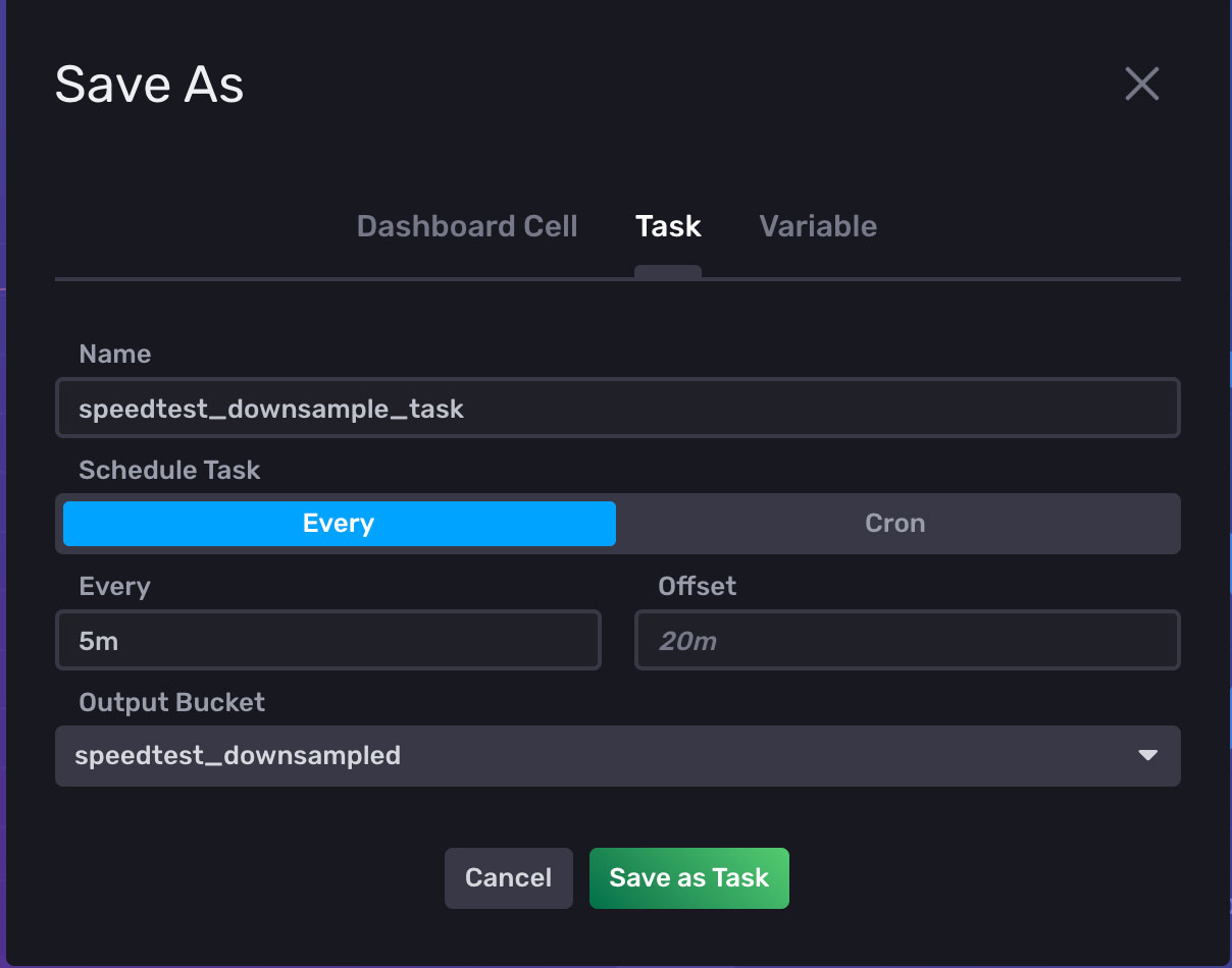
With the Query1 tab selected, click Save As. Enter a Name for the task, a frequency for how often the task should run, and select the ‘speedtest_downsampled’ bucket.
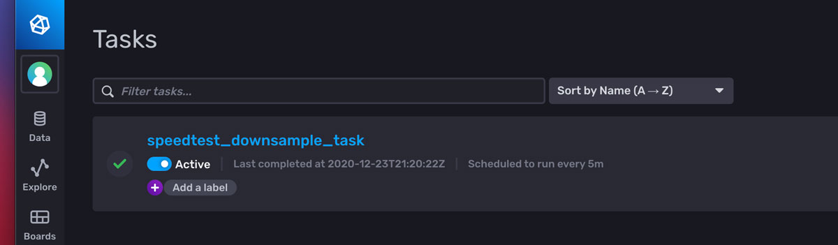
From the Tasks menu, the task can now be edited.
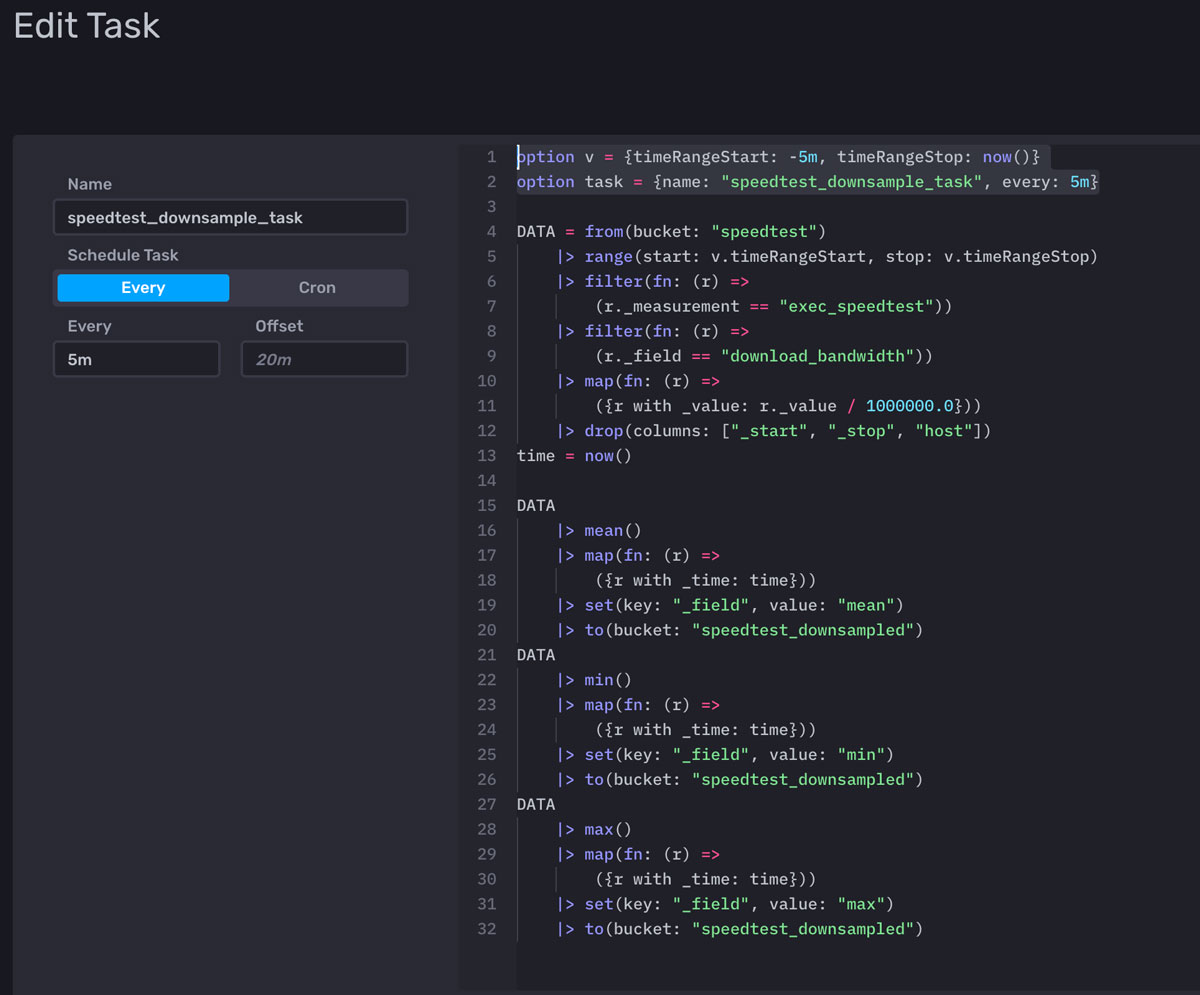
- Remove the extra to() function at the bottom of the task. This is a known issue, every task created writes to the bucket specified on the previous screen. Since the flux written in the saved queries already contain to() functions, this added statement can be removed.
- Verify the timeRangeStart at the top of the task, line 1 above. Use ms, s, m, h, d, or y to specify time intervals, or select specific dates. In this example, -5m is used for the start time to have the task gather data for the last 5 minutes.
- Verify how often the task runs by confirming the value after "every:" in the task declaration (line 2 above).
- Click Save.
Incorporating task outputs in InfluxDB dashboard
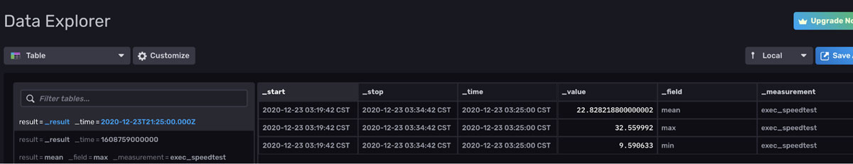
We’re almost done! The new bucket (speedtest_downsampled) will start accumulating snapshots of the 3 aggregated data values. Query them over time and add it to a dashboard. Head back over to the Data Explorer.
Open up a new Query tab and click on Script Editor. Paste in this simple query to view the ‘speedtest_downsampled’ bucket, grouped by the _time field, which works well since the aggregated fields have the same timestamp.
from(bucket: "speedtest_downsampled")
|> range(start: v.timeRangeStart, stop: v.timeRangeStop)
|> filter(fn: (r) => r["_measurement"] == "exec_speedtest")
|> group(columns : ["_time"])
Click Submit, and either using the Table Graph or the Raw Data View, view three records for each timestamp:
The best chart type for viewing up to three records at a time is the Graph (line) visualization. It requires named yield() functions to show more than one series. As discussed previously, use the Script Editor to add in named yield() functions:
DATA = from(bucket: "speedtest_downsampled")
|> range(start: v.timeRangeStart, stop: v.timeRangeStop)
|> filter(fn: (r) => r["_measurement"] == "exec_speedtest")
|> filter(fn: (r) => r._field == "mean" or r._field == "min" or
r._field == "max")
Click Save As, Dashboard Cell, select Speedtest Dashboard, and name the Cell “Trending Download Speeds” to make the new Graph visualization appear on the existing dashboard.

Adjust the location of the Cell on the Dashboard, and we are done.
Final thoughts on trending, performing multiple aggregations in one task, and visualizing the output with InfluxDB
I hope this tutorial helps you with your downsampling and visualization efforts. As always, if you run into hurdles, please share them on our community site or Slack channel. We’d love to get your feedback and help you with any problems.
Credits: Ignacio Van Droogenbroeck Anais Dotis-Georgiou
