Flux Windowing and Aggregation
By
Katy Farmer
updated December 14, 2025
Use Cases
Developer
Product
Navigate to:
Today, we’re talking about queries. Specifically, we’re talking about Flux queries, the new language being developed at InfluxData. You can read about why we decided to write Flux and check out the technical preview of Flux.
If you’re an InfluxDB user, you’re probably using InfluxQL to write your queries, and you can keep writing it as long as you want. However, if you’re looking for an alternative or you’ve hit some of the boundaries of InfluxQL, it’s time to start learning Flux.

I’ve been learning InfluxQL for the past year, so I wasn’t necessarily excited to add another DSL to my mental load. After all, we pride ourselves on developer happiness at Influx, so I want to make sure that learning Flux is a) simple and b) worth the time it takes to learn.
I’m going to test that out by learning how to window and aggregate data, which I already know how to do in InfluxQL (we’ll go over the full InfluxQL query at the end).
The Data
Because I am very hip and very cool, I’m going to use a script that routes cryptocurrency exchange information into InfluxDB. Like most people, I want to keep up on the trends in crypto so I know whether I should regret not buying any.
The Problem
We can get a lot of information about cryptocurrencies, but I only care about a few things:
- What did the seller ask for?
- What did the buyer want to pay?
- At what price did the trade occur?
Essentially, I want to know how much the actual trading price differs from expectations. If the trade price is significantly less than the seller paid, then the whole crypto nonsense is done and I can move on. If the trade price is significantly higher than the buyer wanted, then of course I understand the crypto-craze - I’ve always said that crypto is the future.
We need to figure out the best way to represent the results we want. Let’s shape the data with Flux.
The Solution
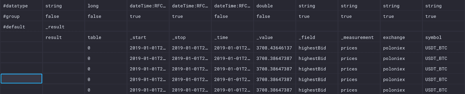
Here is a sample of the data I’m collecting in the “Raw Data” view in Chronograf:
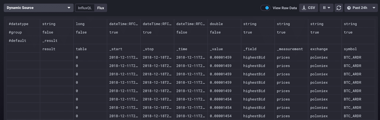
What’s important to know about this data? The top row displays the data type, which is always good to know, but especially useful in this raw data view for debugging. The second row, “group”, signifies which of the data are group keys, which is a list of columns for which every row has the same value (more about that later).
There are also a few Flux-specific columns to understand as well. Within the table schema, there are four universal columns: “_time” (the timestamp of the record), “_start” (the inclusive lower time bound of all records), “_stop” (the exclusive upper time bound of all records), and “_value” (the value of the record). In our case, the start time is 48 hours ago and the stop time is now - 48 hours.
The other columns represent the schema I have defined for cryptocurrency data: “exchange” and “symbol” are tags while “_field” and “_measurement” represent the specific field and measurement of that record.
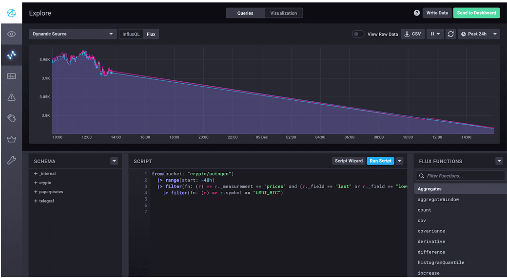
To start writing my query, I read this Flux guide, which explains the concepts of buckets, pipe forward operator, and tables. Essentially, every Flux query needs three things: a data source, a time range, and data filters.
Based on the guide, I started with this query:
from(bucket: "crypto/autogen")
  |> range(start: -48h)
  |> filter(fn: (r) => r._measurement == "prices" and (r._field == "last" or r._field == "lowestAsk" or r._field == "highestBid"))
The first line is my data source, the second is the time range, and everything that follows are data filters.
This query asks my database, “crypto”, for specific fields associated with the measurement “prices”: the last successful trade price (“last”), the lowest price a seller was willing to accept (“lowestAsk”), and the highest price a buyer would pay (“highestBid”) for the last 48 hours.
This is a good start, but the results were overwhelming. The resulting data looks the same as the sample abovebut Chronograf displays a warning: “Large response truncated to first 103K rows.”

When it comes to visualizing data, we don’t want to do unnecessary work. There are so many cryptocurrencies on the market that even limiting the data to 48 hours was still too much to parse, and definitely too much to visualize. Truth be told, I don’t care about all of the currenciesas much as I love the idea of Dogecoin, Bitcoin is the trendsetter.
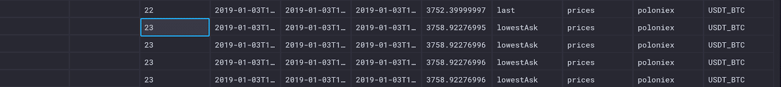
Let’s look at the same data, but only for Bitcoin.
from(bucket: "crypto/autogen")
|> range(start: -48h)
|> filter(fn: (r) => r._measurement == "prices" and (r._field == "last" or r._field == "lowestAsk" or r._field == "highestBid"))
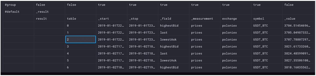
|> filter(fn: (r) => r.symbol == "USDT_BTC")These results are much more manageable. Now we can more easily examine the results. Browsing through the raw data, we can see there are three separate tables (0-2) returned by this query: one for each series.
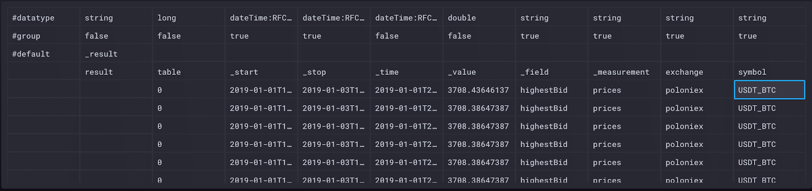
Table 0 represents the unique combination of the symbol (Bitcoin), the exchange (Poloniex), the measurement (prices) and the field (highestBid).
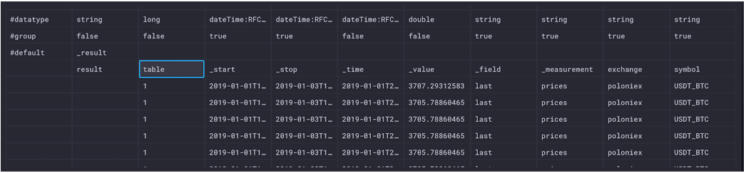
Table 1 represents the unique combination of the symbol (Bitcoin), the exchange (Poloniex), the measurement (prices) and the field (last).
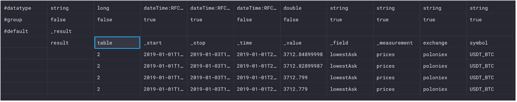
Table 2 represents the unique combination of the symbol (Bitcoin), the exchange (Poloniex), the measurement (prices) and the field (lowestAsk).
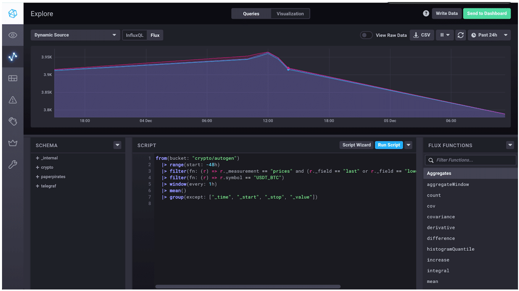
In this case, only the field is changing, so that limits the number of series. Here is what the results look like in a line graph in Chronograf.
Windowing Data
We don’t necessarily need to see every data point represented in our results, especially if we’re interested in trends and changes over time. In this case, we want to window and aggregate our data, meaning that we want to split our output by some window of time and then find the average for that window. First, I hopped over to the official Flux docs to the window() function to add the last line of this Flux query.
from(bucket: "crypto/autogen")
  |> range(start: -48h)
  |> filter(fn: (r) => r._measurement == "prices" and (r._field == "last" or r._field == "lowestAsk" or r._field == "highestBid"))
  |> filter(fn: (r) => r.symbol == "USDT_BTC")
  |> window(every: 1h)
Let’s see what that changed about our raw data.
First, although we can’t see it in the screenshots above, the “_start” and “_stop” columns have changed to reflect the time bounds. If I hover over “_start” and “_stop”, respectively, I see the following time stamps.
2019-01-03T18:00:00Z 2019-01-03T19:00:00Z
Where before our time started 48 hours in the past and stopped now (not now, but you know,now()), our start and stop times have changed to reflect the time window we specified in our query.
Following the table column, we’ve got tables 0-23. If you’re thinking that number should be higher, you’re right, but we’re missing some data due to outages. Each table represents an hour window for each unique series (just like the combinations listed under the tables above).
Now look at the difference in our line graph in Chronograf.
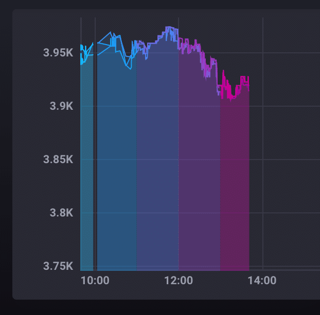
Each color in the graph represents a distinct window of time; in our case, each color represents a one-hour window. This visualization in particular helped me to understand the Flux output. Flux returns tables of data that are based on the time windowsalthough we see them visualized side-by-side, data points in different colored sections of the graph live in separate tables entirely because they are separate time series. Remember, each time series in a graph gets its own unique color, and the colors highlight the start and stop times of each series.
Aggregating Data
Aggregate functions are slightly different in Flux when combined with windowing. When we apply a function like mean() to our current query, the function is applied to each 1-hour window, reducing each of the returned tables to a single row containing the mean value. The number of tables returned remains the same, but the tables only contain one row with the aggregate.
from(bucket: "crypto/autogen")
  |> range(start: -48h)
  |> filter(fn: (r) => r._measurement == "prices" and (r._field == "last" or r._field == "lowestAsk" or r._field == "highestBid"))
  |> filter(fn: (r) => r.symbol == "USDT_BTC")
  |> window(every: 1h)
  |> mean()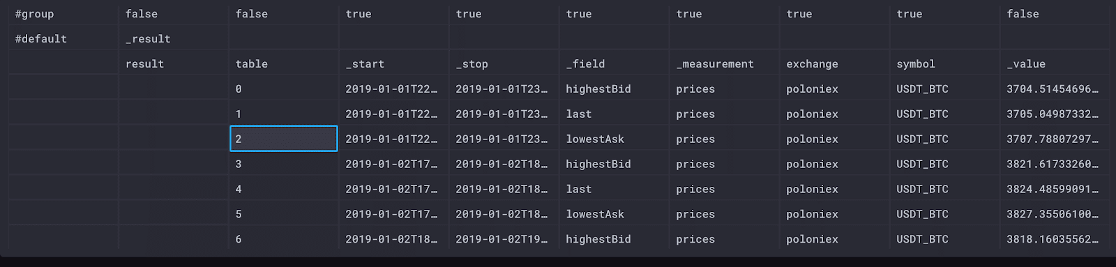
Our raw data view shows that each table is a single row of data for each field in each hour, which is good because that means that mean() did what we expected. The columns in our table are different: we no longer have a “_time” column because there’s no individual timestamp for this summary of data.
One area I had to research was the default value for mean(). When we don’t specify what we are averaging, it defaults to “_value”. Every Flux table includes a “_value” column, and when we perform an aggregate like mean, we transform the values listed there.
Now that we have all of the averages we need, we want our data back in fewer tables. In Flux, we can unwindow our data to combine relevant values by using the group() function.
from(bucket: "crypto/autogen")
  |> range(start: -48h)
  |> filter(fn: (r) => r._measurement == "prices" and (r._field == "last" or r._field == "lowestAsk" or r._field == "highestBid"))
  |> filter(fn: (r) => r.symbol == "USDT_BTC")
  |> window(every: 1h)
  |> mean()
  |> group(columns: ["_time", "_start", "_stop, "_value"], mode: "except")
We’re back to 3 tables (0-2) that give us the hourly averages for the completed trade prices, the lowest asks from sellers, and the highest bids from buyers.
This call to group() transforms our data in a few important ways. Remember when I said we would get back to group keys? This is it! By grouping data, we define the group keys. When we group by “_field” and “_measurement” (the columns left when we exclude “_time”, “_start”, “_stop”, and “_value”), we define the group key as [_field, _measurement]. In the screenshot above, both “_field” and “_measurement” list true in the group row. In practice, this means that the result of our query outputs a table for every unique combination of “_field” and “_measurement”.
This process of grouping the data and defining the group keys represents unwindowing our data.
A note about group() The syntax of the group() function has changed since the community has been using Flux. The original syntax of group() looks like this:
|> group(by: ["_field", "_measurement"])Here is what the regrouped data looks like in our Chronograf visualization.
This Chronograf visualization gives us an easy way to see the trends in the Bitcoin market for the past two days. If I had more data, I could do a full historical analysis to truly understand if I missed out on my crypto-opportunity.
A Better Query
The Flux query we’ve written does exactly what I want, but it’s a little long. When I investigated further, I found a helper function that obscures some of the more confusing logic.
from(bucket: "crypto/autogen")
  |> range(start: -48h)
  |> filter(fn: (r) => r._measurement == "prices" and (r._field == "last" or r._field == "lowestAsk" or r._field == "highestBid"))
  |> filter(fn: (r) => r.symbol == "USDT_BTC")
  |> aggregateWindow(every: 1h, fn:mean)
The aggregateWindow() function includes windowing and un-windowing the data so that we don’t have to worry about the format of the data while we’re writing our query. I love a good helper function, especially when it’s clear from the name and syntax what it’s doing. The data returned looks exactly the same, and we saved ourselves a few lines.
Summary
We’ve written the Flux query that we want - now let’s compare it to the same query written in InfluxQL.
SELECT
mean("highestBid") AS "mean_highestBid",
mean("last") AS "mean_last",
mean("lowestAsk") AS "mean_lowestAsk"
FROM
"crypto"."autogen"."prices"
WHERE
time > now() - 48h
AND
"symbol"='USDT_BTC'
GROUP BY
time(1h)
FILL(none)
This InfluxQL query is still readable, especially if you’re SQL-fluent. Given that our query isn’t too complex, the queries end up pretty similar in Flux and InfluxQL. I do particularly like using the relative time ranges in Flux because it’s more concise without losing readability.
Flux - Likes
Readability is an important part of the programming languages I choose, and Flux gets an A in this. I liked being able to parse a query, even if I’m not a Flux expert. The functional nature of Flux lets me keep transforming the returned data as much as I need, which is especially convenient given the large datasets we’re dealing with.
Also, because the technical preview is already out, I can ask other users the problems and solutions they’ve run into on the community site.
Flux - Dislikes
There’s really only one dislike for me, and that was understanding the shape of the data being returned. It took me a while to understand how the tables in the returned data were being formed, and why they were coming back as tables. That being said, I don’t think this is a flaw in Flux, but rather in the conceptual overviews I read beforehand. Understanding the table structure is vital to writing good Flux queries, so we need to make sure there are more resources available to explain the concepts.
Conclusion
We did it! We wrote a useful Flux query that allows us to compare the asking and selling prices of Bitcoin. The good news is that I think it’s okay that I don’t have any cryptocurrency funds. Probably. Unless the value increases again. While we may not have come to any meaningful conclusions about cryptocurrency, using Flux to explore my data allowed me to easily make meaningful comparisons.