Table of Contents
Giraffe is the open source React-based visualization library that’s used to implement InfluxDB’s v2 UI. It employs clever algorithms to handle the challenge of visualizing the incredibly high volume of data that InfluxDB can ingest and query. We’ve just published documentation describing how developers can take advantage of this library and I’ve tried to create a companion tutorial to further illustrate the power of this library. This tutorial demonstrates how you can use Giraffe in conjunction with the JavaScript Client to build a line graph in the browser. The repo that accompanies this tutorial can be found here.
Tutorial assumptions
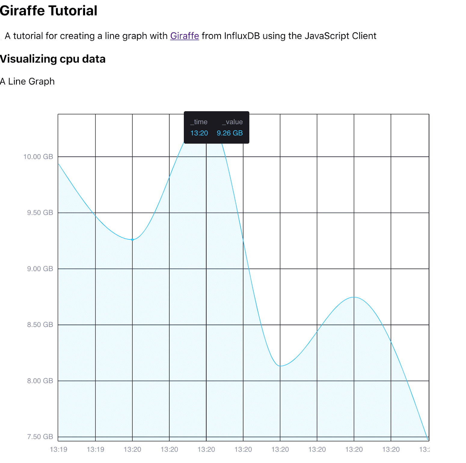
This project was initialized with Create React App. The emphasis of this tutorial is on how to use Giraffe with the JS client and not how to create a React App. For this reason, I am generating a very simple static site. We will be building a line graph that visualizes RAM usage from our local machine. Our site will look something like this:
This tutorial assumes that you have configured Telegraf to gather system stats from your machine. This tutorial also assumes that you are fairly familiar with the JavaScript Client and know how to query InfluxDB. If you’re new to the Client, I encourage you to take a look at this Getting Started with the JavaScript Client guide.
Boilerplate
We need to import our components.
import React from "react";
import { useState } from "react";
import "./App.css";
import { InfluxDB} from "@influxdata/influxdb-client";
import {
 Plot,
 timeFormatter,
 NINETEEN_EIGHTY_FOUR,
 fromFlux,
} from "@influxdata/giraffe";
We also need to specify our valueAxisLabel, or the units of our visualization. This will be used in Step Two below as part of the line graph configuration.
const valueAxisLabel = "GB";Step One: Query InfluxDB and convert the result
Create the fetchData function that queries our instance and stores the result in memory. It also converts the raw Flux Object result from the client into an annotated CSV - the input format for Giraffe. To get started, specify all the Authorization parameters for the client as well as our desired Flux query.
const fetchData = (setMethod, setFetching) => {
 const url = "http://localhost:9999";
 const bucket = "my-bucket";
 const org = "my-org";
 const token = $my-token;
 const influxDB = new InfluxDB({
   url,
   token,
 });
 const fluxQuery =
 'from(bucket: "my-bucket")\
 |> range(start: -5m)\
 |> filter(fn: (r) => r["_measurement"] == "cpu")\
 |> filter(fn: (r) => r["_field"] == "usage_system")\
 |> filter(fn: (r) => r["cpu"] == "cpu-total")'
 console.log("\n*** QUERY ***");
 const queryApi = influxDB.getQueryApi(org);
The queryLines method executes the query and receives result lines (including empty and annotation lines). Create an empty csv string, iterate through the lines, and push the lines to it.
let table = [];
 let csv = "";

 queryApi.queryLines(fluxQuery, {
   next(line) {
     csv = `${csv}${line}\n`;
   },

   error(error) {
     setFetching("error");
     console.log("QUERY FAILED", error);
   },
   complete() {
     console.log(table);
     console.log("csv");
The fromFlux() function converts a series of Flux annotated CSV responses to a single, flattened “Table”, which Giraffe can convert to a visualization.
console.log(csv);
     setMethod(fromFlux(csv));
     setFetching("fetched");
   },
 });
};
Additionally, create an empty table array, before creating the csv variable. This will be updated once the client has finished the query and has fetched the result.
Step Two: Update the table constant and create a config for the visualization
The state handling will be dealt with by our function default.
export default (props) => {
 console.log("Updating Component");
 console.log(props);
We will update the table once we have fetched the data.
const [table, setTable] = useState(null);
 const [fetching, setFetching] = useState("unfetched");
 let plotGraph = <p> Pending </p>;
 let scatterGraph = <p> Pending </p>;
 switch (fetching) {
   case "unfetched":
     console.log("unfetched");
     setFetching("fetching");
     fetchData(setTable, setFetching);
     break;

   case "error":
     console.log("error");
     plotGraph = <p> Error </p>;
     scatterGraph = <p> Error </p>;
     break;

   case "fetching":
     console.log("fetching");
     plotGraph = <p> Fetching </p>;
     scatterGraph = <p> Fetching </p>;
     break;

   case "fetched":
     console.log("fetched");
     console.log(table);
Now we can create our line graph config. Every visualization requires a generic configuration. Corresponding layer types specify the visualization type (i.e. line, histogram, scatter etc.).
const lineConfig = {
       table: table.table,
       valueFormatters: {
         _time: timeFormatter({
           timeFormat: "UTC",
           format: "HH:mm",
         }),
         _value: (val) =>
           `${val.toFixed(2)}${
             valueAxisLabel ? ` ${valueAxisLabel}` : valueAxisLabel
           }`,
       },
       xScale: "linear",
       yScale: "linear",
       legendFont: "12px sans-serif",
       tickFont: "12px sans-serif",
       showAxes: true,
       layers: [
         {
           type: "line",
           x: "_time",
           y: "_value",
           fill: [],
           position: "overlaid",
           interpolation: "monotoneX",
           colors: NINETEEN_EIGHTY_FOUR,
           lineWidth: 1,
           hoverDimension: "auto",
           shadeBelow: true,
           shadeBelowOpacity: 0.1,
         },
       ],
     };
Important config parameters explained:
_time: Use the timeFormater() to format the time value in a table as a user-facing string._value: Format the value of the data we want to plot to specify the number of decimal points to include in our axes and data points.xScaleandyScale: Scale is the axis formatting scale."Log"is also supported.legendFontandtickFont: Define the font type.layers: A layer type. A list of layer types can be found here. Please take a look at layer defaults here.type: Specify the type of visualization you want.xandy: Specify your x and y values respectively.colors: All the colors can be found here.
Community interest in Giraffe and InfluxDB
My motivation for writing this blog post is to gauge the community’s interest in Giraffe. If you decide to explore the library, please share your thoughts, concerns, or questions in the comments section, on our community site, or in our Slack channel. We’d love to get your feedback and help you with any problems you run into!
