Grafana Dashboard Tutorial: How to Get Started
By
Community
Dec 08, 2023
Developer
Getting Started
Navigate to:
Grafana is an open-source web application for visualizing data. You can query your data, create visuals, and receive alerts to better understand what you have. Some people think of Grafana as a Kubernetes-only tool, but in reality, it’s simply a data visualization tool that became popular within the Kubernetes ecosystem, especially when combined with Prometheus.
In this post, I’ll focus on a very specific part of Grafana: the dashboards. To do so, I’ll use Grafana’s tutorial environment setup to help you get up to speed and learn about dashboards using Docker Compose.
Before I get into the specifics, let’s explore what you can do with Grafana dashboards.
What Does a Grafana Dashboard Do?
Dashboards, in general, are a visual representation of data. Raw data itself might not tell you much, but when you use a dashboard you can glean valuable information. Say, for example, you’re hosting a site about the latest gaming industry news. From time to time, you get customer complaints that the site is not loading or is taking too much time. How would you identify the problem? One way could be logging into the servers and reading some logs. That’s doable if you only have a few servers or containers. But when you have dozens, you need a better approach.
Grafana dashboards can help you better understand what’s happening in advance. You can configure Grafana to use any data source you want, and the dashboards will help you with a visual representation so you can fix problems more rapidly. You can also annotate events and explain what happens after certain actions, like a recent release or a marketing campaign. I’ll show you how to do that in the next section.
How Do I Use a Grafana Dashboard?
Setting up
Let’s give you some hands-on experience using the sample application from Grafana. To do so, you need to have Git, Docker, and Docker Compose installed. Then clone the repository to have all the files locally:
git clone github.com/grafana/tutorial-environmentGo to the repository folder and start all the services you’re going to use. This could take a few minutes.
cd tutorial-environment
docker-compose up -d
You can now browse the news site’s sample application on localhost:8081 and Grafana on localhost:3000. Grafana’s credentials are “admin” for both the username and password. The first time you log in, you’ll need to change that password. Make sure you can browse both services and news, as that’s what you’ll use as the data source for the dashboard.
Importing data
Before you get started creating dashboards, you’ll need to let Grafana know which data sources you want to use. You can add multiple types of data sources, such as time series databases, logging and document databases, distributed tracing, SQL databases, and cloud providers. One common data source is Prometheus, which we’re going to use that one today.
Note: You can easily send Prometheus data to InfluxDB using Telegraf plugins. This enables you to combine Prometheus data with other data sources to create a more holistic view of your data sources. InfluxDB works with Grafana natively, enabling you to query and visualize all your data in one place.
In Grafana, click on the sidebar to open the settings menu, then click “Data sources” below “Connections.”

Next, click the “Add data source” button, then click “Prometheus.” In the “Prometheus server URL” text box, enter: http://prometheus:9090. Scroll down to the bottom, then click the “Save & test” button.

You’re going to use Prometheus to get metrics such as latency and the number of requests from the news site. To enrich your dashboards, you can add another data source to get logs from the news site.
Go to the “Data sources” page again and click the “Add new data source” button, scroll down a little bit, and click “Loki” in the “Logging & document databases” section.
Once there, enter http://loki:3100 in the URL text box. Scroll down to the bottom, then click the “Save & test” button.

Open the news site’s sample application to simulate traffic by adding new links, voting, or simply refreshing the browser. We need to get some fresh data to see something in the dashboard.
Creating a dashboard
Now that you have two data sources and have generated some data from the news site, you can visualize the data to get more insights about what’s happening. Go back to the Grafana site and click “Dashboards” in the sidebar menu. Next, click the “New” button in the top-right corner and select “New Dashboard” in the drop-down list. Now click on the “+ Add visualization” button. You should see the two data sources you added earlier, Prometheus and Loki. Add the metrics data source first by clicking the “Prometheus” option.
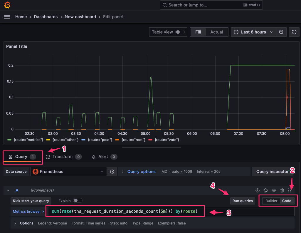
The screen below has several buttons, text boxes, and a big section where you should see a graph. Configure this screen step by step to create your first visualization of the Prometheus data. Click the “Query” tab below the graph and then click the “Code” option on the right side of the screen. Next, in the “Metrics browser” text box, type the following query:
sum(rate(tns_request_duration_seconds_count[5m])) by(route)Now click the “Run queries” button—you should see a visual representation of the query on the screen.
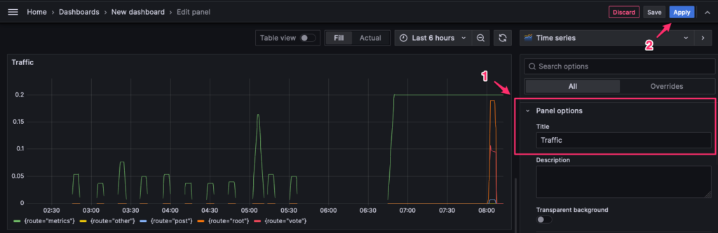
You can customize the title of the graph on the right side of the screen. Go to the “Panel options” and type a title like “Traffic” in the “Title” text box. Notice that the visualization title is different now. To finish creating your dashboard, click the “Apply” button in the top-right corner.
Annotating events
Grafana dashboards allow you to add annotations. This tool is especially useful when things go wrong. You can create annotations automatically or manually. You can add annotations every time you release a new version of the site or a marketing campaign starts. With annotations, if the latency decreases, you will have more context as to why.
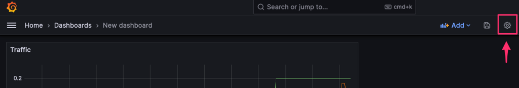
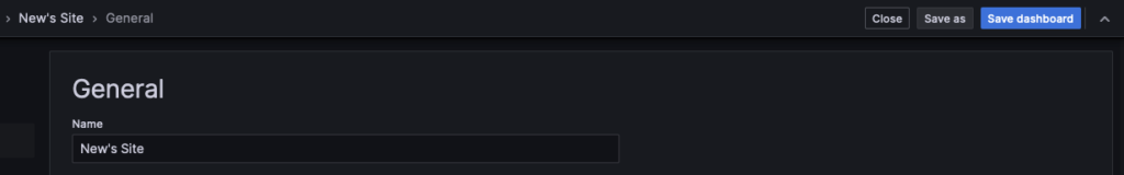
Let’s suppose you initiated a deployment a few minutes ago and want to manually add this annotation to the dashboard. Before you can annotate events, you need to save the dashboard. To do so, click on the gear icon in the dashboard header.
 Next, type a name for the dashboard in the “Name” text box, then click the “Save dashboard” button.
 Click anywhere in the graph from the dashboard, then click the “Add annotation” button.

Add a description and a tag, then click the “Save” button.

If you hover your mouse over the base of the annotation, in the line above the x-axis, you’ll see the annotation. Every time something happens while there’s an annotation in the dashboard, you’ll get extra context about what’s happening on your application. This information can help you make decisions, such as rolling back or quickly pushing a fix.
When you’re done playing with Grafana, you can stop all the container services with the following command:
docker-compose down -v
Wrapping Up
Creating dashboards in Grafana is straightforward. Make sure you have the data sources you need, then build queries that allow you to visualize this data. Adding multiple data sources can help you enrich your dashboards and you can store all this data in InfluxDB. Moreover, when you annotate events, it becomes easier to find the root cause of problems and resolve issues faster.
This post was written by David Snatch. David is a cloud architect focused on implementing secure continuous delivery pipelines using Terraform, Kubernetes, and any other awesome tech that helps customers deliver results.
