MySQL Metrics Part I: Throughput
By
Katy Farmer
updated December 14, 2025
Developer
Product
Navigate to:
In a perfect world, this blog post is about MySQL metrics and monitoring throughput in MySQL. In reality, this post is about understanding data visualizations, querying appropriately, and failing constantlyas a byproduct, I’m also monitoring throughput in MySQL. Let’s get started. (Note: If you’re only interested in throughput and you don’t care about my failures, skip the sections labeled Failure.)

There are lots of reasons you might want to monitor throughputmaybe you have slow load times, dropped connections, server crashes, or you’re just curious. But before you have a problem, you can monitor throughput to gain insight into your traffic.
As always, I’ll be using my hobby project, Blogger (again, not the working, perfectly usable Blogger.com, but my own sad state of Blogger). I can talk about the ways in which monitoring is useful in theory all day, but that doesn’t mean I can lift an X-Wing with The Force. Let’s dig in to how to start monitoring throughput.
You can choose any tool you like to visualize datayou could even use none and use the terminal and your big ol’ brain to analyze data. I’m going to use Chronograf in my examples because it’s the tool I’m most familiar with.
Setup
I’m using a combination of Telegraf and InfluxDB to send metrics to Chronograf. You can reference the “Configuring Telegraf” section of this blog post if you need help setting up the MySQL input plugin for Telegraf. The flow looks like this:

Visualization
In Chronograf, I’ll be using the Data Explorer to, well, explore the data.
I select my database from the DB list (mysql-monitor) and select the mysql measurement from the list. This gives us all of the available metrics from MySQL, which is a lot. A lot is an understatement. If I were Scrooge McDuck, I could swim in a vault filled to the brim with MySQL metrics. If each metric was a folding chair, you’d be wishing it was Wrestlemania.

You get the idea.
We’re focused on throughput, so a good place to start is Questions and Queries. In my previous post, we discussed how these can reflect the volume of traffic. It can also serve as a test that everything is up and running, at least.
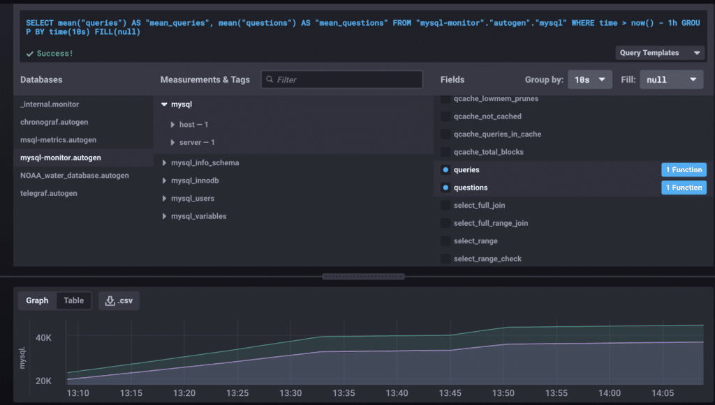
This graph shows the past hour, and we can see a gradual incline. To be honest, this data, even presented nicely like so, doesn’t mean much to me. Is having 40K queries good or bad? Data requires context.
Enter Failure #1
Looking at the graph, we can see that queries tops out around 40K, but when I was totaling questions and queries for my previous post, they were at 282590 and 294564, respectively. At the time, those numbers weren’t useful to me, but now that I have more data points from my monitoring process, I have evidence of an event.
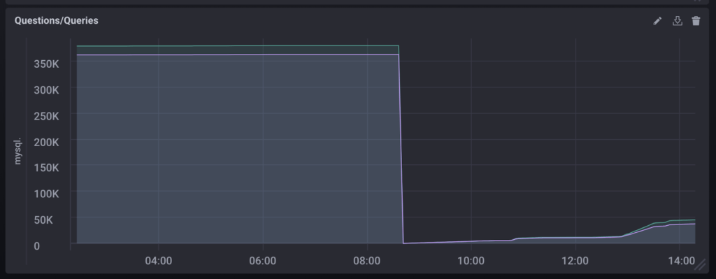
It’s a good news/bad news situation. The good news: good monitoring practices have clued me in to a possible problem. The bad news: what in the WHAT happened at 8:30? Both questions and queries were reset to zero.
Queries
Let me say that I wasn’t sure this was worth pursuing. After the drop, the system seemed to return to normal behavior. However, I find it easier to learn from mistakes than normal behavior. And if we have no context, no points of comparison, then we don’t know what normal behavior even looks like. So let’s get abnormal.

Investigation
Now, questions and queries were really just a sanity check. They give us a vague idea of traffic, but they don’t give us detail. We see that waterfall of awful, but it’s very generalized. Zooming in on the data may clue us into what caused the drop, and reads/writes per second are the most likely to tell us if throughput caused the drop.
Here’s the problem: I don’t know how to find reads/writes per second. But I have the Influx Query Language docs and the internet, so I’m not without options.
To begin, I did what we all do: I googled it. There were plenty of results, but the most helpful, and ultimately, correct, answer was in the InfluxDB issues on GitHub. Truth time: I sped through the conversation, copied the query, made some very slight changes, and popped it into my Chronograf Data Explorer.
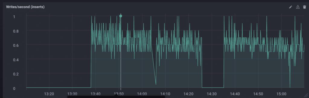
Failure #2
This is a personal failure. I have a working query, and I can easily modify it to work for writes, as you can see above. But using code I don’t understand is not the way forward. I feel like Yoda would be disappointed in me, and that’s a sign I need to re-evaluate my actions. If I’m going to use this query, I’m going to understand it.
Here’s the query:
SELECT non_negative_derivative(first("commands_select"), 1s)
AS "mean_commands_select"
FROM "mysql-monitor"."autogen"."mysql"
WHERE time > :dashboardTime: -1h
GROUP BY time(10s) FILL(null)
It’s just so many things. InfluxQL is SQL-like, so I’m relying on my knowledge of SQL (which is like a solid B+).
SELECTThis is pretty self-explanatory. Everything that follows the SELECT statement comprises the thing we would like to be returned.
SELECT non_negative_derivativeListen to that. That’s the sound of a developer advocate starting to crack as she realizes she only made it two words into the query before all momentum was lost.

Not to worry. Let’s go find the docs.
From the entry on non_negative_derivative:
"Returns the non-negative rate of change between subsequent field values. Non-negative rates of change include positive rates of change and rates of change that equal zero."
Rate of change makes sense. That is, in fact, what we’re trying to measure with reads per second: the rate of change in number of reads from one second to the next.
SELECT non_negative_derivative(first("commands_insert"), 1s)In InfluxDB, FIRST refers to the entry with the oldest timestamp. That’s the kind of clear definition I can understand. In this case, we want the first entry in commands_insert (which is one of our write metrics).
The second argument (1s) specifies to the derivative function the rate at which we want to measure change. If we wanted to measure writes every ten seconds, we could replace this with 10s.
SELECT non_negative_derivative(first("commands_insert"), 1s)
AS "writes per sec"
FROM "mysql-monitor"."autogen"."mysql"
WHERE time > :dashboardTime: -1h
AS provides us an alias, which is useful if we need to refer to this function again later.
FROM specifies the database we’re querying. The “autogen” portion is a default added by Chronograf.
WHERE is the qualifier that says: only bring me results that meet these criteria. In our case, we only want to see entries where the time field is greater than the variable :dashboardTime: (a variable generated by Chronograf that defaults to one hour) minus one hour. This was a bit trickier to understand, but my current belief is that it simply changes the window of time you see in your results. Subtracting one hour from :dashboardTime: means there is no offset.

SELECT non_negative_derivative(first("commands_insert"), 1s)
AS "writes per sec"
FROM "mysql-monitor"."autogen"."mysql"
WHERE time > :dashboardTime: -1h
GROUP BY time(10s) FILL(null)
And finally we’ve arrived at GROUP BY. Essentially, we’re making ten-second buckets and then applying all of the previous functions. For every ten seconds, get the first entry and find the rate of change between each second.
FILL is an option we can set to tell the query what to do in the event of missing data. Null is a good option because it doesn’t skew the data.
Results
Something interesting to note is that using the non_negative_derivative actually masks the event we’re investigating. Replacing non_negative_derivative with derivative results in the following graph.
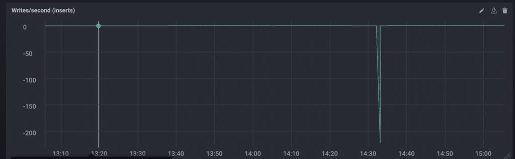
Yes, that says -200. The rest of the data is so skewed by that drop that it looks relatively stable (it ranges from about 0-8 writes/sec). More truth: this is when I realized that I had restarted my laptop to install updates earlier in the day. Running locally really came back to kick me in the Blogger.
Even so, measuring the reads/writes per second with and without the negative values showed me two things: 1) there was still only a single point of anomalous data and 2) the reads/writes were very consistent outside when that point was removed.
Patterns in the data mean more to me than individual values, so knowing that Blogger has a regular heartbeat means it’s working as intended.

Conclusion
Despite the many failures and distractions along the way, throughput proved to be a valuable tool for monitoring as well as investigating my data. Visualizing that data helped me see trends and crazy events, as well as helping me determine if I should care about those things.
In the next article, we’ll look at execution time, and final truth: I hope it’s less emotionally exhausting than throughput.
