Chronograf 1.5 and Kapacitor 1.5 Released
By
Russ Savage
updated December 14, 2025
Product
Use Cases
Developer
Navigate to:
Chronograf started out a year and a half ago with one goal: be the user interface for the TICK Stack. Our goal hasn’t changed, but the way our users are leveraging our stack for metrics and events is evolving, and that means we’re evolving too.
Modern Platform for Metrics and Events
Metrics and event collection has always been at the heart of the InfluxData platform. Metrics are probably the first type of data users push into the platform. Leveraging our open source data collection agent, Telegraf, users can quickly set up collection agents to collect and push CPU metrics, memory, disk usage, and thousands of other metrics into InfluxDB at lightning fast speed.
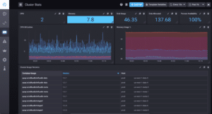
Metrics generate actionable insights, and provide quick wins for observability in an organization, so it makes sense that many current Chronograf features are focused on displaying metrics. Every graph format we provide is some sort of metric visualization. Server CPU, disk space, memory usage, temperature: these can all be displayed easily and quickly using the graph types we have today. Chronograf allows you to build dashboards made up of many individual metrics, visualize multiple metrics across different measurements within the same dashboard cell, and visualize multiple dashboard cells from one or more InfluxData instances. But InfluxData is the modern engine for metrics and events, so focusing on one just isn’t enough. And, based on the feedback from customers and the community, visualizing metrics about your events just isn’t enough detail in many cases. Users want the ability to shift between the context provided by their metrics into the associated event data from within the same user interface.
Tabular Views of Time Series Data
Over the last year and a half, more and more users have been pushing raw event data into the platform in the form of text-based data. These users need ways to visualize their events and incorporate those event views into their metrics dashboards. They want to see exactly what events caused an anomaly clearly shown through the visualization of their metrics data using the same dashboards that they’ve invested their time and expertise building.
Today, with the release of Chronograf 1.5, we are introducing a table cell type for time series data, which allows you to view your time series data in a tabular format. This is our first step in bringing together a holistic view of your metrics and events in a single view, enabling deeper analysis than ever before.
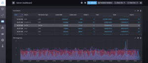
Tables within Chronograf allow users to scroll and scan their text-based, time series events along with the metrics that are important to them. Also, you can hide the time column (or any column) and provide additional context to dashboard users.
We’ve been using tables internally for some time, to add details to our InfluxDB Cloud customer monitoring dashboards. We think you’ll love viewing your data in tables, and we’d love to hear about any issues you find or how you’re using them in your analyses so we can make tables even better.
Kapacitor Adds Support for Kafka and Slack Workspaces
The release of Kapacitor 1.5 brings additional features that provide integration into complex alerting and processing workflows that enterprise companies have become accustomed to. We have added the ability to push alert messages directly to any Kafka topic so that alerts can be handled appropriately by downstream systems. For message-based architectures consisting of a Kafka bus and microservices for processing, this allows you to quickly integrate the power of Kapacitor alerting with the rest of your architecture.
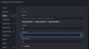 <figcaption> Chronograf provides an easy way for you to configure your Kafka alert endpoint.</figcaption>
Slack is the go-to internal communication system in many large organizations. Many teams are leveraging multiple workspaces to communicate with different teams, customers, or their community. The latest Kapacitor allows you to configure multiple Slack workspaces so that all your alerts can be managed in a single place.
Along with these larger features, Kapacitor has also added some minor improvements based on customer feedback to make writing TICKscripts even easier including support for custom JSON payloads for POSTing to HTTP endpoints and the ability to suppress log lines about missing points in case you don’t need them. We’ve also incorporated the latest versions of the OpsGenie and PagerDuty APIs so that users can continue to leverage those tools for their alerting.
Chronograf and Kapacitor - Better Together
Chronograf is the user interface for the TICK Stack, and that means providing more than just visualizations. We first introduced the TICKscript editor in Chronograf 1.3 last October which deepened the integration between Kapacitor and Chronograf, and we continued to enhance the TICKscript editor with Chronograf 1.4 in February. As new features are introduced into the platform, we want to enable access to them them for users from day one.
All of the new Kapacitor 1.5 features are available to users through Chronograf 1.5. Chronograf 1.5 allows you to configure the Kafka topic as an alert target and setup multiple Slack workspaces along with Kapacitor 1.5.
Download the Chronograf 1.5 and Kapacitor 1.5 releases here.
More than Skin Deep
Not all the changes in the latest release of Chronograf 1.5 are visible to the naked eye. The Chronograf team has been busy behind the scenes making sure we keep up with the latest technology and best practices. We’ve upgraded to React 16 and made a ton of progress in converting our Javascript codebase into Typescript. These changes improve the overall app performance and allow us to find issues quicker, before they impact customers. We’ve also tackled over 50 bug fixes to improve dashboard building and query management in the UI. You may not notice all these fixes, but they go a long way in ensuring that we provide users with the best experience possible.
What's Coming Next?
For Chronograf, we are continuing to invest in ways to provide users with insights into their events in new ways and for more scale. How do you convey information for 10,000 entities on a single page and make it actionable? We are also looking at how customers are using tabular data views in other ways, specifically around providing overviews of the entities pushing data into InfluxDB. We are also looking towards the future with IFQL, our next-generation query language, and focusing on providing the best experience for users to get up and running quickly. Look for more announcements at our InfluxDays London event in June.
