How to visualize time series data
In this technical paper, InfluxData CTO, Paul Dix, will walk you through what time series is (and isn’t), what makes it different from stream processing, full-text search and other solutions.

By reading this tech paper, you will:
- Learn how time series data is all around us,
- See why a purpose built TSDB is important.
- Read about how a Time Series database is optimized for time-stamped data.
- Understand the differences between metrics, events, & traces and some of the key characteristics of time series data.
- Understand the differences between metrics, events, & traces.
Table of Contents
What is time series visualization and analytics?
Tools for graphing time series data
InfluxDB UI visualization layer
What is time series visualization and analytics?
Time series visualization and analytics let you visualize time series data and spot trends to track change over time. Time series data can be queried and graphed in line graphs, gauges, tables and more.
Using time series visualization and analytics, you can generate forecasts and make sense of your data. Time series data provides significant value to organizations because it enables them to analyze important real-time and historical metrics. Data is valuable only if it’s easy to access, so you need to make sure you are using a database optimized for storing and querying time series data. That’s where being able to build dashboards that run repetitive analytical queries becomes a force multiplier for organizations looking to expose their time series data across teams.
What is a time series chart?
A time series chart refers to data points that have been visually mapped across two distinct axes: quantity measured and time. They are considered an ideal way for analyzers to quickly determine anything from data trends to the rate of change.
In a classic x-y graph, the horizontal axis of the chart is used to plot increments of time while the vertical axis pinpoints values of the variable being measured.
Why use a dashboard for visualizing time series data?
Dashboards are a great way to visualize and present time series data to its target audience in a format that is meaningful and easy to understand.

Tools for graphing time series data
There are many types of dashboards to choose from, such as those that come with InfluxDB, other open source projects like Grafana, or even IoT specific dashboarding tools like Seeq. These solutions often come with pre-canned dashboards built by the community to allow you to get started very quickly.
Time series data from InfluxDB can also be visualized with custom graphs using various graphing and libraries such as the:
- Plotly.js graphing library, which offers over 20 different charting types, and packages everything so neatly that it is simple and easy for users to reproduce graphs of their own style and choosing.
- Rickshaw library (like plotly.js, this is built on d3.js).
- Dygraphs charting library (discussed below).
First, let’s discuss visualizing time series data with InfluxDB, then with Grafana.
Want to know more?
Download the Paper
InfluxDB UI visualization layer
InfluxDB allows you to quickly see the data that you have stored via the Data Explorer UI. The InfluxDB user interface (UI) provides tools for building custom dashboards to visualize your data. Using templates or Flux (InfluxData’s functional data scripting language designed for querying and analyzing), InfluxDB empowers you to rapidly build dashboards with real-time visualizations and alerting capabilities across measurements.
Time series data visualization types
The InfluxDB 2.0 user interface (UI) provides multiple visualization types to visualize your data in a format that makes the most sense for your use case. Use available customization options to customize each visualization.
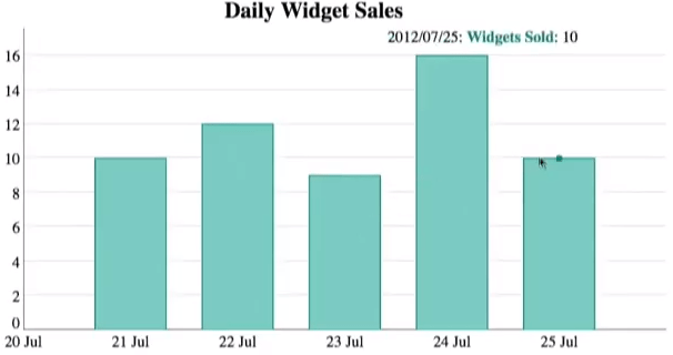
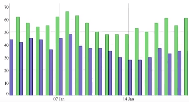
Time series line graphs and bar graphs
The Graph view in the InfluxDB 2.0 UI lets you select from multiple graph types such as line graphs and bar graphs (Coming).
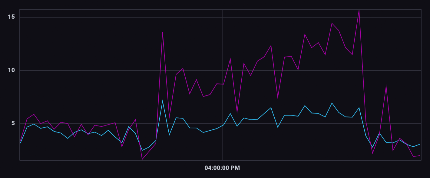
A line graph is the simplest way to represent time series data. It helps the viewer get a quick sense of how something has changed over time. A line graph uses points connected by lines (also called trend lines) to show how a dependent variable and independent variable changed:
- An independent variable, true to its name, remains unaffected by other parameters.
- The dependent variable depends on how the independent variable changes.
For temporal visualizations, time is always the independent variable, which is plotted on the horizontal axis. Then the dependent variable is plotted on the vertical axis.
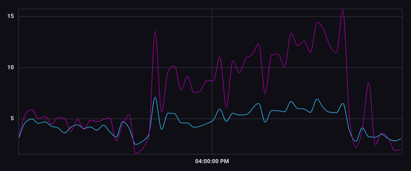
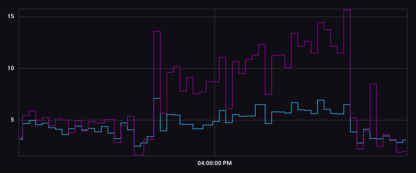
While the above graph is an example of a line graph with linear interpolation (interpolation is the estimation of a value within two known values in a sequence of values), the below two graphs depict smooth interpolation and step interpolation.
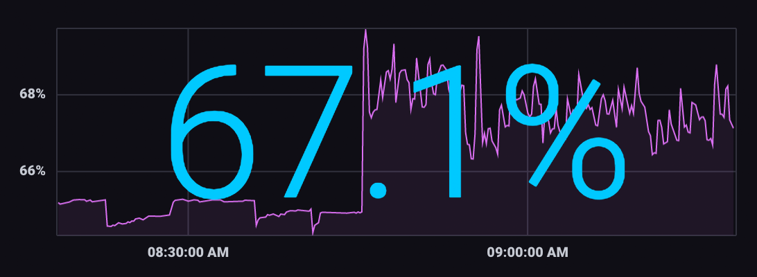
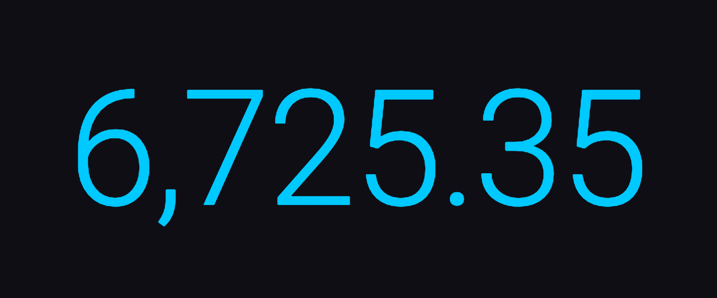
Graph + Single Stat visualization for time series data
The Graph + Single Stat view displays the specified time series in a line graph and overlays the single most recent value as a large numeric value. The Single Stat visualization displays a single numeric data point. It uses the latest point in the first table (or series) returned by the query.
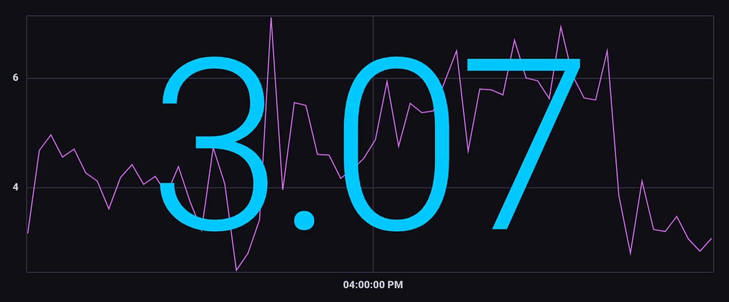
The primary use case for the Graph + Single Stat visualization is to show the current or latest value as well as historical values.
The following example shows the current percentage of memory used as well as memory usage over time.
Heatmap
A Heatmap displays the distribution of data on an x and y axes where color represents different concentrations of data points. Heatmaps divide data points into “bins” – segments of the visualization with upper and lower bounds for both X and Y axes. The Bin Size option determines the bounds for each bin. The total number of points that fall within a bin determine its value and color. Warmer or brighter colors represent higher bin values or density of points within the bin.
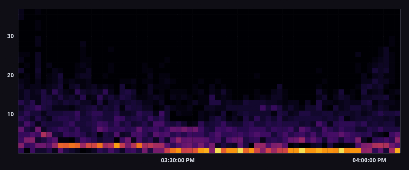
A heatmap, as shown below, can be used to visualize correlation.
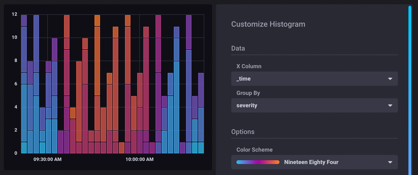
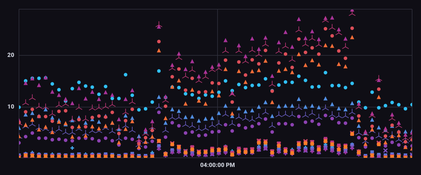
Histogram
A histogram is a way to view the distribution of data. The y-axis is dedicated to count, and the x-axis is divided into bins. The Histogram visualization is a bar graph that displays the number of data points that fall within “bins” – segments of the X axis with upper and lower bounds.
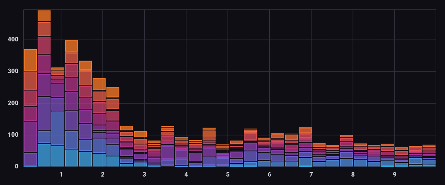
For example, the below histogram shows error counts by severity over time.
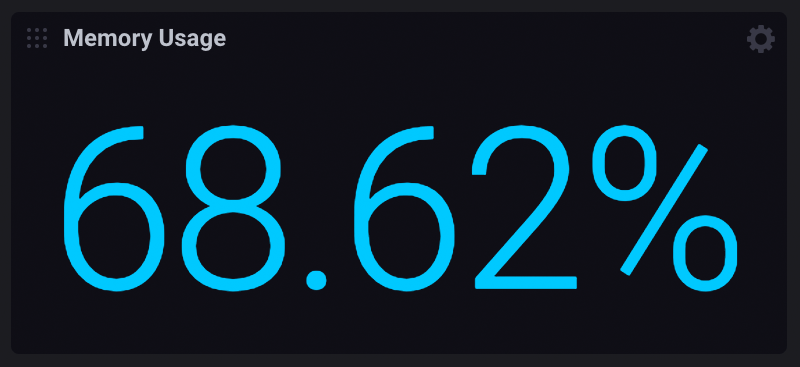
Single Stat
The Single Stat view displays the most recent value of the specified time series as a numerical value. It uses the latest point in the first table (or series) returned by the query.
The following visualization example shows the current memory usage as a percentage.
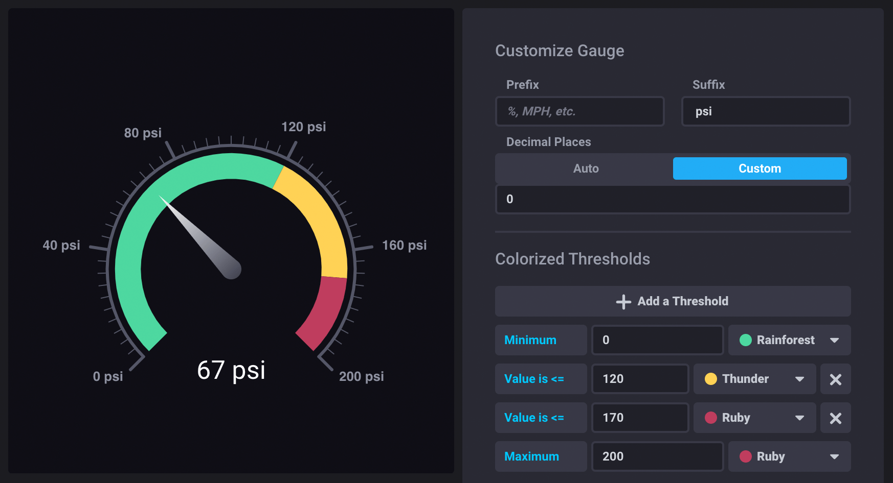
Gauge
The Gauge view displays the single most recent value for a time series in a gauge view. Gauge visualizations are useful for showing the current value of a metric and displaying where it falls within a spectrum.
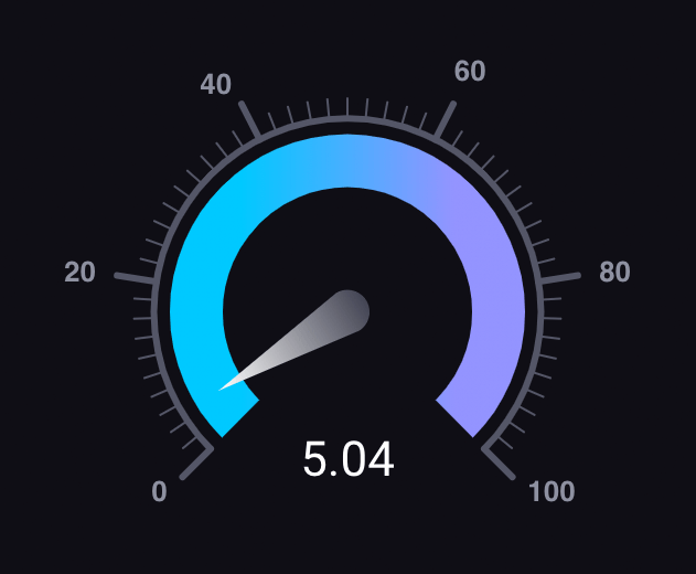
The following gauge visualization displays the pressure of steam pipes in a facility.
Table
The Table visualization option displays the results of queries in a tabular view, which is sometimes easier to analyze than graph views of data.
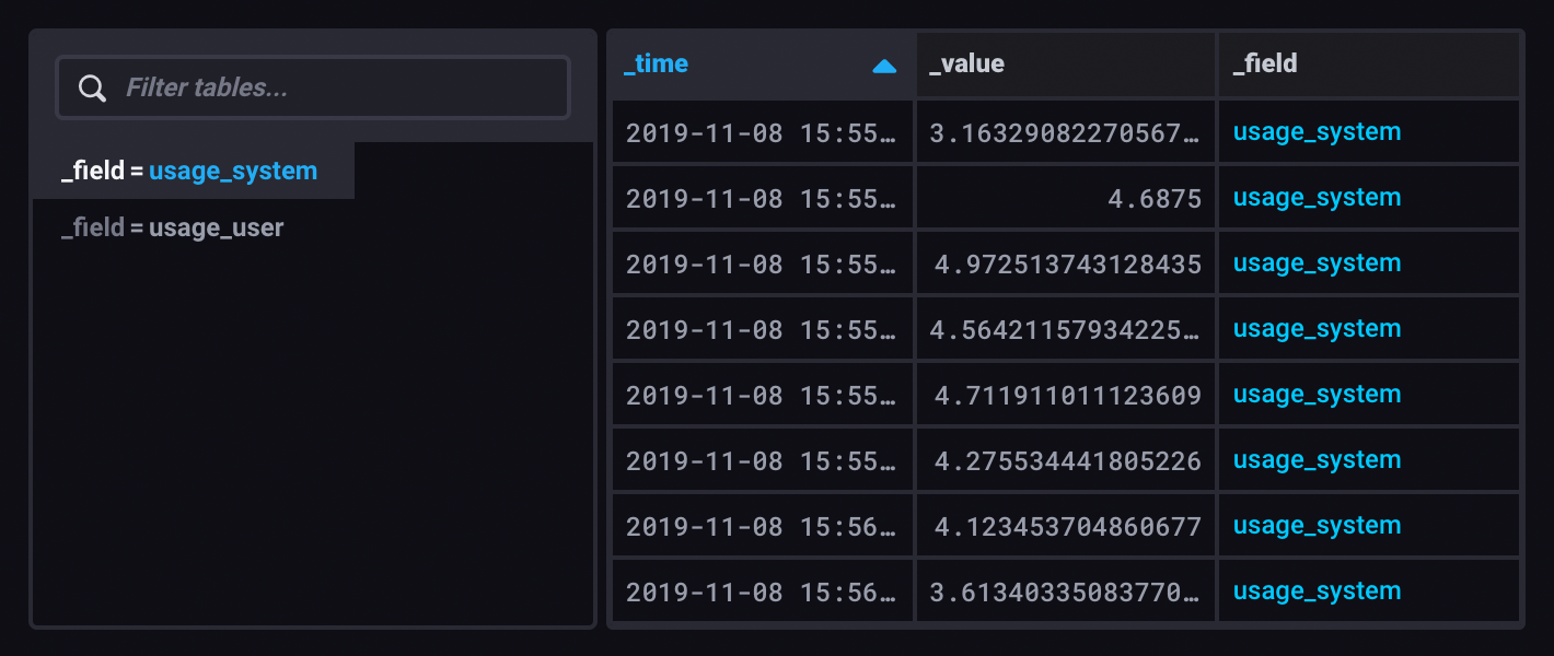
The table visualization renders queried data in structured, easy-to-read tables. Columns and rows match those in the query output. Tables are helpful when displaying many human-readable metrics in a dashboard such as cluster statistics or log messages.

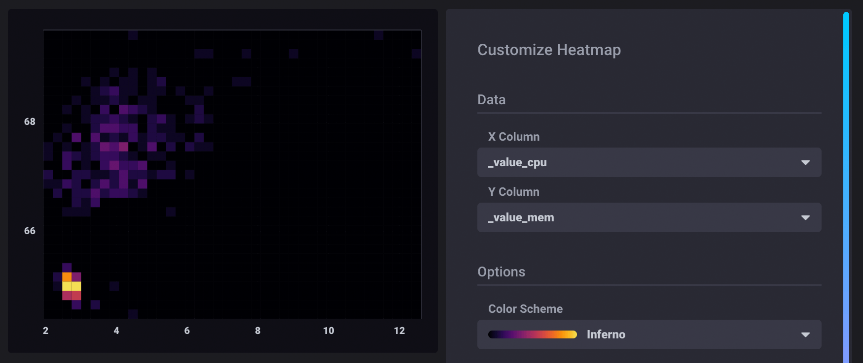
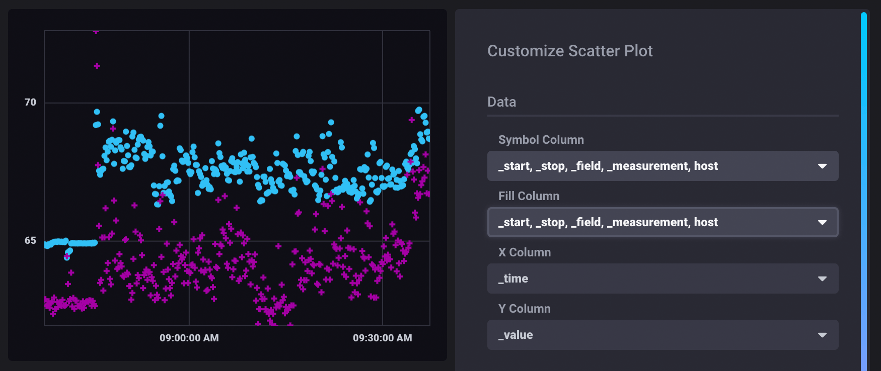
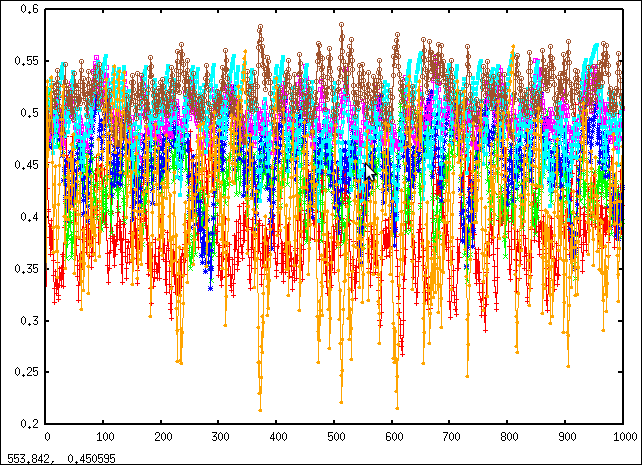
Scatter
The Scatter view uses a scatter plot to display time series data. A scatter plot can have anything on the horizontal axis, in any transformation, and points are not connected or ordered.
The scatter visualization maps each data point to X and Y coordinates.
The following example explores possible correlation between CPU and Memory usage. In the Scatter visualization controls, points are differentiated based on their group keys.
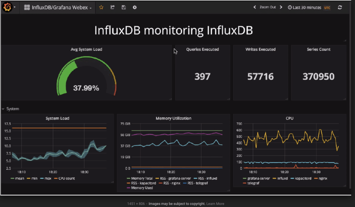
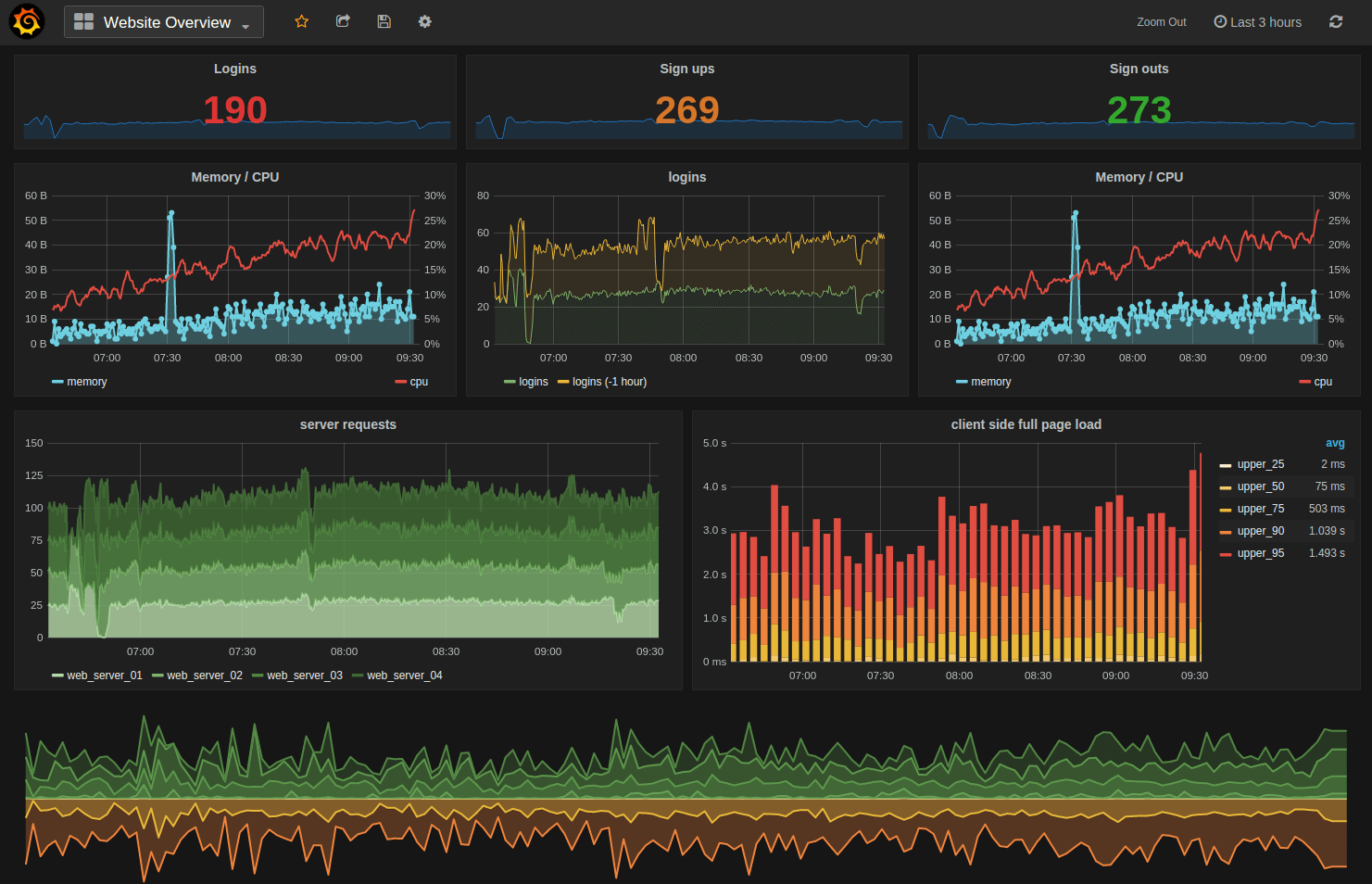
What is Grafana?
Grafana is a popular open source visualization and analytical suite mainly used for time series data. It provides ways to create, explore, and share time series data in easy-to-understand graphical representation. Grafana readily integrates with InfluxDB and Telegraf to make monitoring of sensor, system and network metrics much easier and far more insightful.
The process of setting up a Grafana dashboard and integrating it with various data sources is straightforward. Grafana ships with a feature-rich data source plugin for InfluxDB. The plugin includes a custom query editor and supports annotations and query templates.By clicking on “Add Data Source” in Grafana UI, you configure it for InfluxDB. Once finished, you can select “New Dashboard” button, to start visualizing InfluxDB data of your interest. Click here to learn how to generate Grafana dashboards from a datasource like InfluxDB. To paint a fuller picture of how InfluxDB pairs with Grafana, see how some enterprises have used InfluxData and Grafana for DevOps, IoT, and Real-Time Analytics use cases.
Grafana graphing features include:
- Fast rendering, even over large timespans
- Click and drag to zoom
- Multiple Y-axis
- Bars, lines, points
- Smart Y-axis formatting
- Series toggles & color selector
- Axis labels
- Grid thresholds, axis labels
- Annotations
Grafana provides a high level of customization for building, managing, and editing dashboards:
- Drag and drop graphs to rearrange
- Set column spans and row heights
- Save & search dashboards
- Import & export dashboard (json file)
- Import dashboard from Graphite
- Templating
- Scripted dashboards (generate from js script and url parameters)
- Flexible time range controls
- Dashboard playlists
Various data sources, such as AWS CloudWatch and Prometheus, integrate with Grafana to produce Grafana dashboards. These dashboards are useful because they bring together data and help users to gather insights through real-time analytics. No matter where your data is, or what kind of database it lives in, you can bring it together with Grafana.
Grafana dashboard examples
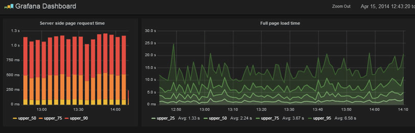
Time series custom graphs
Apart from pre-canned dashboards that come with various visualization tools, custom graphs can be built to adapt the data visualization to the developer’s needs, use case or audience. Below is an example of custom time series graphs used for monitoring a solar battery using a mobile phone.
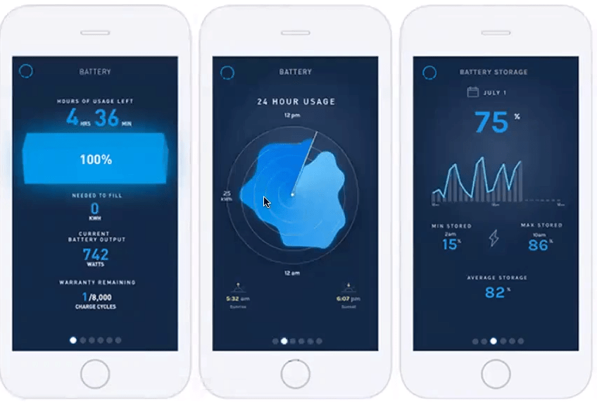
The above graphs, respectively, show the amount of energy stored in the solar battery (of a Blue Planet Energy storage unit that allows buildings equipped with solar panels to store unused solar energy); battery consumption over a 24-hour period; and battery storage over time (which gives users different time increments to query from).
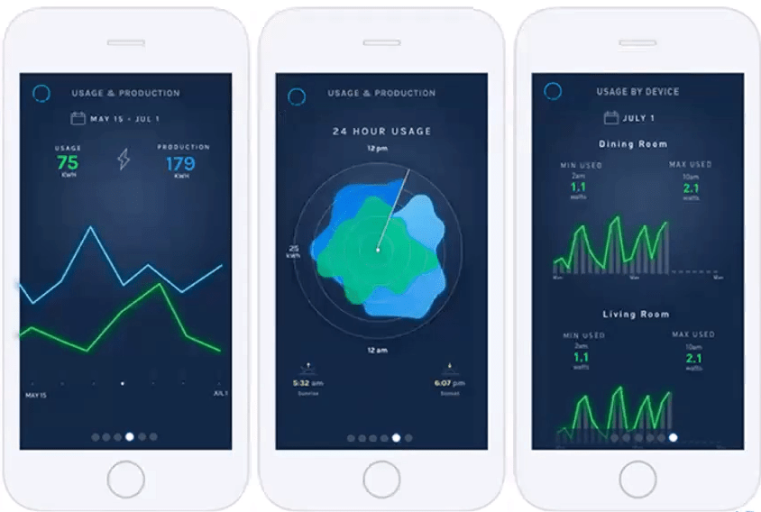
The above graphs show usage against production (enabling homeowners seeking a Net Zero lifestyle to see how their overall production of solar energy compares); a 24-hour view of usage against production; and usage by device (by registers, which are individually monitored parts of the breaker box).
Building custom graphs using Dygraphs Charting Library
Custom time series graphs can also be built using Dygraphs — an open source JavaScript charting library in development since 2006. Dygraphs is an appealing visualization for dashboards due to its combination of performance and interactivity.
Why use Dygraphs?
- Open source
- Canvas-based
- Easy to get from nothing to an interactive chart
- Fast and flexible
Dygraphs allows you to build custom plotters. The plotter option allows you to write your own drawing logic. This can be used to achieve powerful customization.
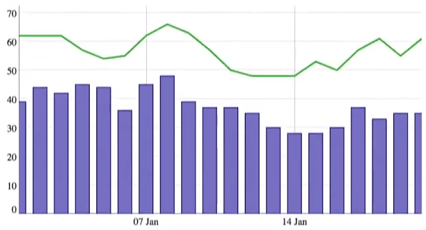
In the below chart example, a specialized plotter is used to draw a bar plot rather than a line plot.
Below, a specialized plotter is used to combine four series into a unified “candle” plot.
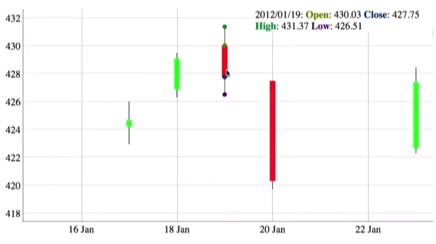
The plotter option may be set on a per-series basis to create mixed charts.
Learn how to add dygraphs to your project and how it can be used to facilitate interactive data exploration.
Graphing one or more time series on a chart
You can graph one or more time series per chart. Charts can be:
- Separated – can graph one time series (each time series on a different chart). These separated graphs are useful because they provide a clear uncluttered view, but can make it hard to make direct comparisons.
- Overlapping – can graph different time series on the same graph in order to compare them (as shown in the overlapping chart example below).
For example, below is a sample overlapping graph showing trend lines for 7 stock prices (overlapping prices and layered trend lines).
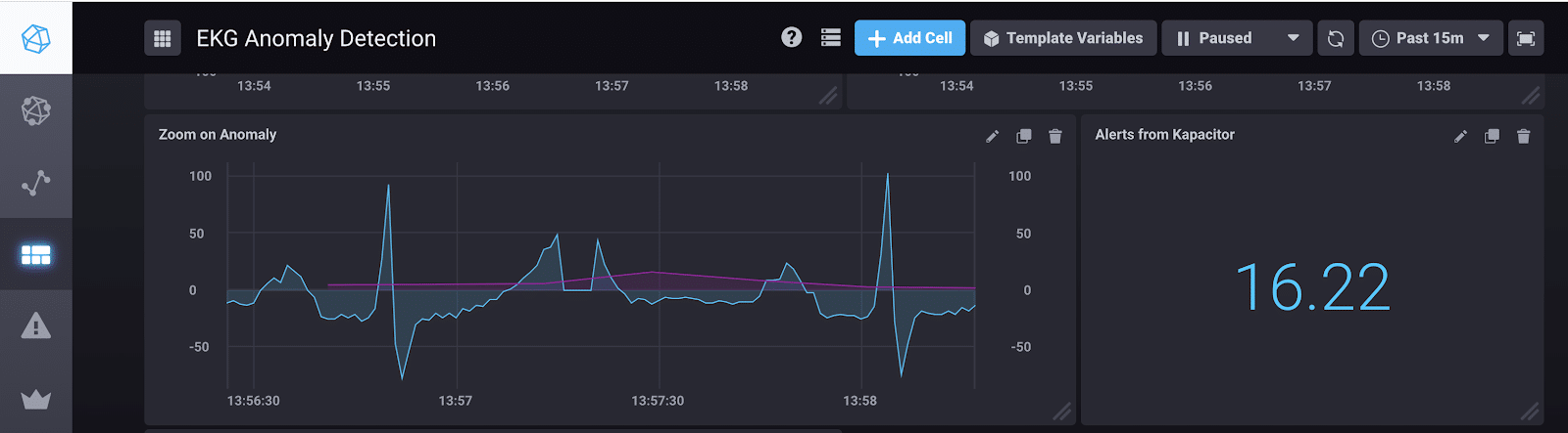
Time series chart with anomaly detection visualization
Time series charts can also visualize anomaly detection (the identification of data that does not conform to expected or usual patterns).
Time series chart with a prediction or trend line
Time series charts can show a prediction developed based on time series forecasting. For example, Timbergrove streams data from their Digi queue and from IBM Event Streams (a managed Kafka service) to InfluxDB. Here, they were playing around with the built-in Holt-Winters forecasting algorithm to generate predictions on their temperature data:
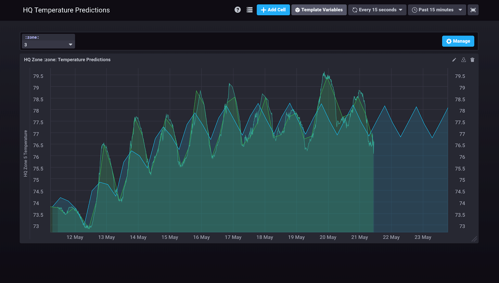
The above chart shows Office Temperature (F) vs. Time(days). The Green line represents the raw data. The blue line represents the prediction emitted by the Holt-Winters forecasting function.
Download this technical paper
#1 Time Series Database
According to DB Engines
Join the millions of developers using InfluxDB to predict, respond, and adapt in real-time.

