TL;DR InfluxDB Tech Tips — Monitoring Tasks and Finding the Source of Runaway Cardinality
By
Anais Dotis-Georgiou
updated December 14, 2025
Product
Use Cases
Developer
Navigate to:
So you’re using InfluxDB Cloud, and you’re writing millions of metrics to your account. You’re also running a variety of downsampling and data transformation tasks. Whether you’re building an IoT application on top of InfluxDB or monitoring your production environment with InfluxDB, your time series operations are finally running smoothly. You want to keep it that way. You might be a Free Plan Cloud user or a Usage-Based Plan user, but either way, you need visibility into your instance size to manage resources and costs. Use the InfluxDB Operational Monitoring Template to protect against runaway series cardinality and ensure that your tasks are successful.
What is the Operational Monitoring Template?
In case you’re new to InfluxData, InfluxDB Templates are a preconfigured and shareable collection of dashboards, tasks, alerts, Telegraf configurations, and more. You apply them by copying the URL of a template of interest from the community templates and pasting it into the UI. Today, we’ll apply the Operational Monitoring Template to our InfluxDB Cloud account to monitor our cardinality and task execution.
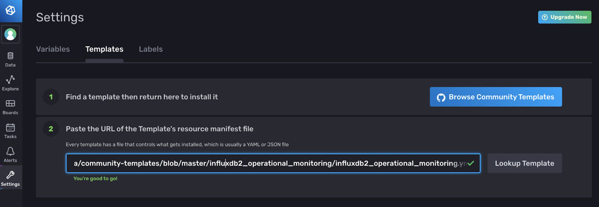 <figcaption> An example of how to apply a template through the UI. Navigate to the Templates tab on the Settings page and paste the link to the YAML or JSON of the template you want to apply.</figcaption>
The Operational Monitoring Template consists of the following resources:
-
- 1 Bucket: cardinality
- 1 Task: cardinality_by_bucket that runs every hour. This task is responsible for calculating the cardinality of all of your buckets and writing the calculation to the cardinality bucket.
- 1 Label: operational_monitoring. This label helps you find the resources that are part of this template more easily within the UI.
- 2 Variables: bucket and measurement.
- 2 Dashboards:
-
- Task Summary Dashboard. This dashboard displays information about your task runs, successes and failures.
- Cardinality Explorer. This dashboard helps you visualize your series cardinality for all of the buckets. Drill down into your measurement cardinality to solve your runaway cardinality problem.
How does the Task Summary dashboard help me?
Both the Task Summary dashboard and the Cardinality Explorer dashboard can be used to monitor your specific task execution status and series growth. The Task Summary dashboard looks like this:
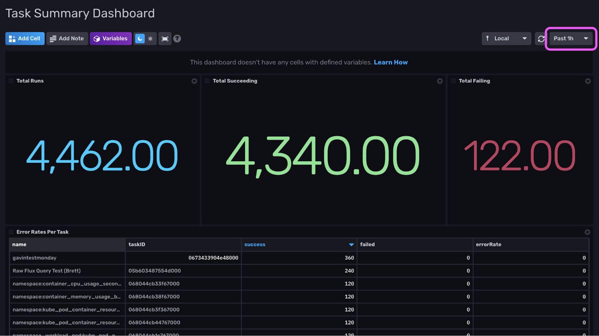 <figcaption> An example of the Task Summary Dashboard. It provides information about the success of task runs for the past hour controlled by the time range dropdown configuration (pink square).</figcaption>
The first three cells of this dashboard allow you to easily evaluate the success of all of your tasks for the specified time range. From this screenshot we see that we have 80 failed task runs. The cell in the second row, allows us to easily sort by the most successful and failed runs per task within the time range. It provides us with the error rate and task ID.
 <figcaption> More of the Task Summary Dashboard. It provides information about the success of task runs for the past hour.</figcaption>
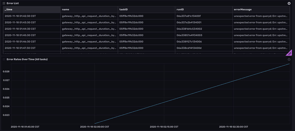
The dashboard also includes an Error List cell. This cell contains information about all of the failed runs, complete with the individual errorMessages for each runID. You can use this cell to determine why a task is failing. Below the Error Rates Over Time allows you to easily determine whether you have an increasing number of failed tasks. A linear line indicates that the same set of tasks are failing whereas an exponential line would suggest that an increasing number of tasks are failing.
 <figcaption> More of the Task Summary Dashboard. It provides information about the success of task runs for the past hour.</figcaption>
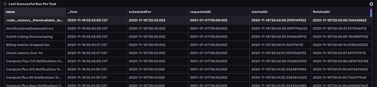
The last cell of the Task Summary Dashboard, Last Successful Run Per Task helps you identify when a task failed so you can more easily debug your task. Now that we’ve reviewed the features of the Task Summary Dashboard, let’s examine the Cardinality Explorer dashboard.
Supplement the Template with your own Task Alerts
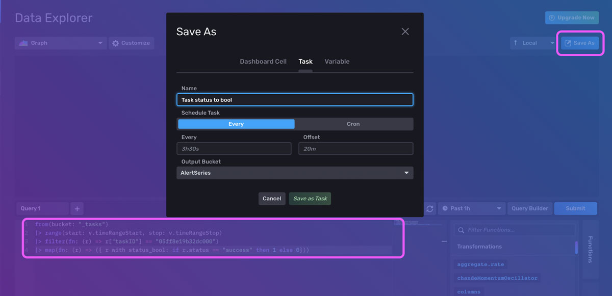
If you are running Tasks that are mission-critical to your time series use case, I recommend setting up Alerts to monitor when those Tasks are failing. Use the Task Summary Dashboard to help you find the taskID associated with the task you want to alert on. Now we need to convert our status into a numeric value in order to create a threshold alert for failed tasks. Next, navigate to the Data Explorer. Use the map() function to convert the status into a boolean with the following Flux script:
from(bucket: "_tasks")
|> range(start: v.timeRangeStart, stop: v.timeRangeStop)
|> filter(fn: (r) => r["taskID"] == "05ff8e19b32dc000")
|> map(fn: (r) => ({ r with status_bool: if r.status == "success" then 1 else 0}))
Click the Save As button, to convert this to an Alert. Then create a threshold alert and alert if the value of status_bool is below 1.
For more information on creating alerts, please refer to the section below, “Supplement the Template with your own Cardinality Alerts”, or Using Tasks and Checks for Monitoring with InfluxDB.
How does the Cardinality Explorer Dashboard help me?
The Cardinality Explorer Dashboard provides the cardinality per bucket in your InfluxDB instance.
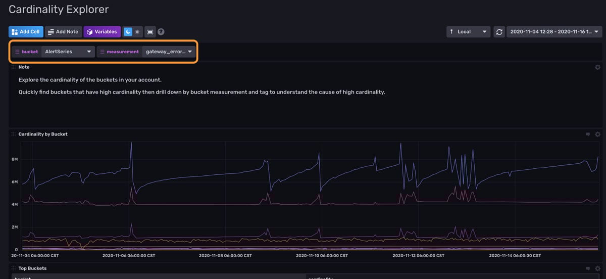 <figcaption> An example of the Cardinality Explorer Dashboard. It provides information about the cardinality of your InfluxDB instance. Labels allow you to visualize metrics with a dropdown configuration (orange).</figcaption>
The variables at the top of the dashboard allow you to easily switch between buckets and measurements.
- The graph in the first cell, Cardinality by Bucket, allows you to monitor the cardinality of all of your buckets at a glance. We can see that our cardinality is remaining within the same range. The fact that the cardinality across all buckets has a small standard deviation is a good sign. It allows us to verify that we don't have a series cardinality problem. It might be advantageous to create additional alerts on top of this bucket to notify you when your cardinality exceeds an expected standard deviation. Dips in the cardinality are likely evidence of successful data expiration or perhaps a data deletion. Spikes in the cardinality could be due to momentary overlap between new data ingested and old data about to be evicted. It's also likely that the spikes are due to an important event.
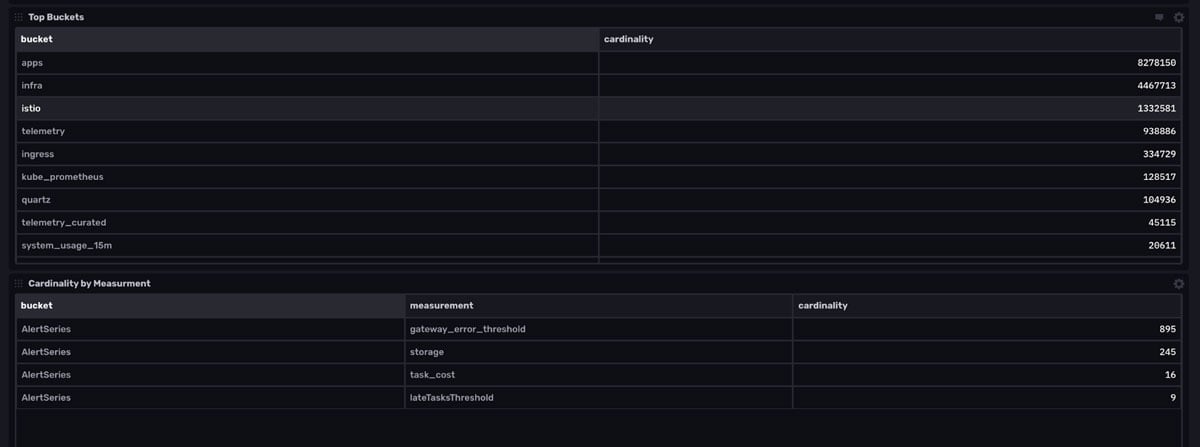
- The second cell, Top Buckets, provides a table view of the largest buckets and their cardinality.
- The third cell, Cardinality by Measurement, allows you to drill into specific measurements for each bucket, selected by the bucket and measurement variables. This is especially useful for finding the source of your runaway series cardinality, if you were to experience it.
- Use the final cell (not pictured), Cardinality by Tag, to find unbounded tags. It's worth noting that the Flux script to execute these calculations is fairly clever.
In the next section, we’ll learn about how the cardinality_by_bucket task works to help us understand how these cells produce this cardinality data as the queries follow the same logic as the task.
How does the cardinality task work?
The cardinality task, cardinality_by_bucket, consists of the following Flux code:
import "influxdata/influxdb"
        buckets()
        	|> map(fn: (r) => {
        		cardinality = influxdb.cardinality(bucket: r.name, start: -task.every)
        			|> findRecord(idx: 0, fn: (key) =>
        				(true))
        		return {
        			_time: now(),
        			_measurement: "buckets",
        			bucket: r.name,
        			_field: "cardinality",
        			_value: cardinality._value,
        		}
        	})
        	|> to(bucket: "cardinality")
The Flux influxdata/influxdb package currently contains one Flux function, influxdb.cardinality(). This function returns the series cardinality of data within a specific bucket. The buckets() function returns a list of buckets. The map() function here is effectively “iterating” through the list of bucket names. It uses findRecord() in a custom function, cardinality, to return the series cardinality of each bucket. The return statement creates a new table with the corresponding r.name for the field key, and cardinality._value for the field value. This data is then written to our “cardinality” bucket.
If you want to learn about the findRecord() function in more detail, refer to How to Extract Values, Visualize Scalars, and Perform Custom Aggregations with Flux and InfluxDB.
Supplement the Template with your own Cardinality Alerts
To gain the full benefits from this template, I recommend setting up a cardinality threshold alert based off of the cardinality bucket. The fastest way to create an alert is through the UI. Navigate to the Alerts tab in the UI. First query for your cardinality. Although it’s hard to visualize our cardinality data in the graph visualization, the default visualization type for the Alerts UI, I can hover over the points or view the data in the Raw Data View to understand my data better.
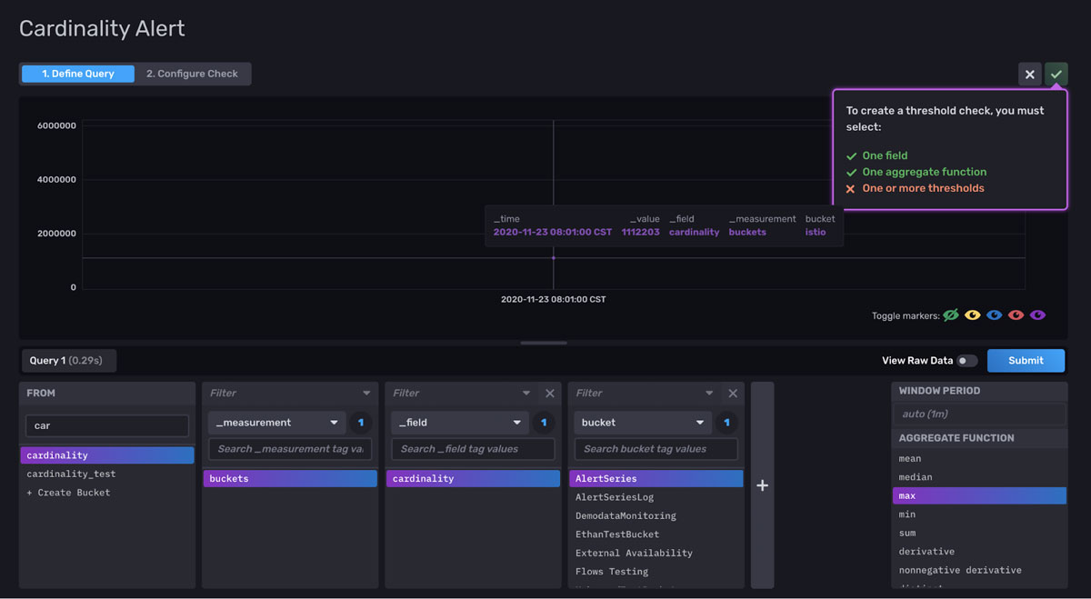
I notice that my cardinality data can be split into roughly three ranges. Next, I will configure alerts around those ranges. If the cardinality in my buckets crosses one of those three thresholds, I will receive an Alert.
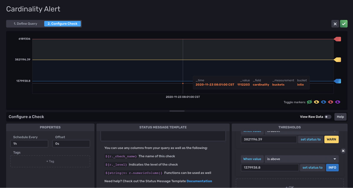
This type of Alert can help you guard against reaching a cardinality limit in InfluxDB Cloud. Specifically, free tier and Usage-Based Plan users want to be alerted when they approach 80% their cardinality limit of 10,000 and initial cardinality limit of 1M, respectively. You might also consider creating a task that sums the cardinality across all buckets and alerting on the total cardinality as well.
If you notice that your cardinality is growing significantly, you can decide whether or not you need to request a higher cardinality limit or whether you need to downsample historical data. To request a higher cardinality limit, click the Upgrade Now button on the top right of the InfluxDB UI.
Please review Solving Runaway Series Cardinality, InfluxDB schema design and data layout documentation, and Data Layout and Schema Design Best Practices for InfluxDB for more information on managing cardinality and optimal schema design.
If you want to learn about creating Alerts with the UI, refer to Using Tasks and Checks for Monitoring with InfluxDB and How to Monitor States with InfluxDB.
As an aside, if you’re interested in learning about why cardinality won’t be a point of concern for future InfluxDB users, I encourage you to read Announcing InfluxDB IOx – The Future Core of InfluxDB Built with Rust and Arrow.
Final thoughts on the InfluxDB Operational Monitoring Template
Please note that the Cardinality Explorer dashboard will be empty until the cardinality_by_bucket task has run. It runs on an interval of 1hr, so it might take a while before that dashboard is populated with meaningful data. However, if you need to visualize your cardinality data immediately, you can repurpose the script in the cardinality_by_bucket task, and select the time range you wish to gather cardinality data from. Then you can write the cardinality data to the cardinality bucket with the to() function if you desire. Use the subDuration() function to create the correct timestamp.
import "influxdata/influxdb"
import "experimental"

time = experimental.subDuration(
  d: 7d,
  from: now(),
)
buckets()
	|> map(fn: (r) => {
		cardinality = influxdb.cardinality(bucket: r.name, start: -7d)
			|> findRecord(idx: 0, fn: (key) =>
				(true))
		return {
			_time: time,
			_measurement: "buckets",
			bucket: r.name,
			_field: "cardinality",
			_value: cardinality._value,
		}
	})
I hope this InfluxDB Tech Tips post provides you with the tools to efficiently monitor your InfluxDB Cloud instance, successful time series operations, and the power to control your cost. If you are planning to use the Operational Metrics Template, please ask us for help and share your story! Share your thoughts, concerns, or questions in the comments section, on our community site, or in our Slack channel. We’d love to get your feedback and help you with any problems you run into! Special thanks to @nathanielc and @aanthony1243 for contributing the two dashboards in this template.
