Use Flux to Group, Shape, and Analyze Your Time Series Data
By
Nate Isley
updated December 14, 2025
Product
Developer
Navigate to:
Flux is a programming language designed from the ground up for time series analysis. Traditionally, grouping, shaping, and performing mathematical operations across large dynamic time series datasets is cumbersome. Flux’s goal is to make it working with these datasets much more elegant.
Several new exciting Flux features were added to the InfluxDB 2 OSS Alpha that compelled me to jump in with two feet to see how they would work in practice. My initial foray was promising, but something wasn’t quite right.
My key insight to understanding Flux
As I researched how to crunch data across multiple data stores, I quickly realized I was missing something fundamental. I kept getting unexpected answers and many of my graphs looked off.
Looking for answers, I reached out to Adam Anthony on the Flux team and he walked me step- by-step through a more complex use case. After a few steps, it clicked the key part I had to pay close attention to was table results.
Tables as data
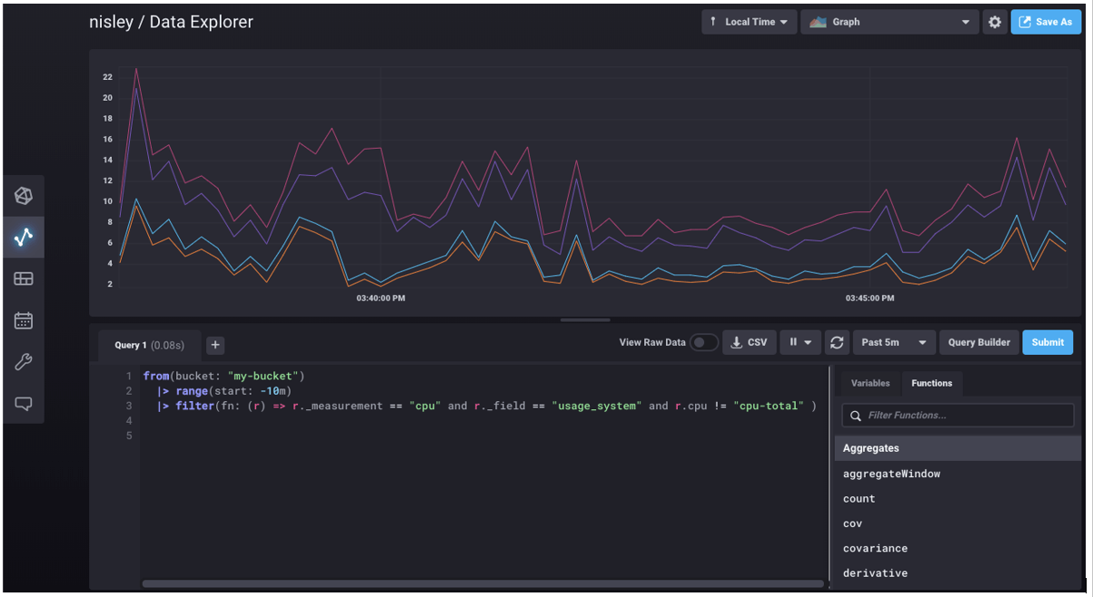
The first few examples you encounter in Flux seem very straightforward. This is a typical first query you might see on system metrics collected by a local telegraf agent:
from(bucket:"my-bucket")
  |> range(start: -10m)
  |> filter(fn: (r) => r._measurement == "cpu" and r._field == "usage_system" and r.cpu != "cpu-total" )
This Flux query pulls all of the data that a Telegraf agent wrote into my-bucket in the prior ten minutes and filters it down to cpu system usage metrics excluding cpu-total values.
When I saw the result of this query in my InfluxDB Cloud 2 UI for the first time, I jumped to the conclusion that Flux simply returned four arrays each with a litany of numbers. Turns out this initial impression was very wrong and the source of my missteps when trying to solve more complex scenarios.
After Adam’s lessons, I realized that using and understanding Flux depended on understanding each part of the Flux results. Flux results are tables, and at times, results are a rather extensive set of tables. I learned that the most useful tool to lean on when stepping through Flux analysis is not the graphing tool, but the UI toggle to View Raw Data.
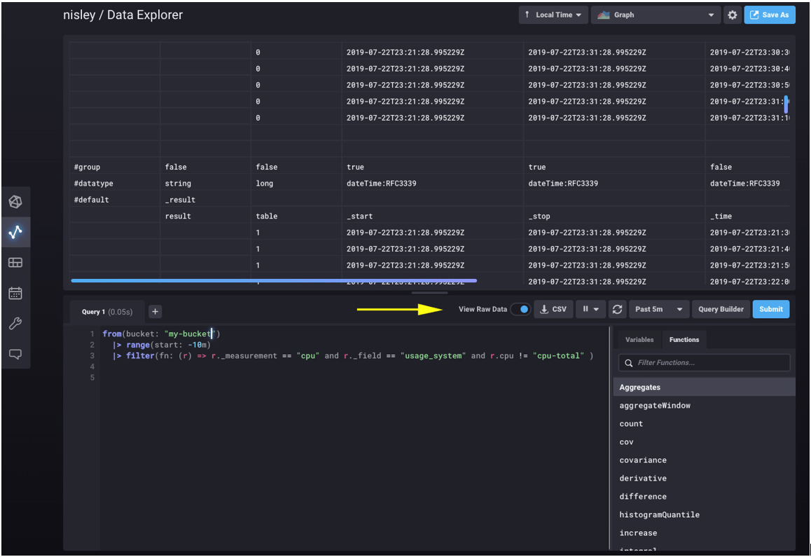
Raw view is exactly that — the complete raw output from Flux. When I first looked at raw view, I thought perhaps the UI was adding things like labels, timestamps, or expanded descriptions. In fact, the UI adds nothing to the result — every label, row, and column here is straight from the Flux response.
Digging into the response, the easiest thing to overlook is the table column — the 3rd column in this example. The UI above is scrolled to display data from two tables (table 0 and table 1). We can see the above system cpu Flux query did not return four arrays at all, but rather four tables — one table for each of the four CPUs Telegraf is monitoring.
As you manipulate, analyze, and shape your data, if you keep the fact that every in-between calculation and result is a table at the forefront of your mind, you will find yourself much closer to the answers you seek. The final example below walks through a more complex use case to demonstrate stepping towards an answer by focusing on tables.
Revisiting the fish tank health vendor
Let’s continue the use case of a fish tank health vendor that stored IoT metadata in Postgres and sensor data in InfluxDB. In that example, the vendor wanted their customer success reps to know the pH balances of all the customer’s fish tanks. After a join, the table result looked like:

This result is simple enough for a customer success rep to read and digest, but add a couple of dozen tanks and sensors and reps will be swimming in data. To make it simpler, management realized what reps really need to know is the location of the fish tanks with a pH higher than 8.
Luckily, they are using Flux and can use the awesome built-in pipe forward operator to simply push the initial table result above into additional calculations to find the highest average pH.
//  group by location so that we can analyze each location independently of the others. (creates 3 tables out of 1)
|> group(columns: ["customer_location"])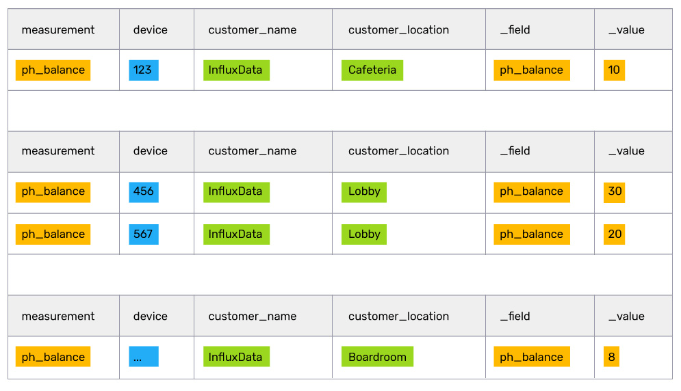
// find the mean value inside of each table
 |> mean(column: "_value")
// grouping by no columns puts all of the tables together into one table
|> group(columns: [])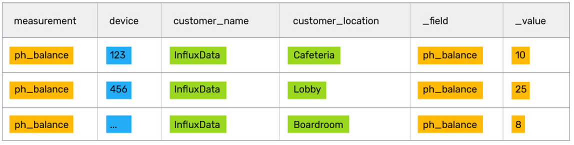
// filter out all rows of data below a value of 8
|> filter(fn: (r) => r._value >  8)
// sort the list to ensure the highest priority fish tanks are at the top of the list
|> sort(columns: ["_value"], desc: true)
After crunching and filtering all the data, the customer success rep should have a manageable list of fish tanks to focus on. In this case, at the top of the list is the Lobby fish tank, which looks like it needs some serious attention.
Flux's future is bright
Flux is starting to hit its stride as many powerful features such as conditionals and multi-data stores are released. Now is a great time to jump in and have a close look at Flux if you are tackling any time series analysis use cases. Easily get started by signing up for InfluxDB Cloud 2, or by downloading the latest OSS alpha.
As always, if you have questions or feature requests for Flux, head on over to Flux’s community forum and let us know.
