Visualize Data with Streamlit and InfluxDB
By
Community /
Product, Developer
Oct 20, 2022
Navigate to:
This article was written by Fortune Adekogbe. Scroll down for the author’s bio and photo.
According to the Python Developers Survey 2021 Results, the majority of developers don’t actively use frontend tools. This means if you wanted to create interfaces to display machine learning models and other systems you’ve built, you most likely need the assistance of another developer.
This is where Streamlit, an open source app framework, can help as a substitute that enables you to create user interfaces without having to go through the trouble of utilizing frontend-related tools and languages, like HTML5, CSS, React, and JavaScript. All you need to build an interface from scratch is Python and preconfigured elements from the Streamlit API.
That’s much easier than building the application yourself and trying to write a limited amount of code to create a useful application. Additionally, the majority of the outstanding libraries that the Python ecosystem provides access to would still be available to you.
In this article, you’ll learn more about Streamlit and how it can simplify the process of creating applications. Additionally, you’ll learn how to create and set up an InfluxDB database and query data for a Streamlit application.
What is Streamlit
As previously stated, Streamlit is an open source framework for building web applications entirely in Python. This enables Python developers, machine learning engineers, data analysts, and data scientists to develop stunning applications without the need for an entire software development team.
The concept behind this framework is that creating applications should be as natural as working in a Jupyter Notebook but have all the flexibility of a strong application development framework.
To enable you to work with a familiar language and development environment, Streamlit focuses on ensuring that all necessary scripting can be done in Python. Additionally, its API offers elements that can be used to implement various widget types simply by declaring them as variables. In doing so, the code becomes organized and clean.
Streamlit also has a caching system that serves as data storage and enables you to reuse information like expensive computations, downloaded data, and models. This decreases latency and speeds up the application because your Streamlit application code is updated and rerun at each user interaction.
When you make changes to the code, Streamlit has a feature similar to hot reload, which enables you to instantly reload your application. This avoids latency even during the development phase because Streamlit only runs the updated portions of the pipeline again. Additionally, it functions well with GPUs, which speeds up inference for deep learning models.
Implementing Streamlit with time series data stored in InfluxDB
To demonstrate the value of Streamlit, in this tutorial, you’ll build a simple dashboard to visualize and analyze weather data. You’ll use InfluxDB as your database to accomplish this because it’s made to work with time series data.
You can find all the code snippets used in this tutorial in the main branch of this GitHub repository.
Setting up InfluxDB
To begin, you need to set up an open source version of InfluxDB as a server on your local computer. Go to the installation page in the InfluxDB OSS documentation to get started:

For instructions on downloading, installing, and starting the server for InfluxDB, click the button that corresponds to your operating system.
When you’ve finished, open your browser and go to http://localhost:8086 to make sure the server has been started. If you use a different port number, be sure to replace it in the URL. This loads up the InfluxDB user interface.
To finish the InfluxDB setup, click Get Started, then enter the necessary information and select Continue. After you do that, you’ll be taken to the homepage:

Writing data into InfluxDB
After the setup, you need to write data to the database. To do this, create a directory for the project and create a data/ directory. Run the following command in a terminal to download the weather data:
wget -o data/jena_climate_2009_2016.csv.zip https://storage.googleapis.com/tensorflow/tf-keras-datasets/jena_climate_2009_2016.csv.zipThe compressed CSV file should now be extracted and put in the data/ directory. Although there are several methods for writing data to InfluxDB, you will use the pandas.DataFrame approach.
Before moving on, go to your InfluxDB interface and click the Load Data option on the left menu and then select Buckets. Click the + CREATE BUCKET button on the right, name the bucket, and select Create:

Next, you need to generate an API token. On the left menu, click the API Tokens option. Select the + GENERATE API TOKEN button on the right then the All Access API Token. Describe the token and click SAVE.
Now, create a virtual environment in the project directory and activate it by executing the following commands (for Linux/macOS users, follow these instructions to do the same):
python -m venv .venv

.venv\Scripts\activate.bat
Next, use pip to install each library required for this tutorial:
pip install pandas influxdb-client matplotlib pandas python-dotenv streamlitThen copy the API token from InfluxDB and put it in an env file:
INFLUX_TOKEN={TOKEN FROM INFLUXDB}Once finished, create a Python script for preprocessing the data and writing it to InfluxDB:
import os

import pandas as pd

import matplotlib.pyplot as plt

from influxdb_client import InfluxDBClient, WriteOptions

from dotenv import load_dotenv

load_dotenv()

df = pd.read_csv("data/jena_climate_2009_2016.csv")

df = df[['Date Time', 'T (degC)']]

df.index = pd.to_datetime(df.pop('Date Time'), format='%d.%m.%Y %H:%M:%S')

df['Measured Fluid'] = ['Air'] * df.shape[0]

plt.plot(df['T (degC)'])

plt.show()
Here, you import all the necessary modules first. Then you use the load_dotenv() method from python-dotenv, which was previously installed, to load the environmental variables. Next, you use the pandas.read_csv() method to read the CSV file by passing the file path as an argument.
Temperature, pressure, humidity, and other readings of various quantities are included in this data set. For the sake of this tutorial, only the temperature readings will be interacted with.
Slice the date and temperature columns from the data frame. Convert the 'Date Time' column to the DateTime data type using the pandas.to_datetime() method, remove the 'Date Time' column from the data frame using the df.pop() method, and set this modified column as the data frame’s index by assigning it to df.index.
Next, add a column to the data frame to represent the measured fluid, which, in this case, is air and will be the same on every row. After that, pass the temperature column to plt.plot to create the plot and add plt.show() to make sure it comes up. And you should see the following image. Comment out the plt.show() so it doesn’t block the execution of the remaining lines of code:

The following lines of code write the data frame to InfluxDB:
ORG = "MY-ORG"

BUCKET = "MY-BUCKET"

TOKEN = os.getenv("INFLUX_TOKEN")

with InfluxDBClient(url="http://localhost:8086", token=TOKEN, org=ORG) as _client:

with _client.write_api() as _write_client:

_write_client.write(BUCKET, ORG, record=df, data_frame_measurement_name='air_temperature',

data_frame_tag_columns=['Measured Fluid'])
In the previous code, you create variables to store the names of your organization and buckets as strings. Using the os.getenv() method, you define a different variable to load the API token. Then you create an instance of the InfluxDBClient() with the URL of your InfluxDB server, the token, and the organization as its parameters using a context manager via the with statement.
Then you create a second context manager that creates a client.write_api() instance using the client instance. You call the write_client.write() method next, passing the bucket and the organization names as parameters. You also pass in the data frame to the record parameter, 'air_temperature' to the data_frame_measurement_name parameter, and ['Measured Fluid'] to the data_frame_tag_columns parameter. Finally, run this script to write data to InfluxDB.
Creating the Streamlit application
The following step entails querying InfluxDB for data and supplying it to your Streamlit application. To begin, create a new Python script called app.py and import the necessary modules:
import os

from influxdb_client import InfluxDBClient

import streamlit as st

from dotenv import load_dotenv

load_dotenv()

ORG = "MY-ORG"

BUCKET = "MY-BUCKET"

TOKEN = os.getenv("INFLUX_TOKEN")

@st.cache

def get_weather_data(time_range=20):

client = InfluxDBClient(url="http://localhost:8086", token=TOKEN, org=ORG)

query_api = client.query_api()

result_df = query_api.query_data_frame(f'from(bucket:"{BUCKET}") '

f'|> range(start: -{time_range}y) '

'|> pivot(rowKey:["_time"], columnKey: ["_field"], valueColumn: "_value") '

'|> keep(columns: ["_time","Measured Fluid", "T (degC)"])')

result_df['month'] = result_df['_time'].dt.month

client.close()

return result_df
In the previous code sample, after importing the modules, you load the environmental variable and create variables to store your organization, bucket, and token.
Then you define a function get_weather_data() to read the temperature data from InfluxDB. The @st.cache decorator should be added to this method to guarantee that the query is cached and not rerun with each user interaction. Then you create an instance of the query API by creating an InfluxDBClient instance in the function.
Use the query_api.query_data_frame() method with the query as its parameter to make sure that the result is returned as a data frame. This query is a string written using InfluxData’s Flux scripting language. By observing it line by line, you can see that the bucket, the time range to query from (in years), the pivot (determines which columns the output rows depend on), and the columns to be returned are all defined. After this, create a month attribute by calling the .dt.month method on the DateTime column.
Then call the client.close() method to shut down the client and return the data frame.
The components of the Streamlit application are defined next. Line charts, area charts, and bar charts are the three types of plots that must be created:
chart_df = get_weather_data()

chart_df.rename(columns={"_time": "Date-Time", "T (degC)": "Temperature (°C)"},

inplace=True)

st.title("Air Temperature (°C) vs. Time")

st.write("## Line Chart")

st.line_chart(chart_df, x="Date-Time", y="Temperature (°C)")
In this code, the get_weather_data method is called to make the query and return the data in a data frame. Next, more descriptive column names are added to the data frame. The plot name is then specified using the st.write() method, and a line chart is created to display the data. The data frame and the column names for the x-axis and y-axis are passed as parameters to the st.line_chart() method to accomplish this.
Run the command streamlit run app.py in your terminal to view the application. This launches a tab in your browser with a view similar to the one shown here:
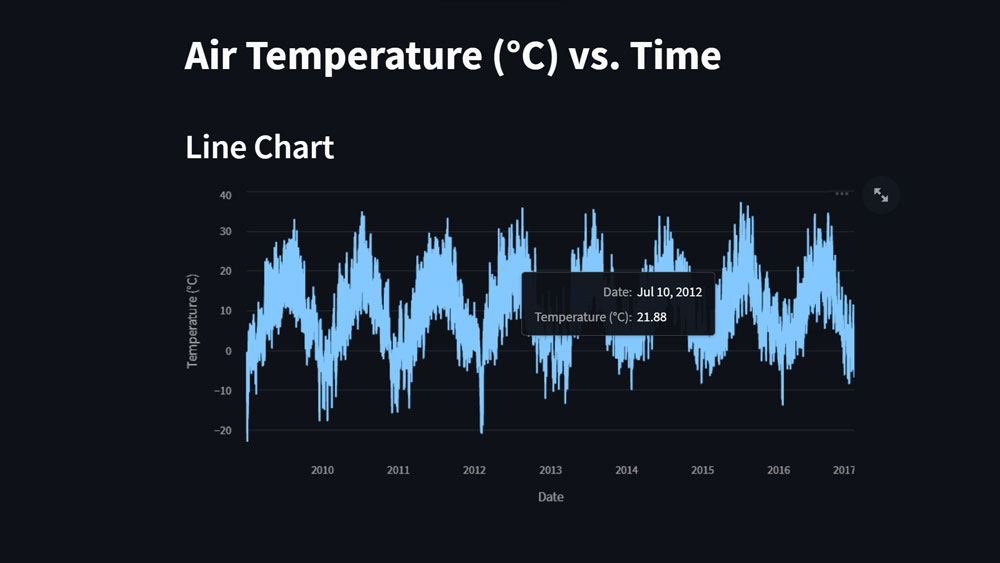
As you can see, unlike the plot created earlier with matplotlib, the Streamlit plot is interactive. By moving your cursor over the plot, you can see more information about each data point. Additionally, you can zoom in to see more particular time frames.
The second and third plots are then made, as shown here:
st.write("## Area Chart")

st.area_chart(chart_df, x="Date-Time", y="Temperature (°C)")

chart_month = chart_df.groupby('month')['Temperature (°C)'].mean()

st.write("## Bar Chart\nThis shows the average temperature in each month")

st.bar_chart({'Month number': chart_month.index,

'Average Temperature (°C)': chart_month.values},

x="Month number",

y="Average Temperature (°C)")
The second plot’s title is then added, and an area chart is made in a similar fashion using st.area_chart().
The dataframe.groupby() method is used to group the data by months and determine the average temperature in order to create the third chart.
Finally, the title of the third plot is added, and then the st.bar_chart() method is used to create the chart. The data is parsed as a dictionary of the month’s numbers and the average temperature in each month.
To view the application, navigate to your browser and click the Rerun button on the top right. The following plots will be added to your dashboard:

Similar to before, these plots are also interactive and offer a great way for you to interact with your data and share it with others after deployment. You can find all the code snippets used here in the main branch of this GitHub repository.
Conclusion
In this article, you learned about Streamlit, what its benefits are, and how it functions. You can also set up, write to, and read data from an InfluxDB database. Additionally, you can use Streamlit to build a dashboard to visualize data.
InfluxDB was developed by InfluxData to facilitate the creation of real-time applications and the handling of time series data. You can create a system to track and analyze real-time data coming from your networks or sensors using InfluxDB. Sign up and get started with InfluxDB today.
Additional resources
If you are interesting in learning more about data visualization or working with time series data, check out the following resources:
- Time Series Forecasting Methods
- Anomaly Detection Overview
- Recharts data visualization tutorial
- React Native Victory charting library tutorial
- ReactJS Nivo tutorial
- Tensorflow Time Series tutorial
About the author

Fortune is a Python developer at Josplay with a knack for working with data and building intelligent systems. He is also a process engineer and technical writer.
