Visualizing Time Series Data with Chart.js and InfluxDB
By
Community /
Product, Use Cases
Nov 29, 2022
Navigate to:
This article was written by Armstrong Asenavi. Scroll down for the author’s photo and bio.
Time series data is a sequence of data points generated through repeated measurements indexed over time. The data points originate from the same source and track changes at different points in time. Times series data includes data like stock exchange data, monthly inflation data, quarterly gross domestic product (GDP) data, and logs from IoT sensors.
InfluxDB is a time series database that specializes in providing tools for storing and querying time series data. Developers use it to build various applications that depend on time series data, like IoT and cloud applications. InfluxDB has high-availability and high-performance service that empowers developers to build time series applications on the edge.
In this tutorial, you’ll learn how you can use Chart.js in tandem with InfluxDB Cloud to build time series data visualizations. Chart.js is a JavaScript visualizations library that makes it possible for you to include interactive and animated charts on your website for free.
If you want to clone the project and follow along in your own editor, you can do so with this GitHub repo.
What is InfluxDB?
InfluxDB is an open source time series database that boasts fast read and write speeds as well as high availability. It works well for applications that require faster storage and retrieval functionality, like monitoring IoT sensors (ie oxygen sensors in combustion engines, water quality sensors, and chemical sensors).
You can use InfluxDB for all kinds of time series-specific data. For example, Red Hat, a company that provides storage, application development and management, product management, support, training, and consulting services to its customers, uses InfluxDB to optimize data storage. Because Red Hat collects data from large networks, they use InfluxDB for efficient data storage.
WP Engine, a well-known WordPress services vendor, also uses InfluxDB to solve observability challenges. WP Engine runs an application monitoring platform at scale and, on a typical day, logs about 3 TB of data. Given the scale of data flows, the company ran into observability challenges and deployed InfluxDB to solve these challenges.
You can also use InfluxDB to detect problems in real time. For instance, Equinor, a Norwegian state-owned oil company, uses InfluxDB to detect oil rig problems in real time.
Visualizing time series data with Chart.js and InfluxDB
The following section explains how to set up Chart.js and InfluxDB in order to create a visualization.
Learning the basics of Chart.js
As stated previously, Chart.js is a free and open source JavaScript visualization library. While other visualization tools exist, including D3.js, React-vis, and Plotly, Chart.js is the most popular.
To use Chart.js, you need to know some JavaScript, HTML, and CSS; however, you don’t have to be an expert in JavaScript. In this tutorial, you’ll use canvas and include a <canvas> tag on your page for context in Chart.js. With this tag, Chart.js will automatically render all your charts and configurations, including styling and resizing.
Setting up a project with Chart.js
To use Chart.js on a web page, start by downloading it and storing it conveniently in a folder where you can import it to a web page using the <script> tag (<script src="../js/Chart.min.js"></script>). For modular development environments, you can use package managers, like npm or Bower to install Chart.js:
npm install chart.js --save
bower install chart.js --save
Chart.js integrates well with ES6 modules (Angular, React, and Vue).
The simplest way to get started is to load the library from a content delivery network (CDN). CDNs store libraries in the cloud, allowing users to access them on the fly. Using any text or code editor, copy the link to the src attribute of a script tag placed somewhere in the <head> of your HTML file:
<script src="https://cdnjs.cloudflare.com/ajax/libs/Chart.js/3.7.1/Chart.min.js">
</script>
If you have a development environment like Visual Studio Code, set up a template file that includes the Chart.js CDN script tag for new pages. This will save you time on future projects.
Note: It’s best to avoid using the bundled version since it includes extra non-Chart.js libraries. The best practice is to import third-party libraries separately when needed.
Creating basic charts with Chart.js
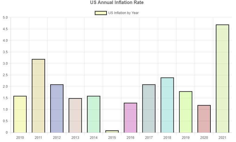
In this section, you’ll learn how you can create a basic bar and line chart using Chart.js. In this example, you’ll use the annual inflation rate for the United States for the period 2010–2021.
You can find this data on the US Inflation Calculator.
The data set looks like this:
| Year | Inflation rate |
|---|---|
| 2010 | 1.6 |
| 2011 | 3.2 |
| 2012 | 2.1 |
| 2013 | 1.5 |
| 2014 | 1.6 |
| 2015 | 0.1 |
| 2016 | 1.3 |
| 2017 | 2.1 |
| 2018 | 2.4 |
| 2019 | 1.8 |
| 2020 | 1.2 |
| 2021 | 4.7 |
Bar chart
To create a bar chart, you need an html page that will load Chart.js from a CDN. Name the html page barchart.html:
<!DOCTYPE html>
<html lang="en">
  <head>
    <meta charset="UTF-8" />
    <meta http-equiv="X-UA-Compatible" content="IE=edge" />
    <meta name="viewport" content="width=device-width, initial-scale=1.0" />
    <script src="https://cdnjs.cloudflare.com/ajax/libs/Chart.js/3.7.1/chart.min.js"></script>
    <style src="./styles.css"></style>
    <title>ChartJS Barchart</title>
  </head>
  <body>
    <div class="container">
      <canvas id="mybarChart" width="800" height="500"></canvas>
    </div>
    <script src="./app.js"></script>
  </body>
</html>
In the previous code, you create a canvas element in the <div> tag. Chart.js relies on the HTML5 canvas tag to create charts.
Now you need to create a JavaScript file named app.js to hold the code for drawing the bar chart using the following code:
const data = {
    '2010': 1.6,
    '2011': 3.2,
    '2012': 2.1,
    '2013': 1.5,
    '2014': 1.6,
    '2015': 0.1,
    '2016': 1.3,
    '2017': 2.1,
    '2018': 2.4,
    '2019': 1.8,
    '2020': 1.2,
    '2021': 4.7

};
const ctx = document.getElementById('mybarChart').getContext('2d');
const myChart = new Chart(ctx, {
    type: 'bar',
    data: {
        labels: Object.keys(data),
        datasets: [{
            label: 'US Inflation by Year',
            data: Object.values(data),
        }, ],
    },
    options: {
        plugins: {
            title: {
              display: true,
              text: 'US Annual Inflation Rate',
              font: {
                size: 16
              }
            },
          },
        backgroundColor: [
            'rgba(226,234,60, 0.3)',  // Bar 1
            'rgba(194,172,57, 0.3)',  // Bar 2
            'rgba(16,44,139, 0.3)',  // Bar 3
            'rgba(179,138,114, 0.3)',  // Bar 4
            'rgba(77,212,123, 0.3)', // Bar 5
            'rgba(156,167,20, 0.3)',  // Bar 6
            'rgba(166,2,136, 0.3)',  // Bar 7
            'rgba(70,123,116, 0.3)',  // Bar 8
            'rgba(54,185,183, 0.3)',  // Bar 9
            'rgba(154,251,39, 0.3)',  // Bar 10
            'rgba(155,12,8, 0.3)', // Bar 11
            'rgba(171,212,68, 0.3)'   // Bar 12
        ],
        borderWidth: 2,
        borderColor: 'black',
        mantainAspectRatio: false,
        responsive: false
    }
});
In the app.js file, you are saving the data as an object, with the keys representing the years and the values representing the average inflation rate.
The css file will look like this:
.container {
			max-width: 800px;
			margin: 0 auto;
		}
When completed, your bar chart should look like the following:
You can flip the bar chart to create a horizontal chart by changing the indexAxis property to y in the options object:
const myChart = new Chart(ctx, {
                type: "bar",
                data: {
                    ...
                },
                options: {
                    plugins: {
                        title: {
                            ...
                            },
                        },
                    },
                    backgroundColor: [
                        ...
                    ],
                    indexAxis: "y",
                    borderWidth: 2,
                    borderColor: "black",
                    mantainAspectRatio: false,
                    responsive: false,
                },
            });
The horizontal bar chart will look like this:

Line chart
Now that you’ve created a bar chart, it’s easy to make other chart types from the same data. For instance, in order to create a line chart, you simply change the type from bar to line. To do so, in the app.js file, locate the following code:
type: 'bar',
    data: {
        labels: Object.keys(data),
        datasets: [{
            label: 'US Inflation by Year',
	…
And update it with the following:
type: 'line',
    data: {
        labels: Object.keys(data),
        datasets: [{
            label: 'US Inflation by Year',
	…
Now you’ll have a line chart that looks like this:

As you can see, creating charts using Chart.js is easy. You can also experiment with other types of charts, including scatter, pie, and radar.
Setting up InfluxDB
If you don’t have an InfluxDB account, visit InfluxDB Cloud 2.0 and sign up for a free account. Verify your account by clicking on the verification link in your email, log in, and select a cloud provider (Amazon Web Services, Microsoft Azure, or Google Cloud Platform).
Note that the free version offers limited reads and writes, up to 10,000 data sets, and a retention policy of 30 days.
After selecting a cloud provider, navigate to your dashboard:

Then navigate to the Buckets section and create a bucket:

Go to the API Token page from the left sidebar and create an All Access API Token. The token will allow you to read and write data to your bucket:

Using Chart.js with InfluxDB
Now that InfluxDB is set up, you’re going to write data in InfluxDB, query it, and create a chart using Chart.js.
This tutorial uses InfluxDB’s sample CoinDesk Bitcoin data. This data includes Bitcoin pricing for the last thirty days and is collected from the CoinDesk API Bitcoin.
Using Flux to write data to your bucket
To load the sample data in your bucket, click on Data explorer in the sidebar and select SCRIPT EDITOR:

Write the following code in the editor and select Run. Make sure to change the bucket name to match yours:
import "influxdata/influxdb/sample"
sample.data(set: "bitcoin")
    |> to(bucket: "bitcoin-bucket")
After writing the data, you are now able to query it and create visualizations.
Using Flux to query the data from InfluxDB Cloud
To query the data in InfluxDB from Node.js, you need to create some scripts that will let you access data stored in your InfluxDB bucket for creating visualizations.
To begin, create an npm project and install the dependencies:
npm install dotenv @influxdata/influxdb-clientThen create a .env file with your credentials:
INFLUX_TOKEN=<your token>
INFLUX_ORG=<your organization name>
INFLUX_URL=<The URL of your InfluxDB instance>
Create a file app.js in the root of your project and add the following code:
const http = require('http')
require("dotenv").config(); // install dependency with npm install dotenv to import .env variables
const influxConnect = require("./query"); //import query

const app = http.createServer(async (req, res) => {
  const url = req.url
  console.log(url)
  if (url === '/charts') {
    const data = await influxConnect()
    res.writeHead(200, { 'Content-Type': 'application/json', 'Access-Control-Allow-Origin': '*' })
    res.end(JSON.stringify(data))
  }
}
)

const PORT = process.env.PORT || 8080

app.listen(8080, () => {
  console.log(`Server is listening on port ${PORT}`)
})
Visualizing the data with Chart.js
Now, you need to create a query.js file that will let you query data from InfluxDB using the JavaScript client:
const { InfluxDB } = require('@influxdata/influxdb-client');

const token = process.env.INFLUX_TOKEN
const org = process.env.INFLUX_ORG

const client = new InfluxDB({ url: process.env.INFLUX_URL, token: token })

const queryApi = client.getQueryApi(org)

const query = `
from(bucket: "bitcoin-bucket")
|> range(start: -12h, stop: now())
|> filter(fn: (r) => r["_measurement"] == "coindesk")
|> filter(fn: (r) => r["_field"] == "price")
|> filter(fn: (r) => r["code"] == "USD")
|> filter(fn: (r) => r["crypto"] == "bitcoin")
|> filter(fn: (r) => r["description"] == "United States Dollar")
|> filter(fn: (r) => r["symbol"] == "$")`

const influxConnect = async () => {
    const scatterData = [];
    const lineBarData = [];
    await queryApi
        .collectRows(query /*, you can specify a row mapper as a second arg */)
        .then(data => {
            data.forEach((x) => {
                scatterData.push({ x: new Date(x._time).getHours(), y: x._value });
                lineBarData.push({ x: x._time, y: x._value })
            })
            //console.log('\nCollect ROWS SUCCESS')
        })
        .catch(error => {
            console.error(error)
            console.log('\nCollect ROWS ERROR')
        })
    return ({ scatterData, lineBarData })

}

module.exports = influxConnect
After obtaining the data, you can create a wide variety of charts with InfluxDB’s various built-in visualizations. In this tutorial, you’ll use Chart.js to visualize the data using a line chart and a scatter plot.
Create a folder called public and create a file called index.html in the public folder. Put the following code in the index.html file. This code sets up the structure of the webpage:
<!DOCTYPE html>
<html lang="en">
  <head>
    <meta charset="UTF-8" />
    <meta http-equiv="X-UA-Compatible" content="IE=edge" />
    <meta name="viewport" content="width=device-width, initial-scale=1.0" />
    <link rel="stylesheet" href="./style.css" />
    <title>InfluxDB Chart.js Visualizations</title>
  </head>
  <body>
    <h1 style="text-align: center;">
      Visualizing Bitcoin Data with InfluxDB & Chartjs
    </h1>
    <div class="container">
      <canvas id="lineChart" width="800" height="500"> </canvas>
    </div>
    <div class="container">
      <canvas id="scatterChart" width="800" height="500"></canvas>
    </div>

    <script src="https://cdn.jsdelivr.net/npm/chart.js"></script>
    <script src="./charts.js"></script>
  </body>
</html>
Inside the public folder, create the style.css:
.container {
    max-width: 800px;
    margin: 0 auto;
}
Create a charts.js file in the public folder. This is where you’ll set up the charts.
Then write the following code in the charts.js file:
async function tryChart() {
    await getChartData()
   // Create the chart
}
tryChart()

// Fetch Data from API

async function getChartData() {
    const API_URL = 'http://127.0.0.1:8080/charts';
    const response = await fetch(API_URL)
    const result = await response.json()
    scatterData = result.scatterData
    lineBarData = result.lineBarData

}
The getChartData() function will fetch the data from the API and set the scatterData and lineBarData variables.
To make a line chart, write the following code after the await getChartData() call:
const lineChart = new Chart(
        document.getElementById('lineChart').getContext('2d'), {
        type: 'line',
        data: {
            datasets: [{
                label: 'Bitcoin Price',
                backgroundColor: 'blue',
                borderColor: 'rgb(255, 99, 132)',
                data: lineBarData
            }]
        },
        options: {
            plugins: {
                title: {
                  display: true,
                  text: 'Hourly Bitcoin price (in USD) Time series Line plot',
                  font: {
                    size: 16
                  }
                },
                legend: {
                display: false
              },
            },
            backgroundColor: 'rgba(16,44,139, 0.3)',
            mantainAspectRatio: false,
            responsive: false
    }
        }
);
When completed, the line chart will look like this:

Note: The data is dynamic, and your chart may not look exactly like this because of data changes. However, the aesthetics should be the same.
To create a scatter plot chart, write the following code:
const scatterChart = new Chart(
        document.getElementById('scatterChart').getContext('2d'), {
        type: 'scatter',
        data: {
            datasets: [{
                label: 'Bitcoin Price',
                backgroundColor: 'rgb(255, 99, 132)',
                borderColor: 'blue',
                data: scatterData,
                pointRadius: 5
            }]
        },

        options: {
            plugins: {
                title: {
                  display: true,
                  text: 'Hourly Bitcoin price (in USD) Time series scatter plot',
                  font: {
                    size: 16
                  }
                },
                legend: {
                display: false
              },
            },

            backgroundColor: 'rgba(16,44,139, 0.3)',
            mantainAspectRatio: false,
            responsive: false
      }
    }
    );
You can find the code for this entire tutorial in this GitHub repo.
Conclusion
In this article, you learned how to leverage the capabilities of InfluxDB with the flexibility and power of Chart.js to visualize time series data efficiently. By utilizing these platforms and tools, you learned how to create charts that can attract a viewer’s attention and simplify complex data sets to boost comprehension and discovery.
Next steps and additional resources
Now that you are set up with InfluxDB there are a number of things you can do in addition to visualizing your time series data. Check out these resources for some ideas:
- Analyze your time series data
- Make forecasts and projections with your data
- Create automations and workflows
- Full InfluxDB documentation
About the author

Armstrong Asenavi is a seasoned machine learning engineer and data analyst with a penchant for insights, business intelligence (BI), dashboards, metrics, analysis, modeling, and visualizations. In addition to experience with data engineering projects, he is well versed in major programming languages including Python, R, JavaScript, SQL, and DAX. His skills include research, project management, and technical report writing.
