Matplotlib Tutorial - Learn How to Visualize Time Series Data With Matplotlib and InfluxDB
By
Community
updated October 20, 2023
Use Cases
Product
Developer
Navigate to:
This article was written by Armstrong Asenavi. Scroll down for author bio.
A time series is a sequence of data points (observations) arranged chronologically and spaced equally in time. Some notable examples of time series data are stock prices, a record of annual rainfall, or the number of customers using a bike sharing app daily. Time series data exhibits certain patterns, such as the highs and lows of hotel prices depending on season.
InfluxDB is a leading, high-performance time series database (TSDB) that empowers developers to build real-time analytics, IoT, and cloud applications with time series data.
In this article, you’ll learn how to leverage the capabilities of InfluxDB together with the flexibility and power of Matplotlib for efficiently visualizing time series data.
What is InfluxDB?
InfluxDB is an open source, non-relational TSDB optimized for high availability and fast read-and-write functionality for time series data written in the Golang programming language. The faster retrieval and storage makes it popular for many applications, such as monitoring applications in production, storing data from IoT sensors, and performing real-time analytics. InfluxDB provides a wide range of access options, including SQL-like queries.
InfluxDB is ideal for storing data that needs quick processing once it reaches the database. Thus, it leverages a Network Time Protocol (NTP) to synchronize time across systems. It also uses a simple indexing approach, giving a clear speed advantage as compared to other TSDBs.
InfluxDB is useful for all kinds of applications that involve large amounts of time-stamped data. Here are some examples of how enterprises use InfluxDB for a variety of purposes:
-
Monitoring signals in production lines. Texas Instruments (TI) uses InfluxDB to monitor manufacturing operations and detect anomalies before they become costly. TI monitors over one thousand different signals of potential issues that could become troublesome. The aim is to build apps that could identify critical issues and act autonomously.
-
Enhancing connection efficiency in Industrial Internet of Things (IIoT). ThingWorx Kepware uses InfluxDB to help companies connect their legacy assets to databases (on-prem and cloud). Companies can collect and store tag data easily and at scale, allowing managers to monitor events across multiple devices in real time.
-
Real-time monitoring of user statistics. Index Exchange uses InfluxDB to monitor user statistics. An InfluxDB cluster trigger allows for real time storing of data, which analysts can then access and process in real-time inexpensively.
Visualizing time series data with Matplotlib and InfluxDB
Now let’s take a closer look at how to use Matplotlib and InfluxDB to visualize time series data. You’ll learn about the basics of Matplotlib and review some example charts, and then walk through a tutorial that will show you how to set up and use an InfluxDB Python client to perform CRUD operations.
Introduction to Matplotlib
Matplotlib is an open source library for data visualization as charts, plots, and graphs. It’s arguably the most popular plotting library for Python and is used by data scientists and machine learning engineers all around the world.
In Matplotlib, plots are hierarchical, nesting Python objects to create tree-like structures. A figure object encapsulates each plot, as pictured here:

This “figure” is the top-level container of the visualization. It can have multiple axes, which are basically individual plots inside the container.
Matplotlib uses an API known as pyplot to make it easier for users to create visualizations — you don’t have to explicitly configure the figure and axes yourself.
You can also find Python objects that control axes, tick marks, legends, titles, text boxes, the grid, and many others, all of which can be customized.
The anatomy of a Matplotlib plot looks like this:
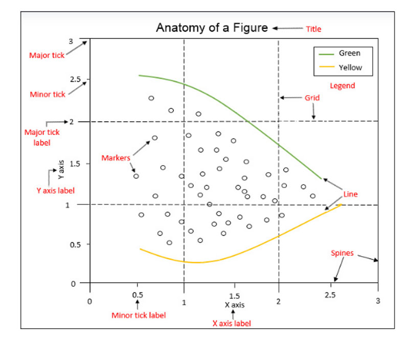
Image courtesy of The Data Visualization Workshop
Matplotlib can be installed using the pip or conda package manager, depending on your preference:
pip install matplotlibOr:
conda install matplotlibThen install the Numpy module as follows:
pip install numpyIt’s also handy to use the alias plt to reference the imported sub-module:
import matplotlib.pyplot as plt

import numpy as np # for creating arrays

import pandas as pd # for manipulating dataframes
With Matplotlib, you can create all kinds of visualizations, such as bar plots, pie charts, radar plots, histograms, and scatter plots. Here are a few examples showing how to create some basic chart types:
Line Plot
plt.plot([1, 2, 3], label='Label 1')

plt.plot([2, 4, 3], label='Label 2')

# Add title

plt.title('Two-way line plot')

plt.legend()

plt.show()
Scatter Plot
# Create a Figure with dpi set to 100

plt.figure(dpi=100)

# Fixing random state for reproducibility

np.random. seed(100)

n = 20

x = np.random.rand(n)

y = np.random.rand(n)

colors = np.random.rand(n)

area = (30 * np.random.rand(n))**2

plt.scatter(x, y, s=area, c=colors, alpha=0.5)

# Add title

plt.title('Scatter plot')

plt.show()
Bar Chart
labels = ['A', 'B', 'C', 'D']

x = np.arange(len(labels))

width = 0.4

plt.bar(x - width / 2, [20, 25, 40, 10], width=width)

plt.bar(x + width / 2, [30, 15, 30, 20], width=width)

# Ticks and tick labels must be set manually

plt.xticks(x)

ax = plt.gca()

ax.set_xticklabels(labels)

# Add axes and titles

ax.set_xlabel("x-axis")

ax.set_ylabel("y-axis")

plt.title('Bar chart')

# Show plot

plt.show()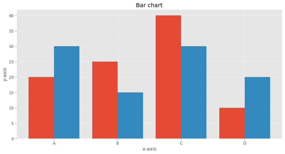
Pie Chart
# Create figure

plt.figure(figsize=(8, 8), dpi=100)

plt.pie([19.5, 12.2, 4.9, 3.7], explode=(0.1, 0, 0, 0), \

labels=['USA', 'China', 'Japan', 'Germany'], autopct='%.0f%%')

# Add title

plt.title('Top 4 Global Economies by GDP')

# Show plot

plt.show()
Setting up InfluxDB
Now let’s dive into the details of the tutorial, which will focus on the cloud version of InfluxDB. It’s very easy to get started, thanks to various modules for collecting, evaluating, and visualizing data.
To begin, sign up as a free user on the InfluxDB Cloud website. Be sure to verify your account by clicking on the link sent to your email. Then log in and select a cloud provider (AWS, Azure, or GCP). Note that the free version offers limited reads and writes, up to 10,000 data sets, and a retention policy of thirty days.
After signing up, you should find yourself on the dashboard page:

Next, navigate to the Buckets section and create a bucket:

Navigate to the API Token section and create an All Access API Token. This is important because you will write data to your bucket; an All Access Token will allow you to read and write data into a bucket without limitation.
Then you’ll want to create the required folders, set up a Python virtual environment, and install required packages:
# Create a directory

mkdir influxDB-Tutorial

# Navigate into the folder

cd influxDB-Tutorial
Next, create a virtual environment using the venv library. Note that venv is recommended when running Python v3.6+. See this documentation for more information.
# To create a virtual environment

pip install venv

# Activate virtual environment

source venv/Scripts/activate

# Install influxDB client

pip install influxdb-client

# Create a file known as named __init__.py

touch __init__.py

# Create a file known a file .env to store credentials

touch .env

# Create .gitignore file to prevent .env going public

touch .gitignore

# Install python-dotenv to allow access to the .env file

pip install python-dotenv

# Create folders for storing data and img

mkdir data

mkdir img

# Install yfinance to Collect data

pip install yfinance

# Install matplotlib

pip install matplotlib
Store your credentials (token, bucket, and organization) in the .env file. Remember to include the .env file in the .gitignore file.
INFLUX_TOKEN = " All access token from InfluxDB"

ORG = "email you registered with on InfluxDB"

BUCKET = "name of your bucket"
In the __init__.py file, start importing the dotenv and os modules for reading credentials from the .env file.
Then go back to the InfluxDB Cloud UI, to the Sources section. In the client libraries, select “Python.” Copy the code under Initialize the Client and paste it into the __init__.py file:

# Import modules

from dotenv import load_dotenv

import os

from influxdb_client import InfluxDBClient, Point, WriteOptions

from influxdb_client.client.write_api import SYNCHRONOUS

load_dotenv()

token = os.getenv('INFLUX_TOKEN')

org = os.getenv('ORG')

bucket = os.getenv('BUCKET')

client = InfluxDBClient(url="https://us-east-1-1.aws.cloud2.influxdata.com", token=token, org=org)
Next, run your Python file:
$ python __init__.pyIf there are no error messages, you have successfully connected to InfluxDB Cloud.
Using Matplotlib with InfluxDB
This tutorial uses adjusted closing prices from Yahoo Finance for four tech companies: Apple (AAPL), Amazon (AMZN), Google (GOOG), and Microsoft (MSFT), from January 1, 2020 to March 30, 2022. The idea is to visualize the price trend of the stocks over the COVID-19 period.
Downloading and saving the data
First, use the yfinance library to download the data:
import yfinance as yf

tickers = ['AAPL', 'GOOG', 'AMZN', 'MSFT']

#Download only adjusted closing price for the tickers

data = yf.download(tickers, start="2020-01-01", end="2022-03-30")['Adj Close']

data.head()
The imported data will appear as follows:

Then use this code to save the data as a CSV file:
# Save the data into the data folder as a csv file.

data.to_csv('data/stocks.csv')
Preparing to write the data
Next, use the following code to load the required libraries and link to the InfluxDB Python client:
# Import required packages and access influxdb client

from collections import OrderedDict

from csv import DictReader

import rx

from rx import operators as ops

from dotenv import load_dotenv

import os

from influxdb_client import InfluxDBClient, Point, WriteOptions

from influxdb_client.client.write_api import SYNCHRONOUS

load_dotenv()

token = os.getenv('INFLUX_TOKEN')

org = os.getenv('ORG')

bucket = os.getenv('BUCKET')

client = InfluxDBClient(url="https://us-east-1-1.aws.cloud2.influxdata.com", token=token, org=org)
Creating a function to write the data
Then use the code below to prepare the CSV data in point structure and write it into an InfluxDB bucket named finance-bucket:
def parse_row(row: OrderedDict):

"""

This function parses rows into Point with structure:

the csv file has the following columns:

Date,AAPL,AMZN,GOOG,MSFT

...

:param row: row of csv file

:return: Parsed csv row to Point

"""

return Point("financial-analysis")\

.tag("type", "stock-daily") \

.field("aapl", float(row['AAPL'])) \

.field("amzn", float(row['AMZN'])) \

.field("goog", float(row['GOOG'])) \

.field("msft", float(row['MSFT'])) \

.time(row['Date'])

"""

Convert the stocks.csv into data points

"""

data = rx \

.from_iterable(DictReader(open('./data/stocks.csv', 'r'))) \

.pipe(ops.map(lambda row: parse_row(row)))

"""

Create a client that writes data.

"""

write_api = client.write_api(write_options=WriteOptions(batch_size=5_000, flush_interval=1_000))

"""

Write data into InfluxDB

"""

write_api.write(bucket=bucket, record=data)

write_api.close()
Using Flux to query the data from InfluxDB Cloud
Once the data is in the bucket, you can query it using Flux language and return a dataframe (df) using the following code:
query_with_multiple_fields ='''

from(bucket: "finance-bucket")

|> range(start:0, stop: now())

|> filter(fn: (r) => r._measurement == "financial-analysis")

'''

# Output the data as data frame named df

df = client.query_api().query_data_frame(org=org, query=query_with_multiple_fields)

df.head()
As you can see, the data in the dataframe is presented in a flat structure, with each field in a row:

Writing a Flux query to pivot the time series into a dataframe
Next, use Flux to query and pivot the data into a dataframe with all fields presented as columns:
query_with_pivot ='''

from(bucket: "finance-bucket")

|> range(start:0, stop: now())

|> filter(fn: (r) => r._measurement == "financial-analysis")

|> pivot(rowKey:["_time"], columnKey: ["_field"], valueColumn: "_value")

|> keep(columns:["_time", "aapl", "amzn", "goog", "msft"])

'''

# put the data in a dataframe

df = client.query_api().query_data_frame(org=org, query=query_with_pivot)

df.head()
The output shows that the data is now in the intended dataframe. However, as you can see in the screenshot below, InfluxDB added ‘result’ and ‘table’ columns, which you’ll drop in the next section.

Dropping irrelevant columns
Use the drop method to remove the ‘result’ and ‘table’ columns that are not relevant to this analysis:
df["_time"] = pd.to_datetime(df["_time"].astype(str))

df = df.drop(columns=["result", "table"])

df = df.set_index("_time")

df.head()
The final dataframe is presented as follows:

Normalizing the dataframe to create professional charts
The dataframe shows that AMZN and GOOG stock prices are in the thousands, while AAPL and MSFT have their stock prices in the tens and hundreds. Plotting the data as-is will have two charts at the top (AMZN and GOOG) and two charts at the bottom (MSFT and AAPL), which will look unprofessional. To solve this problem, you can normalize the stock data regarding day 1, forcing the first day price to start at $1.
Use the following code to do so:
def normalize_df(df):

"""normalizes stock data w.r.t price in day 1,

force first day price to start at $1"""

return df/df.iloc[0,:]

data = normalize_df(df)
Visualizing the data with Matplotlib
Finally, use this code to create your time series plot of the stock prices:
# Create the plot

ax = data.plot(figsize=(15, 10))

ax.set_xlabel("Date")

ax.set_ylabel("Adjusted Price")

plt.title('Adjusted Closing Prices')

plt.legend(loc='upper left', fontsize=12)

plt.tight_layout()

plt.style.use('bmh')

plt.grid(True)

plt.show()
After running the code, the output will look like this:

Analyzing the data
As you can see in the final plot, there was a temporary decline in prices between March and April 2020, when governments announced lockdown measures due to COVID-19. Since then, technology stocks have performed relatively well despite the effects of COVID-19. There are a number of options available for more in-depth time series data analysis, as well as how to make projections via time series forecasting methodologies.
Conclusion
In this tutorial, you learned the basics of time series visualization in Matplotlib, a popular plotting library for Python. You also learned how to set up the InfluxDB Cloud, write data to a bucket, and read the data into Python for analysis, using simple Python scripts to perform read-and-write operations in InfluxDB.
As you’ve seen, there’s a lot of power and flexibility in combining the capabilities of InfluxDB and Matplotlib for creating efficient visualization of time series data. You can access the full source code for this tutorial in this GitHub repo.
Additional resources
If you are interested in some other tutorials showing how to visualize data with InfluxDB, check out the links below:
-
Recharts Tutorial - Learn how to visualize IoT data using the Recharts charting library with InfluxDB
-
Highcharts InfluxDB Tutorial - Learn how to use the Highcharts JavaScript charting library with InfluxDB to visualize ocean tide data.
-
React Native Victory Tutorial - This tutorial shows how to use the React Native version of the Victory charting library, which allows you to use your web development experience to create native mobile applications.
-
Nivo Tutorial- In this article you learn about the fundamentals of the Nivo charting library and how to create various types of charts while pulling data from InfluxDB.
-
Plotly.js Tutorial- Use the PlotlyJS charting library to display data stored in InfluxDB.
About the author:
Armstrong Asenavi is a seasoned machine learning engineer and data analyst with a penchant for insights, business intelligence (BI), dashboards, metrics, analysis, modeling, and visualizations. He has requisite experience with all stages of value-enhancing data engineering projects and is well-versed in major programming languages including Python, R, JavaScript, SQL, and DAX. He has a strong background in research, project management, and technical report writing. He is an analytical, critical thinker, and data-driven analyst. Armstrong communicates clearly and is able to translate complex information into workable solutions. He collaborates well with team members and thrives in a team environment.
