InfluxDB and GeoData - Emergency Generators
By
Jay Clifford
updated December 14, 2025
Product
Use Cases
Developer
Navigate to:
With the widespread use of LTE (Long Term Evolution), we are seeing more IoT devices come online in remote regions of our planet.
Picture this scenario: A country is currently experiencing a national emergency due to an electrical grid failure. To mitigate the power shortage the government has deployed generators in the remote regions of their country to power the most remote villages. The problem? The villages are still reporting outages due to the emergency generators running out of fuel.
So how can we as IoT specialists counter this? This blog post will deploy InfluxDB’s geodata tools to transform and visualize data being produced by the remote generator sensors, with the aim to enhance monitoring and response times.
Geodata
So what is geodata? Geodata can comprise two different forms of geographical data, spatial and spatial-temporal. Spatial is related to information (such as metrics) describing an association with a place on our earth. A common example of this is longitude and latitude. Longitude and latitude is essentially a pair of numerical values which relates to a specific point on our earth:
- (Latitude: 48.858093, Longitude: 2.294694) = Eiffel Tower
- (Latitude: 51.510357, Longitude: -0.116773) = Big Ben
You get the idea. In this scenario, we will use Longitude and Latitude to place our emergency generators on a map. Spatial-temporal data is the union of space and time. A valid example of spatial-temporal data is indexing a species within a region where over a period of time, these stats fluctuate based on environmental factors.
Our use case can be loosely associated with spatial-temporal data. We are storing:
- Generators' location (Spatial)
- Generators' state over time (Temporal)
The solution
The simulator code and InfluxDB template for this blog can be found here.
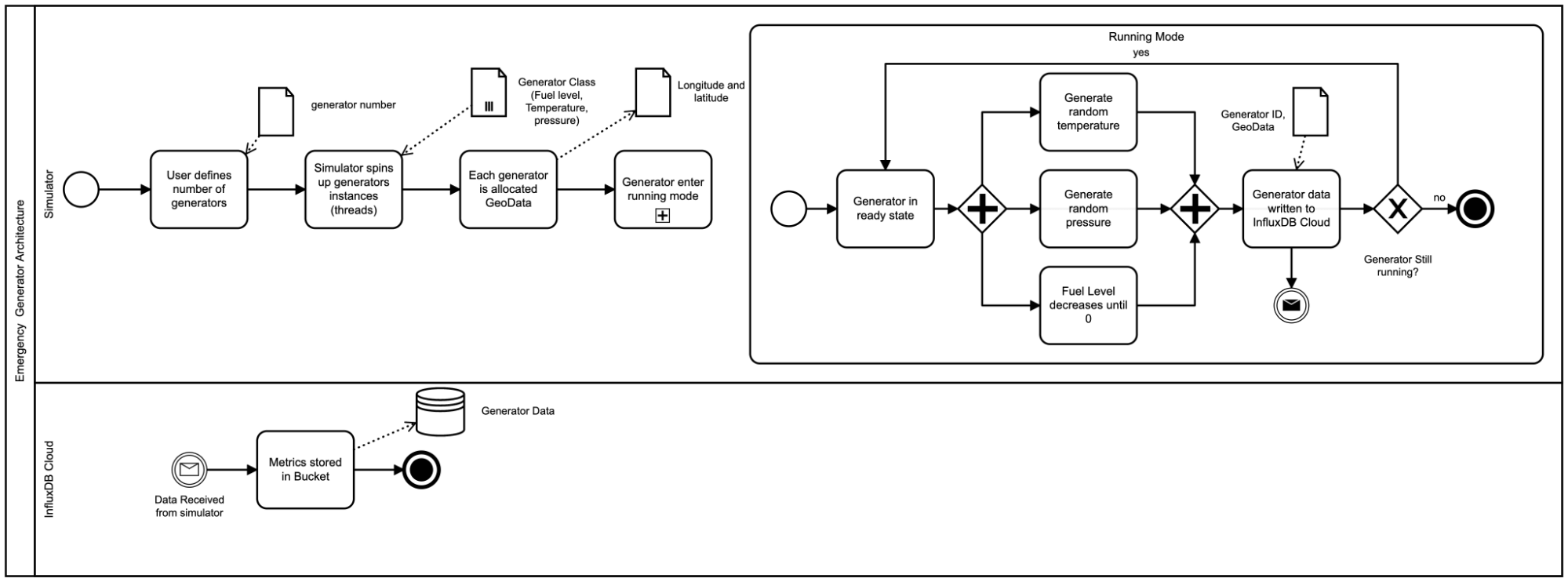
Simulator
Since we do not have a fleet of emergency generators in the field to monitor, we have to use the power of our imagination and Python to generate our scenario. I won’t discuss the implementation details of the simulator, but this diagram gives you an overall idea of what it’s doing.
Now that we have our data in InfluxDB, let’s take a look at what we have:
| result | table | _time | _value | _field | _measurement | generatorID |
| 0 | 2021-10-15T13:32:11Z | 624 | pressure | generator_stats | generator6 | |
| 1 | 2021-10-15T13:32:01Z | 619 | fuel | generator_stats | generator5 | |
| 2 | 2021-10-15T13:32:28Z | 86 | temperature | generator_stats | generator2 | |
| 3 | 2021-10-15T13:32:03Z | -91.58045 | lon | generator_stats | generator3 | |
| 4 | 2021-10-15T13:31:43Z | 44.27804 | lat | generator_stats | generator1 | |
| 5 | 2021-10-15T13:31:43Z | 174 | pressure | generator_stats | generator1 | |
| 6 | 2021-10-15T13:31:48Z | 415 | pressure | generator_stats | generator4 | |
| 7 | 2021-10-15T13:31:48Z | 33 | temperature | generator_stats | generator4 | |
| 8 | 2021-10-15T13:32:03Z | 48 | temperature | generator_stats | generator3 |
You can see in the above table that we have 6 different generators outputting:
- Temperature
- Fuel Level
- Pressure
- Longitude and Latitude
Data preparation
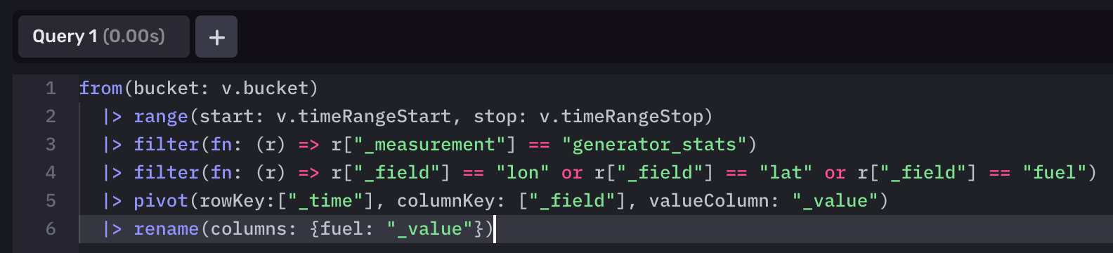
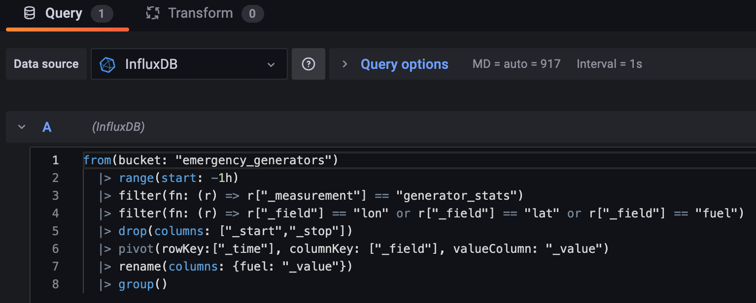
Before we can visualize our data within the Map panel of InfluxDB Cloud, we need to prepare our data. Thankfully, Flux makes this pretty simple for us:
Note: We have taken a key assumption within this use case that the emergency generators send their Geodata with each sample. It can be the case that Geodata is not produced by the static sensors or only on first initialization. See Appendix for a feature proposal where we can set these statically using variables.
from(bucket: "emergency _generator")
  |> range(start: v.timeRangeStart, stop: v.timeRangeStop)
  |> filter(fn: (r) => r["_measurement"] == "generator_stats")
  |> filter(fn: (r) => r["_field"] == "lon" or r["_field"] == "lat" or r["_field"] == "fuel")
  |> pivot(rowKey:["_time"], columnKey: ["_field"], valueColumn: "_value")
  |> rename(columns: {fuel: "_value"})
Breakdown:
- Select data between a start and a stop time range.
- Filter for data that contains the measurement equal to "generator_stats"
- Then filter that subset of data to only return fields containing the longitude, latitude and fuel level of the data.
- Transform the table so that the _fields column values become columns. The data associated with those fields (currently in the _value column) moves under the appropriate column.
- We rename our new column called "fuel" back to "_value" (The Map visualization tool expects this column).
Our data now looks like this:
| result | table | _time | _measurement | generatorID | _value | lat | lon |
| 0 | 2021-10-15T12:40:57.103569828Z | generator_stats | generator1 | 784 | 44.27804 | -88.27205 | |
| 1 | 2021-10-15T12:40:36.03140913Z | generator_stats | generator2 | 624 | 34.09668 | -117.71978 | |
| 2 | 2021-10-15T12:50:42.905288313Z | generator_stats | generator3 | 756 | 41.6764 | -91.58045 |
InfluxDB Map
Our data is ready! Onto the visualization.
-
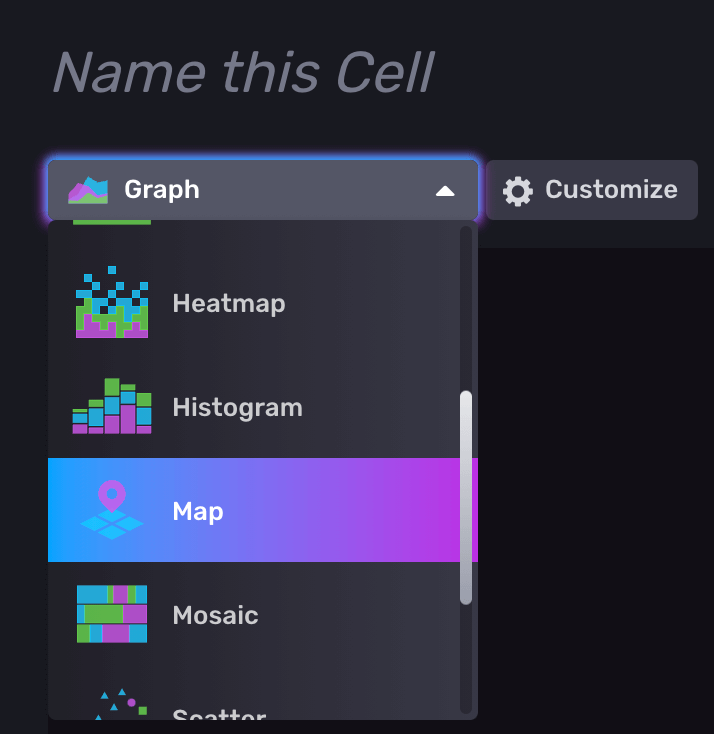
- Create a new Dashboard and select the Map Title.
- Open the query editor and copy and paste the Flux query we made earlier and submit the query.
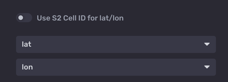
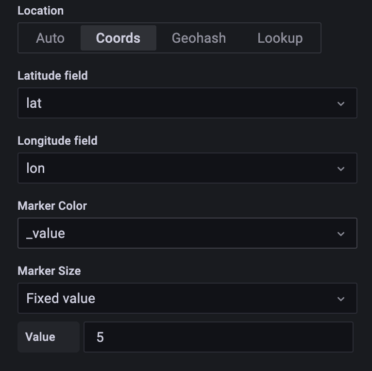
- Next, navigate to the Customize panel for the map. Untoggle Use S2 Cell ID for lat/lon. S2 cell id is a calculated geo-position for aggregating several plot points rolled into one. This is great for use cases that span multiple regions with many points (S2 provides scalability and robustness for these use cases). Check out this great article for more information). Since our generators have a single location point and do not move we will use raw longitude and latitude for this example. Change the lat and long dropdowns to match our Flux query columns. It should look like this.
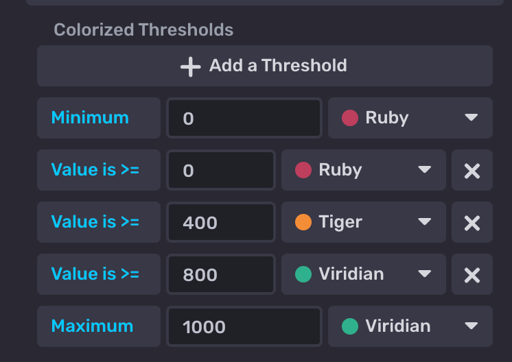
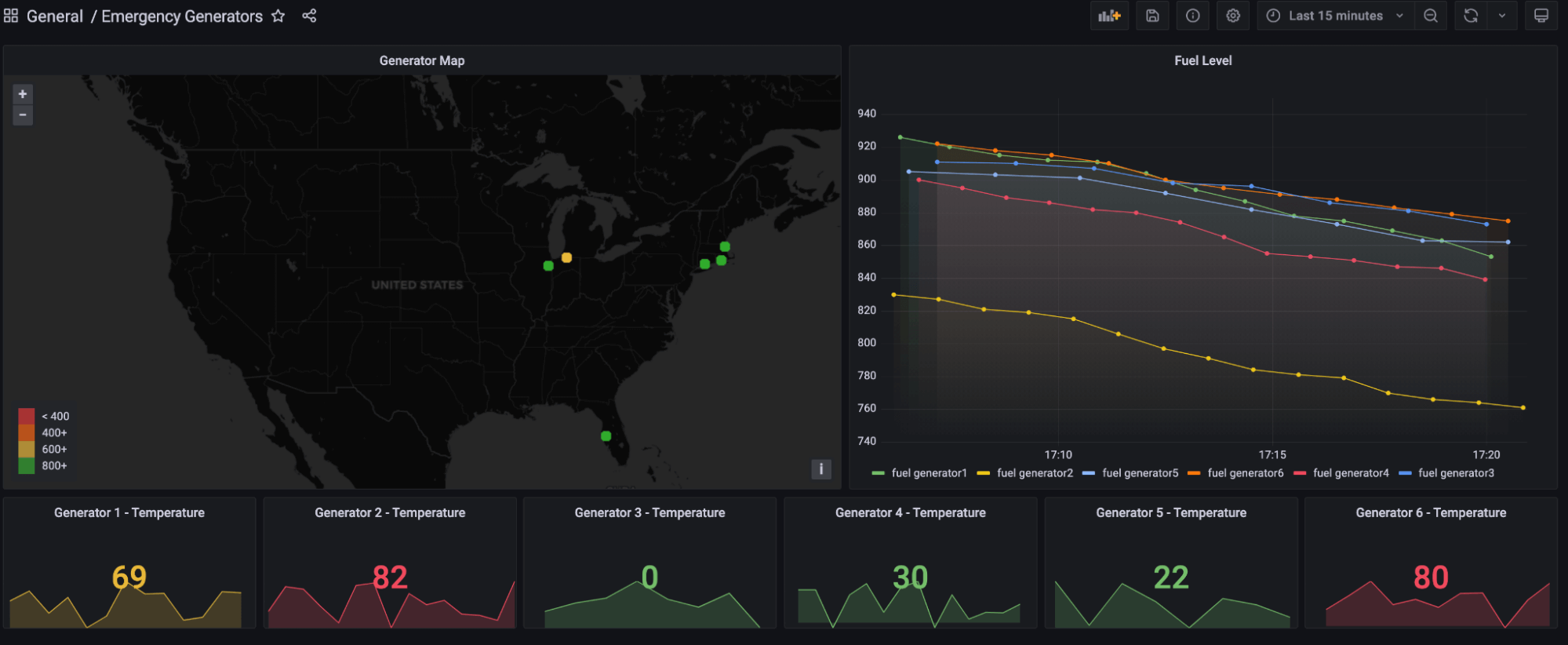
- Lastly, let's update the thresholding to a traffic light system. This will be important for monitoring the fuel levels of each generator being plotted at a glance.
- Create a new Dashboard and select the Map Title.
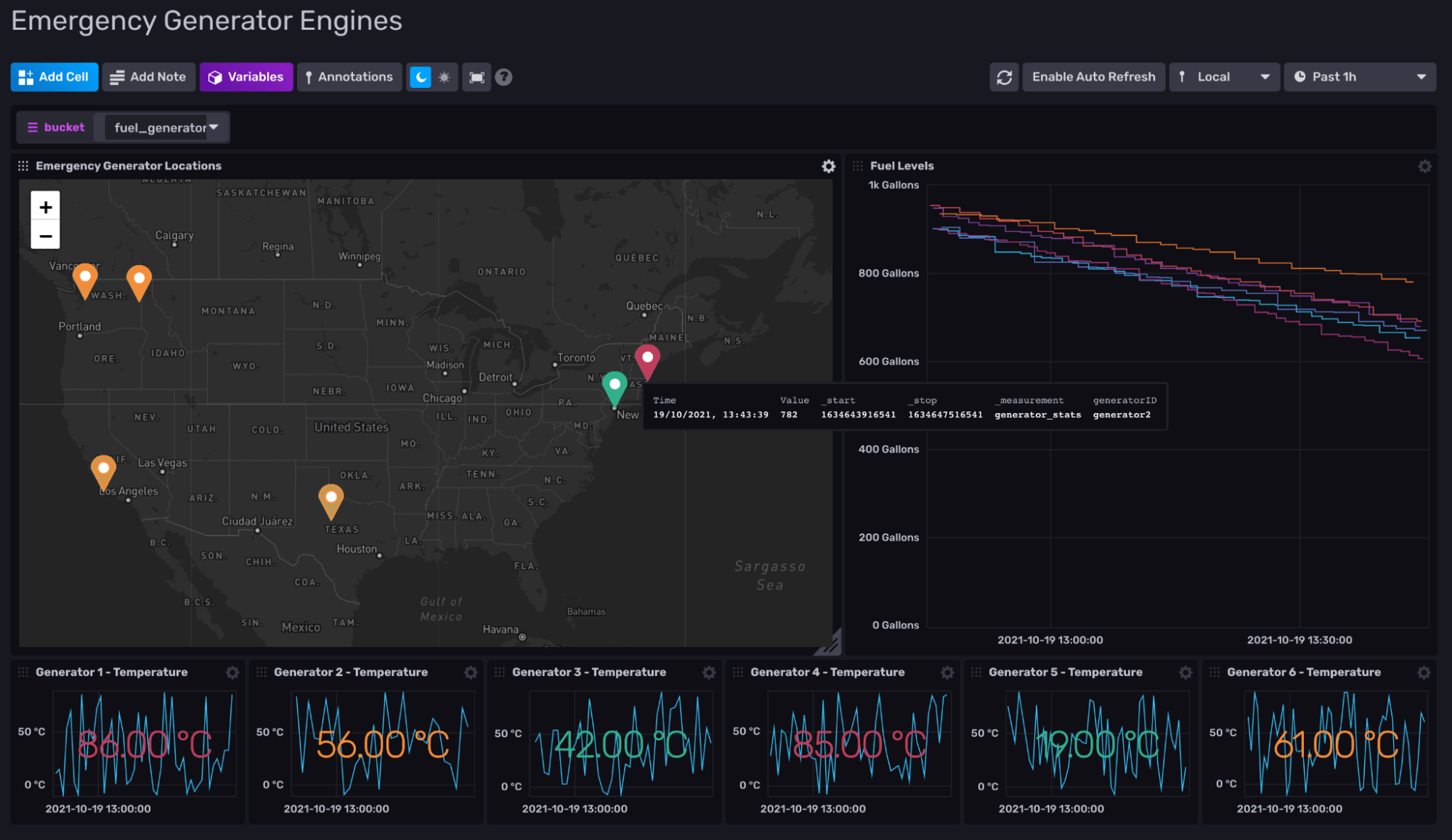
Now select the green tick and you’re done! I have taken some creative liberty to finish the dashboard which now looks like this:
Grafana Geomap
There is also great news for our Grafana power users out there. This visualization is also possible using the Geomap panel:
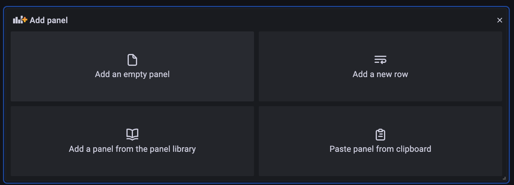
- Click Add panel.
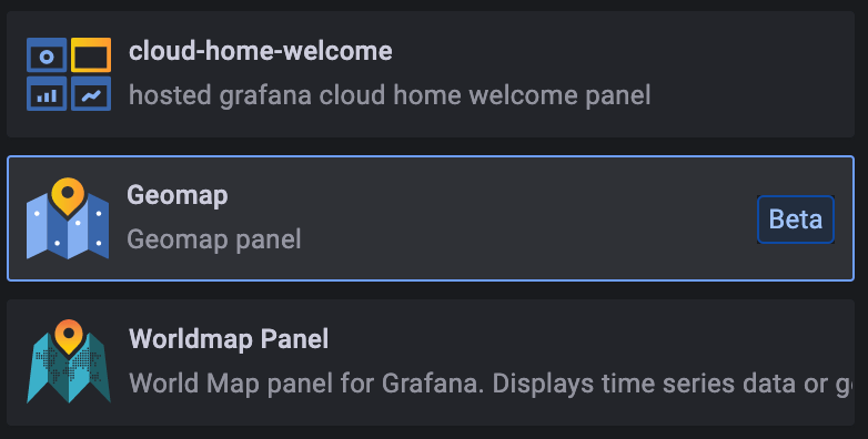
- Select Geomap from the visualization panel.
- Like in maps, we add our Flux Query.
Note: There are some extra steps we must take to clean up our data ready for Grafana. We drop the _start and _stop columns as they are not required for this visualization. Then, we perform a group() which combines each data frame into one.
- Lastly, we select our latitude and longitude fields from within the Geomap options panel.
I took our InfluxDB dashboard template and reproduced it:
Conclusion
Geodata is a powerful tool in the right context. Let’s return to our scenario: through the use of the map title, we have plotted each emergency generator on a geographical map and attached the fuel levels collected from each. This allows an operator to monitor each generator at scale as well as plan fuel routes based upon the fuel shortage (we may cover this in a later blog).
So what do you think? I’m excited to hear your thoughts on geodata and how you currently use it! Head over to the InfluxData Slack and Community forums (just make sure to @Jay Clifford). Let’s continue the discussion there.
Appendix
Adding static geodata
Note: This is currently not possible within InfluxDB since variables can only be selected within the Dashboard UI. If you would like to be able to choose variable values from within a Flux query, support this feature request.
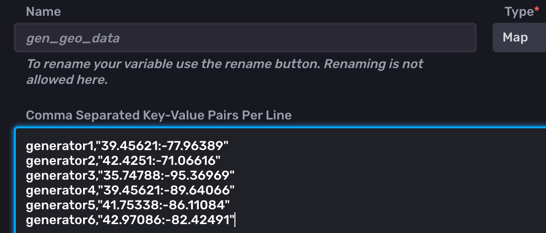
As discussed in the “Data preparation” section above, it may be the case that you need to provide manual geodata in order to plot your maps. We can do this through the use of variables:
- Let's take our 6 generators and create a key, value pair for each (<generatorID,":")
- When creating our Flux query, we use a map() function rather than a pivot()
import "strings"
from(bucket: "emergency _generator")
  |> range(start: v.timeRangeStart, stop: v.timeRangeStop)
  |> filter(fn: (r) => r["_measurement"] == "generator_stats")
  |> filter(fn: (r) => r["_field"] == "fuel")
  |> map(fn: (r) => ({ r with lat: strings.split(v: v.gen_geo_data[r.generatorID], t: ":")[0],
                              lon: strings.split(v: v.gen_geo_data[r.generatorID], t: ":")[1]}))
This would add both the lat and lon columns to our table. For each row, the generatorID is used as input for our key, value pair variable. We then use split() to break up the returned coordinate string using the colon (:) as our separator.
The SQL way
Lastly, we could consider a hybrid of time series and relational storage. Let’s consider the following scenario. During deployment of the emergency generators, we register their details with two separate datastores:
- Relational: This DB will hold our static data: (GenID, Geodata, manufacturer, etc.)
- Time Series: This DB will hold our temporal data (GenID, Fuel, Temperature, Pressure)
Note: GenID remains constant across our two data stores. It will become evident why shortly.
Conveniently, Flux allows us to ingest our relational data and combine it with our temporal data. Let’s break down the following Flux query:
// Import the "sql" package
import "sql"

// Query data from PostgreSQL
  GenGeo = sql.from(
  driverName: "postgres",
  dataSourceName: "postgresql://localhost?sslmode=disable",
  query: "SELECT GenID, lat, lon FROM generators"
)

// Query data from InfluxDB
GenTemporal =from(bucket: "emergency _generator")
  |> range(start: v.timeRangeStart, stop: v.timeRangeStop)
  |> filter(fn: (r) => r["_measurement"] == "generator_stats")
  |> filter(fn: (r) => r["_field"] == "fuel")

// Join InfluxDB query results with PostgreSQL query results
join(tables: {metric: GenTemporal, info: GenGeo}, on: ["GenID"])- Import our SQL library.
- Create a variable called GenGeo. GenGeo holds the results from our sql.from() query. Our query pulls in the columns GenID, lat and lon.
- Create a variable called GenTemporal and store the results of our original query (omitting the lat and lon fields).
- Lastly, we perform a join(). This allows us to merge both tables stored within our variables. GenID provides the "anchor" point. If GenID(GenGeo) = GenID(GenTempoeral), then add EngineID's lat and lon to time series row.
As you can see, there are many routes to the same result. Each route has its own values and drawbacks. This is why flexibility is integral to any platform architecture.
