Table of Contents
We recently introduced a new Map graph type into InfluxDB Cloud to help users visualize time series data that includes position.
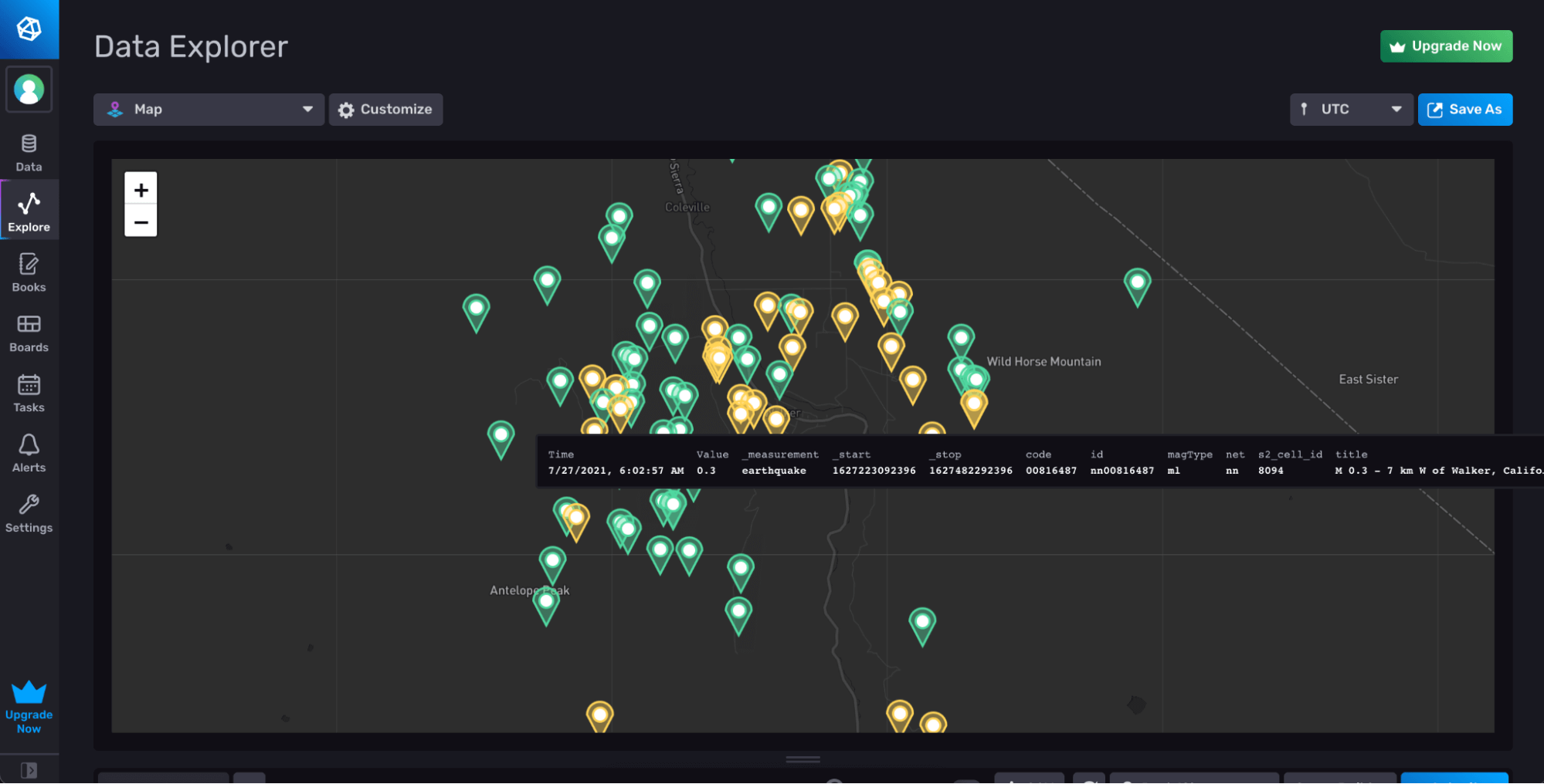
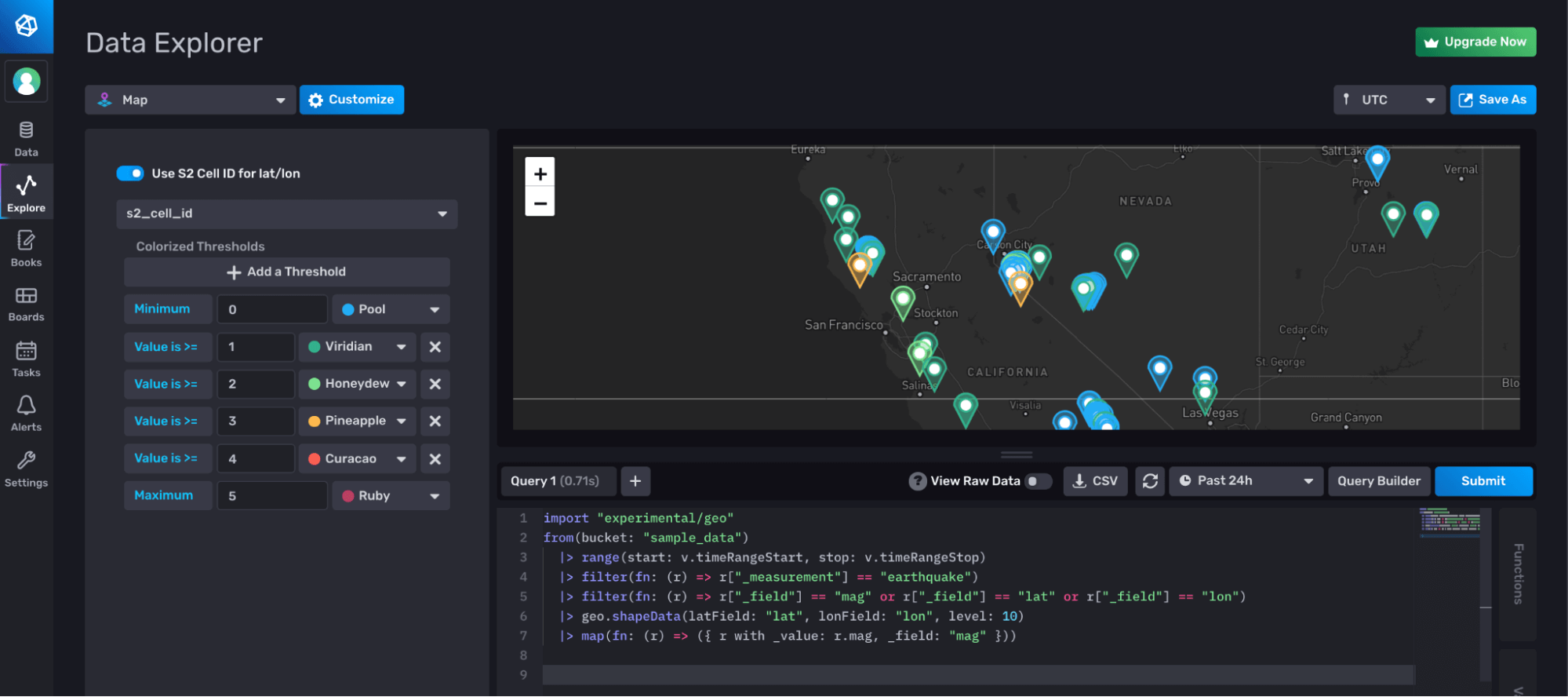
Above is a graph showing the most recent earthquakes in California, where the color of the marker indicates their magnitude.
In this post, I’m going to walk through the ways to ingest geotemporal data into InfluxDB Cloud, and how to use the new Maps visualization type.
Before we continue, you’ll need to sign up for a free InfluxDB Cloud account if you haven’t already.
Ingesting geotemporal data
There are many different ways to ingest geotemporal data into InfluxDB Cloud, but there are recommended schema design considerations to think about.
If you are ingesting data with latitude and longitude information that changes over time, we recommend storing those values as fields within InfluxDB, so that it doesn’t continually increase your cardinality. This can also make it easier to track the same object moving over time, since you can group by the name of the object stored as defined by one or more tags such as sensor name, device ID, MAC address, etc.
Even if the latitude and longitude values never change, and have the same cardinality as your other tags like sensor name, we would still recommend you store the information as fields, so that you don’t need to worry about converting the values when doing calculations, since all tags are stored as strings.
If you do many queries where you need to group by the coordinates of the data, then we recommend you encode the latitude and longitude values using S2 Geometry. S2 takes the planet, and divides it into cells of customizable size (known as levels), such that you have a bounded set of values when working with the data. This way, the cell identifier (commonly tagged as s2_cell_id) can be added as a tag to the dataset without leading to runaway cardinality.
The Flux geo package and the new Maps graph type are designed to work with either latitude and longitude stored as fields, or the S2 cells stored as tags in your dataset. Adding the s2_cell_id as a single tag provides a performance boost when working with geotemporal data as all tag values are indexed. When ingesting your data, you can pre-calculate the S2 cell ids using the s2geo processor in Telegraf and store it with the dataset.
If you aren’t using Telegraf, the Flux geo package provides the ability to calculate the s2_cell_id on the fly, but the performance of the resulting query will be slightly slower as a result. If you’ve already been ingesting geotemporal data without this s2 cell information, don’t worry. You can also leverage Tasks to define a background process that would pre-calculate the s2 cells at different levels and store them with your dataset.
For playing with the Map type, we offer a few different sample datasets you can use. You can leverage the USGS Earthquake dataset (usgs) or the NOAA National Buoy Data Center dataset (noaa). You can access them using the new Sample data Flux package.
import "influxdata/influxdb/sample"

sample.data(set: "usgs")
Graphing the data with the maps
Once the data has been ingested into InfluxDB Cloud, you can begin working with that data when building out visualizations.
Simply select the series that you are interested in, ensure that you have selected either the latitude and longitude fields in your data, or the s2_cell_id tag, and select the Map visualization type from the graph options dropdown.
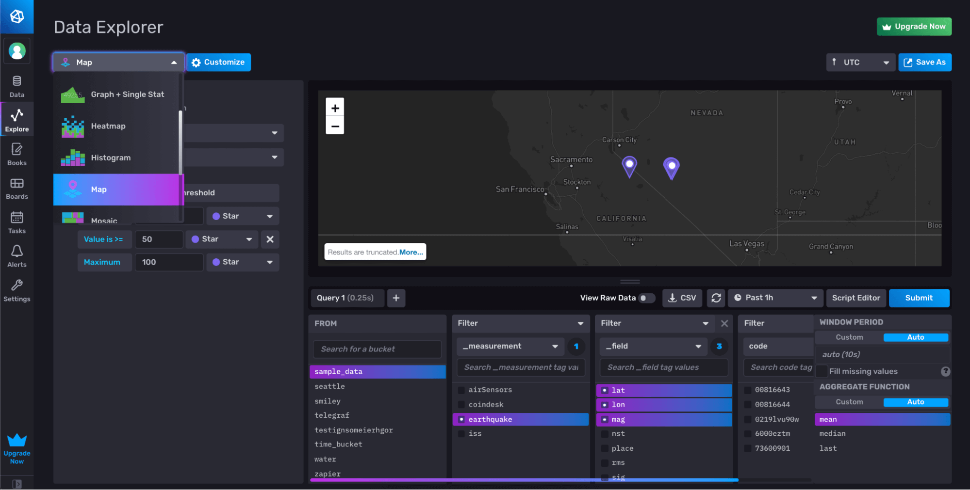
If all goes well, you should see a Map display with your points displayed. You might see an error if your fields are not named lat and lon or your tag isn’t named s2_cell_id. That’s ok. You can open the config options for the graph type and select the correct column or fields to use for the display.
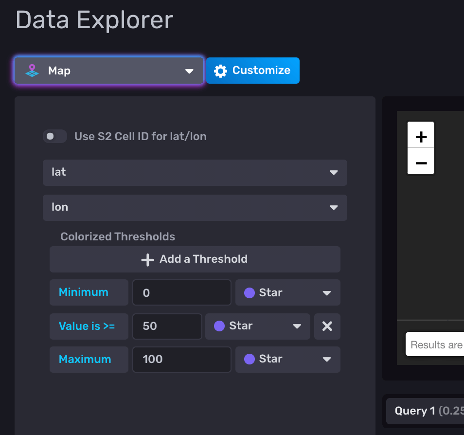
Changing Map Marker colors
The Map graph type allows you to configure a value to use to change the colors of the markers on the map. In order for this to work, the data will need to use the s2_cell_id tag for the coordinates, so that you can use the specific field value to set the marker colors.
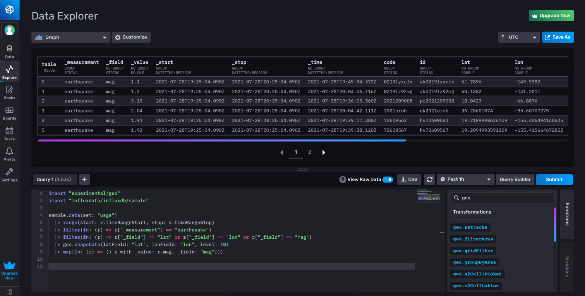
If your data already includes the s2_cell_id column, you can just use that. If you only have the latitude and longitude values as fields, you can leverage the shapeData function in the Geo package to calculate s2_cell_id you need. Finally, you can map the value column you would like to use in your threshold back to the _value column. The example below provides a sample query using this approach.
Once you have your data in the correct format, you can then configure threshold values to adjust the colors of the markers on the graph.
Here is an example of using the magnitude field of the earthquake to change the marker colors of the map.
Conclusion
We hope you enjoy this new ability to analyze your data using the Map graph type. Looking at the data geographically can unlock new insights or allow you to find patterns that you may have otherwise overlooked.
We are always looking for feedback on how you are using the capabilities of our product, or how we can improve. Please join us in our community Slack workspace or open feature requests directly in GitHub to let us know what you are interested in.

